Favourite Space | Stacey Bancroft

I'm really pleased to be able to share with you another 'favourite space', this time it belongs to Stacey Bancroft, graphic designer and co-owner of Darcy the Caravan Bar. It's no surprise then that Stacey's favourite space is in fact Darcy. It's easy to see why, he is super cute, and he's a bar! :)

Stacey and her husband, Mark, were living in Melbourne and on holiday in Cambodia when the idea for Darcy was conceived. With time to relax and switch off from their normally busy lives, it was Stacey who started brainstorming the idea, and draughtsman Mark immediately jumped onboard. Once back in New Zealand, he threw himself into the project and started trawling TradeMe for the perfect caravan.

They found Darcy and began renovating him in March 2015. That required gutting the caravan, putting in a new floor and bringing him back to life. With the help of CedarVille Joinery & Building they added the pine bench and cedar window. Mark and Stacey lined the walls themselves in ply, and they then got Darcy professionally painted. Keeping the colour scheme neutral means Darcy will suit any event, whether it be vintage, sophisticated, bohemian, country or town.

By the end of November 2015 Darcy was ready to go to his first party and is available to hire for your special occasion - a wedding, birthday, work or any private function. Pop over to his website to find out more.

As always, I had a few questions for Stacey so we could get to know her a bit better...

What do you love most about Darcy the Caravan Bar?

I love the clean Scandinavian feel of Darcy. He is such a great blank canvas for any kind of style. It is so much fun dressing him up for events. It's my favourite part of the job.

Were there any hiccups along the way with the renovation?

Once he was all finished, we went to get his Warrant of Fitness and he failed!!! But after a new drawbar and some rust proofing he passed with flying colours.

Do you have any advice for others renovating a caravan?

It takes longer than you think, so make sure you have plenty of wriggle room if you need it finished by a specific date.

What’s your favourite time of the day?

Gin o'clock.

Who or what inspires you?

All of the wonderful creative people we have here in the Hawke's Bay. After living overseas in large cities I am loving being back and involved in such a great community of creative people. I enjoy meeting up with, or bumping into people and finding out what is happening around here. It's so nice having that network. And for a business like Darcy it is the perfect way to get his name out there.

What are your reading at the moment?

I have had the 5th book 'A Dance with Dragons' from the Game of Thrones series on my kindle for over a year now. Whenever I manage to get a minute to read it, I love it! After living overseas for 8 years and having to take public transport all the time, I read so much. But now that we are back in New Zealand I miss my compulsory reading time on the tram or tube.  

Sweet or savoury?

Sweet!! I am particularly partial to any kind of french pastry. 

Favourite drink?

Champagne. Especially when there is something to celebrate.  

Favourite thing you own?

My husband's nana's spoon collection. When she passed away a few years ago I went around her house and took photos of all her amazing bits and pieces. I was particularly taken with her spoon collection she had on the wall. She had made the wooden case that they sat in. That year Mark's mum gave me the collection for my birthday. I felt very honoured to receive it. It now features in our living room where everyone can see it. There are spoons from all over the place including, Bonnie Doon, Australia (made famous in the movie The Castle) and Fantasyland, Hawke's Bay.

Top of your wish list for your home?

We just bought our house in January and I cannot wait to put in some french doors off the dining room. Once we have done that we can buy a new dining table with money we were gifted for our wedding over two years ago. I cannot wait!!

As you can imagine, Darcy is very social. If you want to follow him and see what he's getting up to, he has his own Facebook and Instagram page. You can also follow Stacey's graphic design and styling business, The Blushing Teacup on Facebook and Instagram.

A wee thanks to Lushka Flowers for the beautiful foliage in the shoot. Last, but definitely not least, many thanks to the incredible photography skills of Florence Charvin.

The Block Bathroom | Girls vs Boys

I have to say, I am super impressed with this season's teams. Bathroom week is often one of the toughest weeks on The Block. You need every tradie available - builder, plumber, waterproofer, tiler, electrician, plasterer (have I forgotten any?) - and because of the tight deadline, they're often working on top of each other in a small space. So completing the room in a week is a huge undertaking, and one that everyone achieved to pretty high standards. Well done guys.

Niki and Tiff: 1st place - 16.5 points (8.5 from Fiona and 8 from Paul)

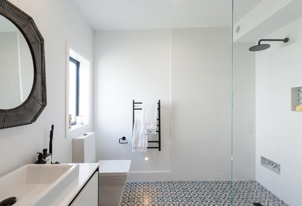
Another win for these girls, and it was well deserved. They stuck with their clean aesthetic with an earthy palette and a global influence. I LOVE their tiles, and their matt black fittings. The square lines found in their bath and toilet were a deliberate choice to be different, which I applaud, but I would've loved to have seen a simple round mirror to soften those lines. I find the one they chose quite heavy, and although round in the centre, the frame adds more angles.

In saying that, I'm a big fan of these girls, and I really look forward to seeing their room each week. And, did I mention they installed a sound system in their bathroom so they can relax with some tunes when they're in the bath?! Noice :)

Emma and Courtney: 2nd place - 15 points (8 from Fiona and 7 from Paul)

Emma and Courtney also did a fantastic job with their bathroom. I love the juxtaposition of the large concrete tiles and the tiny hexagon ones. The foot niche for shaving your legs is brilliant, I wish I had one (Niki and Tiff also have one), although the girls did get called up for the untidy finish on this. Something I'm sure they'll fix.

The floating vanity and wall hung toilet create a sense of space. I do wonder if the bath could've been pulled out slightly though, as it seems a bit jammed up in the corner. A little bit of air around it would've been nice, that would've required a tap that came out further, so perhaps placement was dictated by that. But the accessories were great and I love the led lighting under the vanity.

Sam and Emmett: 3rd place - 14.5 points (6.5 from Fiona and 7 from Paul and the +1 point)

Only one point behind Niki and Tiff after Paul's scores were revealed, Sam and Emmett gambled the +1 point they'd won at the challenge earlier. But it wasn't enough to push them to the front, and they finished in third place behind both girls teams.

They made some nice choices, I like their bath and their grey subway tiles, but I have to agree with the judges that the amount of grey was overwhelming creating a slightly cold feel. A break in the tiles would've added some relief, or some warm touches - light wood, or Emma and Courtney's pink towels. Their little rustic stool is my favourite thing, and once again, led lighting under the floating vanity is awesome.

Dyls and Dylz: Last place - 11 points (6 from Fiona and 5 from Paul)

These low scores, of course, caused some upset with Dyls and Dylz. The boys worked really hard and had high hopes for their room. They created their dream bathroom, and it certainly had a masculine vibe. But the judges slammed them for having too much going on. I have to agree with Fiona and Paul. It was really hard to watch the judges results being read out, as the boys had put their heart and soul into it, but there were too many things competing for your attention.

I loved the rustic wood in the vanity top, but the open shelving, the double sinks, and then the reflection of the double shower heads in the mirror, takes away from that. Shelley was right when she quoted Coco Chanel... "before you leave the house, look in the mirror and take one thing off". Choose what you want your "hero" to be, and then let that shine. Everything else should complement it, not compete with it for your attention. But the standard of finish looks really high, and there are definitely some great ideas in this bathroom, they just need to pull back a little bit.

Tell me your thoughts, and what you loved, it's always great hearing from you. Keep watching this week as the teams produce their guest bedroom, as well as take part in Dinner Wars, which is always interesting. And head over to the TV3 website to see more pics and all the latest content.

The Block Kid's Room | Girls vs Boys

Sorry I couldn't bring you this week's roundup sooner, we've been out of town visiting some amazing new clients, but I have been keeping up to date with everything that's happening on The Block. What did you think of the kid's rooms? What a turn around by Sam & Emmett - from zero to hero in a week! The boys got some first hand advice from a 10 year old girl, which I thought was very smart, and certainly paid off as they walked away with the win.

Sam and Emmett: 1st place - 18 points (9 from Fiona and 9 from Paul)

These were really high scores for week 2 - too high?.. Hmmm, perhaps. Don't get me wrong, I think Sam and Emmett's room was a great effort, especially compared to their first room, but I'm not sure it was one point off perfection. I loved the colours they chose - Resene Half Duck Egg Blue on the walls, and Resene Alabaster on the ceiling and trims. It's a lovely soft, restful colour palette and one that would suit an older child or an adult, giving future buyers plenty of scope.

This week both the boys teams had to design their room for a 10 year old girl, and the two girls teams had to design theirs for a 10 year old boy. Contrary to popular belief, girls rooms don't have to be filled with pink. My three girls are all "blue" fans, as was Sam & Emmett's 10 year old consultant, and she also wisely suggested gold which adds warmth, and balances the cooler wall colour.

The fairy lights and touches of bling in the mirror and lamps were fantastic, and the room could easily be adjusted for a teenager by changing out artwork and accessories, which I love.

Minor criticisms - there are a lot of little things going on in the room, a larger "hero" piece of art over the bed would've created a focal point. I just want to re-zhush a few of the styling pieces, and perhaps lower the hooks as they look a bit high for a child to reach, but that's being picky. Well done boys.

Dyls and Dylz: 2nd place - 15 points (7 from Fiona and 8 from Paul)

The "double D's" was actually my least favourite this week (sorry guys). I think what gave them the good scores was their use of tiny lights in the ceiling creating a starry night - that was amazing. Unfortunately I don't love their choice of wall colour, and with the sloping ceiling it seems to stunt the room. I think painting the walls and ceiling the same colour would've been better.

I love a hanging chair and I'm sure all little girls would too. The thick rope seems very heavy and out of place though. A simple metal chain would've moved the focus back to the chair and the cushions.

The room needs a few more details - some artwork and accessories would've added a bit of life. But on a positive note, the little desk was a great use of that space.

Emma and Courtney: 3rd place - 14.5 points (7.5 from Fiona and 7 from Paul)

I like the warmth and texture the girls brought to the room with the plywood wall. It's a good size room and I'm sure a 10 year old would love the double bed and all the accessories.

The desk looks a little high, but that could be fixed. Personally, I would've hung the curtains right from the ceiling - it's only a few more cm's, but just adds that sense of height and elegance to a room. There are elements I like in this room, but I'm not blown away by the space.

Niki and Tiff: Last place - 10 points (5 from Fiona and 5 from Paul)

The girls were strategic this week, purposefully forfeiting the win by ignoring the brief, choosing to think of the overall look and feel of their home as a whole. The brief was for a 10 year old boy's room and no white walls.

I'm in two minds about their room... it's by far my favourite of the four, but I do feel they could've easily tweaked the room to make it more kid appropriate, without compromising their design aesthetic. Accessories, whether it's a guitar, a surfboard, a pair of sneakers, some sort of music setup (or all of the above) could've looked really cool. The bones would've remained the same, and the room would've been more on brief.

I love the faux brick wall, and the texture and styling is spot on. But designing a kid's room is really fun and I think they lost an opportunity here. There are plenty of adult spaces to come.

What are your thoughts? Have you got a favourite team yet, and do you agree with the judges, or me for that matter? Bathroom week is shaping up to be a goodie, I can't wait to see how they turn out, and if everyone manages to finish.