Cameron | Before + Afters

We recently finished '‘phase 2” of a renovation for some favourite clients of ours. The family of seven live in a beautiful old villa that they’re gradually breathing new life into, honouring her original architecture but creating better space, flow and aesthetics. We began this journey several years ago in the kitchen/dining area, which you can see here. This latest renovation involved transforming a mostly unused family room, a dark hallway, and the addition of a small downstairs bathroom.

You can see from this section of the plan (above) by our friends at Architecture HDT - old plan on the left, new on the right - how we’ve closed the entrance to the family (rumpus) room and added French doors, borrowed some space from an adjoining office to create the bathroom, removed an old structure outside the family room, and replaced the small window along this wall with the original office window.

The brief for the family room was to make a space where the whole family could come (or the kids and their friends) to hang out, watch movies, and to make it a more inviting room to be in.

Previously the room featured heavy wood panelling, and quite a large raised stage at the back of the room which cut the room in half, limiting the furniture placement. The TV was tucked into the corner of the room on an angled built-in cabinet with a large unused fireplace taking pride of place. The small leadlight window sits awkwardly on top of the panelling.

This large leadlight window in the adjoining office needed to come out to make room for the new bathroom, so it made perfect sense to use it in the family room to replace the smaller one and let it more light.

We knew we wanted to remove the heavy panelling, but the style of the home really suited wall panelling, so we drew up a plan for the builder to follow with new panelling that had a lighter touch. Brendan Grant (the builder) did a brilliant job with our panelling design, and the entire renovation of this lovely old girl.

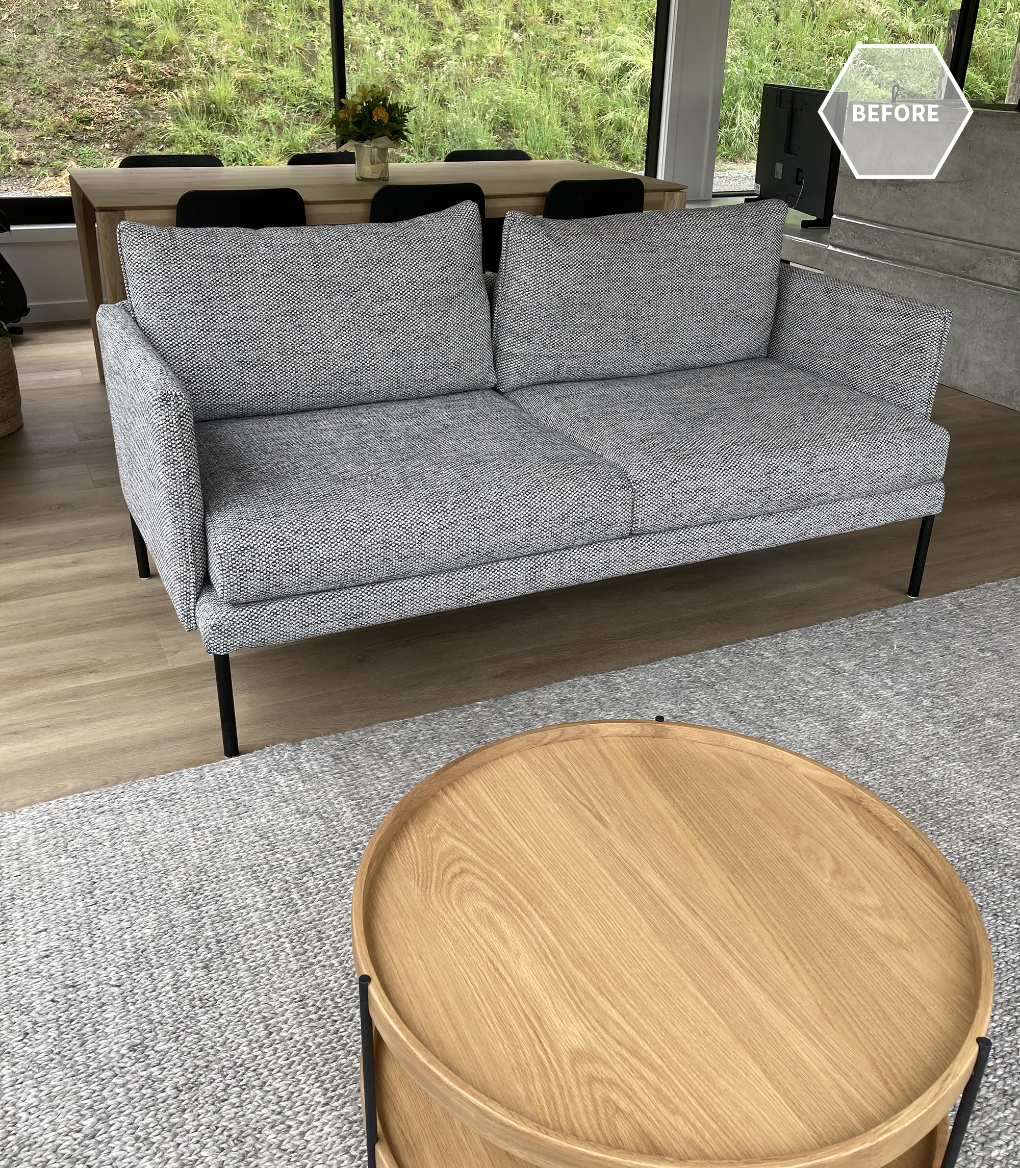
Taking the stage right back to just two small steps gave us so much more floor space, so we had a large corner sofa custom made along with a large round ottoman that could tuck under the new oak coffee table. The ottoman can double as seating when needed, and the new orientation of the seating allowed the family to take in the beautiful view out to the pool and beyond. A large rug zones the seating area, a warm white softens and lightens the room, and new curtains in a gorgeous fabric are hung as high as possible for a sophisticated finish.

The wall which previously was the focal point of the room has had quite a transformation. The panelling, built-in units, fireplace and hearth were removed. One of the main things we were asked to do in this room was create a space for a baby grand piano that is a family heirloom but hadn’t previously been able to fit anywhere. We boxed out the right side of the wall, covering the fireplace and creating a built-in shelving unit, also creating a nook for the piano.

The open shelves gave our clients the opportunity to display some favourite pieces, adding personality and interest. The cupboards below store all those things you may not want on display.

The office was cut in half so that a bathroom could be added downstairs. Previously family and friends had to go all the way upstairs to find the first bathroom. The downstairs addition has been life-changing, and great for when the kids want to jump through the shower after a swim.

We chose to clad the walls in HardieGroove™ to add that texture, but also, because it’s suitable for bathrooms, it meant we didn’t need to tile these walls. We added plenty of hooks for all the kids’ towels.

Inside the shower we used a marble chevron tile that echoed the herringbone flooring in other areas of the house. The tapware is all brushed platinum which is a slightly more sophisticated finish compared to chrome.

The last part of this renovation involved transforming the hallway that leads from the kitchen and dining area down to the family room and new bathroom. It’s the centre of the home with stairs leading up to the second floor, but it had a dark feel, once again with a lot of heavy wood panelling.

We knew that by painting the panelling it would instantly lighten and brighten the space, but we understood that this was a big thing to ask our clients. So we created 3D imagery to show them what we wanted to do and this gave them the courage to take the plunge. You can see we kept some of the wood in its natural state, but painted all of the walls.

In the render we had lighter panelling with two shades darker on the walls above, but we ended up flipping that and are really pleased with the end results. New carpet was put throughout to add a cosiness and warmth, it also dulls the noise of kids running up and down the stairs.

Once again we’d like to thank our clients for allowing us to share their home with you all, and for the trust they put in us and our designs. We have loved watching their incredible home transform and seeing how much more functional, as well as beautiful, it has become for them.

Durham | Before + Afters

Sometimes a client will come to us for a colour consult, which then organically grows into a much bigger project. That’s what happened when we worked on this super cool home by Don Pitt Design. Our clients, Dana and Maia, with their two gorgeous kids (one who arrived mid way through this project), wanted their home to be calm and restorative. It had to be practical for their family that includes two dogs as well as the two kids, welcoming to their friends and whanau who they like to entertain, and a sanctuary to retreat to after a busy day.

Once we had selected paint colours for outside and in, Dana came to us for help choosing rugs and coffee tables for the two living areas. The existing sofa in one living area wasn’t proving very practical either, so we chose a custom sofa that would suit the style of the house and covered it in an amazing fabric with a built-in stain resistant technology. We then added custom made Bibby + Brady cushions.

We love the concrete fire surround and window ledge that Don Pitt designed. It creates a divide between the two living areas, helping to zone them, and the window ledge doubles as a place to perch. The Samsung “The Frame” TV sits nicely to the side of the fireplace, looking like a piece of art when not in use.

The oak dining table and black stained chairs have strong, clean lines with subtle design detail that complement the home

Dana and Maia had chosen the two sofas in the second living room and they still looked great, but the rug was very similar in colour, so we moved that to one of the bedrooms and replaced it with a rug that introduced a subtle pattern and contrast. We added a custom made round ottoman to nestle with the oak coffee table we’d chosen, and made some more custom cushions. We even sourced some pieces that look great but are child-friendly, as the ottoman and coffee table are at the perfect height for toddlers.

The little powder room was designed by Don Pitt, but we sourced some accessories to take it to the next level. The little in-set wooden shelf is the perfect place for a few “pretties”.

The hallway leading to the bedrooms is one of our favourite features in the home. One side of the hall has large floor to ceiling windows to let in light and give it a luxurious, spacial feel. The other side has large floor to ceiling sliding doors to each bedroom that can be left open, or closed for privacy and quiet. The doors are such a beautiful, dramatic feature - open or closed.

We had beautiful linen curtains made for the bedrooms that hung from an almost invisible track in the ceiling. In the primary bedroom they wrapped around one corner for additional texture and softness. We designed each bedroom and wanted the primary bedroom to feel extra special, creating that luxury retreat for the hard-working parents.

Dana had already chosen the duvet cover, but we elevated the room by adding the custom made headboard that we designed, along with a linen quilt, Euro pillows, a Bibby + Brady lumbar cushion, oak bedsides, elegant lamps, the oak bench seat, and a stunning piece of art by Rakai Karaitiana.

The middle bedroom needed to be flexible so that most of the time it was a child’s bedroom, but sometimes the two single beds could be pushed together to make a king bed for guests.

There’s a built-in wardrobe on one side of the room but additional drawers were needed. To keep it clean and cohesive we matched the tallboy to the bedside table, and added height to the table with a bedside lamp in mossy green. The print on the wall is another favourite by Rakai Karaitiana.

The last bedroom needed a solution for when the children were sharing the room, so we added the cutest set of bunk beds leaving room for a large bookshelf and some room to play.

We chose white wooden shutters for the narrow, high window. They look clean and smart, let plenty of light in but can also be closed up tight at bedtime.

Thank you so much Dana and Maia for allowing us to share your amazing home, and for being the coolest clients ever! You were a pleasure to work with, we know you love your home as much as we do, and we hope you have many, many happy days in it.

Eskridge Home | Before + Afters

This is a project that brightened up a pretty crazy 2020 for us, despite Covid19 making some aspects of it a bit trickier. Our clients contacted us at the end of 2019 when they had just purchased their beautiful home in the Esk Hills, Hawke’s Bay. They took possession of the house early 2020 and hired us to help them furnish it. Essentially no structural work was to be done, and the kitchen and bathrooms were not part of our brief (other than a mini makeover in the powder room).

Let’s walk through the home with some ’before & afters’ and I’ll explain what we did. Although the house was already painted a neutral, slightly beige-y shade, we re-painted it a fresher, lighter shade of white. The change is subtle but it’s amazing how it elevates and gives the home a more contemporary feel.

You can see in the ‘before’ photo above the little nook to the side of the front door. As soon as we saw it we knew the perfect furniture piece for here. I measured the space and found it would fit with millimetres to spare and was the exact depth. The cabinet with internal shelves is used for the family’s shoes, and a matching nook on the opposite side has hooks for coats and hats. We chose the dish on top of the cabinet to throw the car keys as you enter. The print features colours that we’ve used throughout the home, whilst the frame picks up the oak in the cabinet.

The previous owners had a single runner down the long hallway. We had two gorgeous, deep teal runners custom made to fit either side of the front door, leaving the walkway from the door into the main living area clear. The two runners help to lead your eye down to the rooms beyond, and add a softness to the polished concrete floors.

The original home owners had a round dining table, which was nice, but our clients had their hearts set on a long antique French-style table. We found the perfect table for them and it works so well in the space. The long table sits beautifully in front of the large window and leads your eye out to the view as you enter the room. We teamed it with deep green velvet chairs, super comfy for long, leisurely dinner parties.

The dining area sits between the main living room and the kitchen in a large open space. The light hanging over the dining table helps to zone that area, and we used a large wool rug to zone the living area. The existing schist fireplace echos schist on the exterior of the home, so the clients wanted this to stay.

The living room consists of several custom pieces. We had a large corner sofa made, which enables multiple people to either watch TV or enjoy the incredible view beyond. A pair of custom made arm chairs create a social setting with the sofa; and a large custom made ottoman tucks under the coffee table and can be used to put your feet on, an extra seat, the kids can lie on it, or you can pop a tray down for drinks. We had the artwork behind the sofa commissioned for the room.

We had new curtains made for the living room and chose a matt black curtain rod for a more contemporary look. We then replaced the venetian blinds on the smaller windows with roman blinds in the same fabric.

As I mentioned, we didn’t do anything in the kitchen, other than provide a set of cool barstools. But there was a built-in drinks cabinet tucked in a corner between the kitchen and dining room. It was made from a beige-y yellow melamine product (or similar), and this didn’t look great once we painted the walls in a fresher white, so we got our painters to give it a new lease on life by painting it black and we added cute brass handles.

At the other end of the large open plan living area, past the kitchen is a smaller living room that we dubbed “the sunroom”. It’s always great having two living areas in case the kids are watching TV in one room and you want a quieter spot for a glass of wine with your girlfriend (one example that springs to mind).

We liked the previous owners furniture layout, it created a social setting and you could enjoy the gorgeous view from the sofa.

Because this room is smaller we chose to add circles and curves to soften the straight lines and angles. A large round wool rug grounds the furniture which includes a small round coffee table, and a pair of custom made curved armchairs. These are covered in outdoor fabric to protect them in their sunny spot. A small round side table brings a touch of colour and pattern. It contrasts the chairs and coffee table, which we deliberately kept light and leggy to give an airy feel in this light-filled room.

Along the hallway that leads to the bedrooms, there is a small guest powder room. The client asked us to give this a mini makeover, meaning they didn’t feel the need to change the toilet or handbasin, but they did want to remove the frieze that ran around the room.

We replaced the frieze with a stunning wallpaper that echoed the teal blue runner outside. We swapped the mirror out for a round one to soften the strong angles in the basin and vanity; and we also replaced the smaller fixed accessories like the hand towel rail and toilet roll holder for slimmer matt black versions.

Another of our custom curved armchairs sits in the corner of the master bedroom and also creates a focal point as you walk down the hall into the room.

In the master bedroom we had the chair, the headboard, the bedside tables and the ottoman at the foot of the bed custom made. We took our colour palette from the gorgeous art piece that we chose for the room, and it also repeats colours used in other areas of the home. We wanted the room to be a calm oasis for our clients to escape to after a busy day.

The cushion was also custom made, as most of our cushions are to ensure the best quality and longevity.

We wanted the guest bedroom to also have a calm and peaceful vibe, so we painted it a soft green blue. Once again the headboard and cushion were custom made and we chose bedding to compliment.

Finally we move on to the two little girls’ rooms, which we had so much fun designing. Both these rooms had bright blue feature walls before we got to them. It’s our belief where possible to paint or wallpaper all of the walls in a room. Feature walls were big in the 90’s so they can look dated now, and we encourage you to embrace your choice of paint or wallpaper and just go for it!

On occasion this room will be used by guests also, hence the king bed. But the little girl is still very young so we wanted a room that she could love as well as having a quiet sophistication for when adults stay.

We had the headboard, the long cushion, and the chair all custom made for this room. When she outgrows the whimsical wallpaper it can be stripped and the room painted, but the headboard and chair will still work for a teenager or young adult.

Little sister has a pair of single beds so big sister can share the room when needed, and when she’s a bit older her friends can stay over. We piped these curved custom headboards, which might just be my favourite of all of them. The wallpaper is a bit bolder in this room, but the colour scheme has a sense of continuity between the two children’s rooms.

What a great way to finish, on one of my favourite photos. I hope you enjoyed this tour and getting a glimpse into the journey. Thank you so much to our amazing clients (who were a pleasure to work with) for allowing us to share their home with you.