Starting fresh in 2023

We recently appeared in the first issue of Bay Buzz for 2023 which was all about ‘refresh and renew’. It’s packed with great advice from many experts on how to refresh and renew your mind, body, career, business and home, as well as the planet. We highly recommend picking up a copy to read all about it.

The new year is a brilliant time for new beginnings and a new, fresh look for your home. We love transforming our clients’ homes and seeing the positive effect it has on them, their family and their lifestyle. We wanted to share with you some of the tips and advice we gave Bay Buzz (plus a few extra) to make changes in your home that don’t require a big, expensive renovation but can make the world of difference.

LAYOUT & FLOW : :

We always recommend starting your design process with a really good edit. Take everything out of the room except for the large furniture pieces and look at it with fresh eyes. Are you happy with the arrangement, does it have good flow? If not, try moving furniture around. If possible move furniture away from the walls. It always surprises us how many people push all their furniture to the edge of the room and have their coffee table floating in the middle out of reach and disconnected, or the seating is too far apart to function socially. If your room is large enough, try pulling your furniture in to create cosy, social settings. It might take a few moves before you get it right, and this process may also highlight areas that are lacking or need changing. For example, you may need a bigger coffee table, or to add side tables... That’s ok, this is all part of the process to get the best looking and best functioning room for you.

SHOP FROM YOUR HOME : :

Once you’re happy with your furniture layout move onto the decor. Put all of your accessories together in another space, perhaps on the dining table or kitchen bench, and ‘shop’ from your collection. Look at each piece and consider whether you would buy that if you saw it in a shop today. Only put back those pieces you love, and don’t feel you have to put them back in the same place. You may want to move some pieces to another spot or to other rooms in the house. We regularly move pieces around our homes to refresh each space.

Create groupings with your items. We like to put odd numbers of items together - 3, 5, sometimes 7 or 9. But three seems to be the magic number to keep your eye moving for a more interesting visual experience. Another way to create interest is to have a mix of shape, size and texture. Experiment and play around, there is a real skill to styling and you’ll get better the more you do it.

Books are a favourite tool of ours. We use them as plinths to ground and elevate smaller objects. They also add an element of design and reflect your interests. Look for books about things you love, but also keep in mind the colour of the book and the graphic nature of the spine and cover and how that will work in your room. Sometimes the colour of the hardback book beneath the jacket can be quite different giving you two options in the one book.

FILL THE GAPS : :

If there are any gaps after the process of shopping from your home, you now have specific pieces you can look for, so you can shop with purpose. We love that final layer in a home, it’s the one that adds your personality. Keep scale in mind. Large-scale pieces like a large lamp, balanced with a large vase add drama and interest and create a less cluttered look than a lot of tiny pieces would. We try not to have any decor pieces smaller than an orange, which is a good rule to remember. Often larger pieces make a space feel more luxurious and expensive. Give it a try.

PAINT : :

Without a doubt painting your room is the least expensive way to create impact. Look at existing pieces in your room like furniture, art, curtains and flooring and choose a colour that will be harmonious. We’ll often pull the paint colour out from one used in a piece of art or the rug.

We’re not fans of the feature wall, it’s the quickest way to make your room look dated. Instead we encourage you to go for it and paint your entire room. Don’t forget the trims and ceiling, we’ll often paint them a fresh white, but on occasion we’ll paint the trims, and even the ceiling, the same colour as the walls. If done right it looks incredible and is especially effective in media rooms and powder rooms to create a cocooning feel.
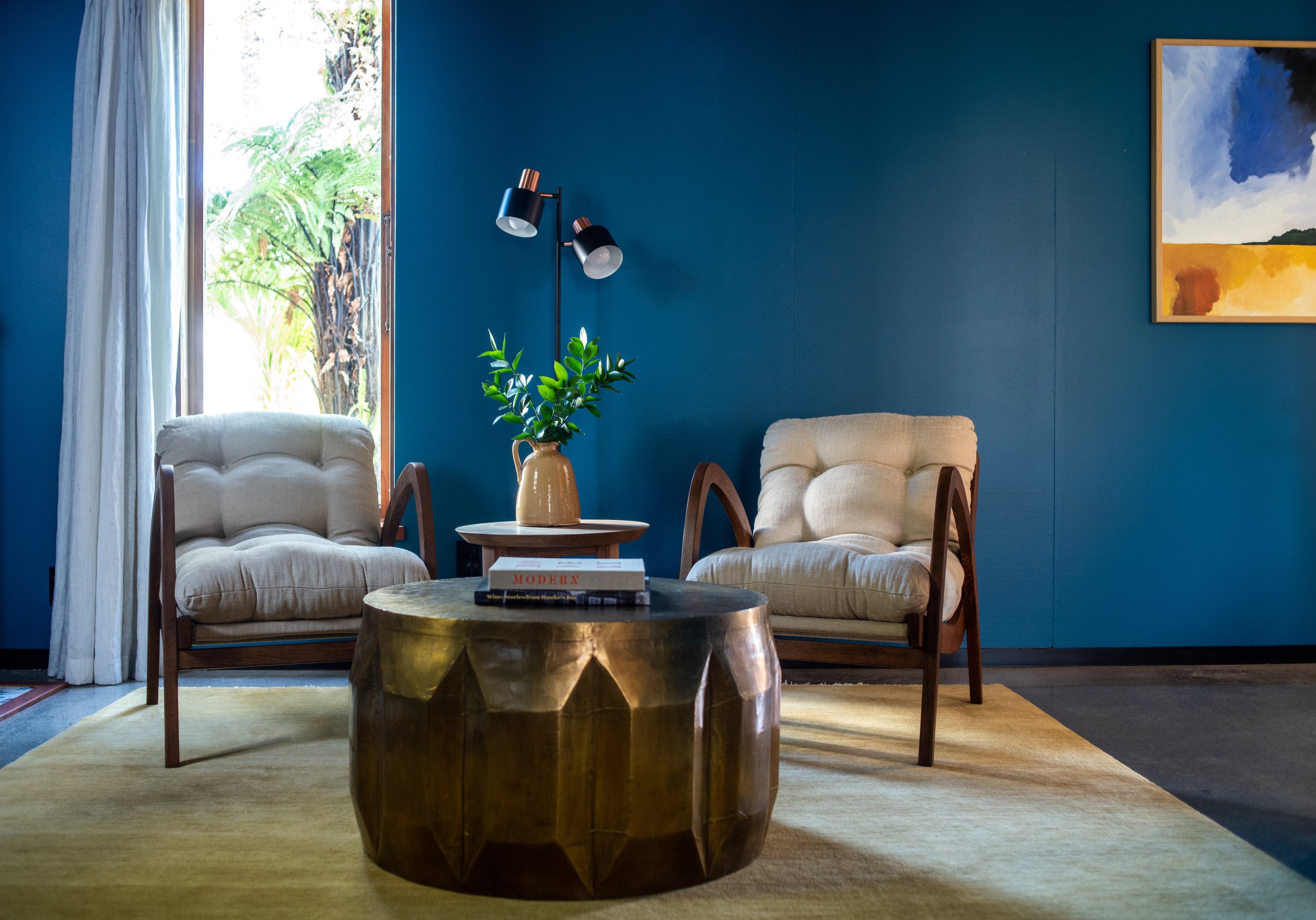
ELEVATE YOUR WALLS : :

We love to use wall paneling to elevate a room and add architectural detail in an otherwise plain room. There are lots of different styles to choose from - v-groove, box moulding, board & batten, wainscoting. The style of your home will dictate which style of panelling you choose. If you’re handy with the tools you could apply the panelling yourself, otherwise talk to your local builder or handyman.

We used a chunky box moulding in Dael’s media room (above) in her 1940’s home; and a finer, more subtle panelling for our clients’ character villa (below).

UPDATE YOUR HANDLES : :

It’s amazing what a difference an updated handle can make in your kitchen, wardrobe, dresser etc. Knobs are easy to replace as there is only one hole, but if you have a D handle measure the distance between the two centre holes and look for new handles with the same centre handle distance. This will save you having to fill holes if the new handles are a different size.

Overhead cupboards in the kitchen can sometimes look more contemporary if you take the handles off completely, fill, sand and paint them and add a push-to-open mechanism on the inside.

INVEST IN NEW LIGHTING : :

Replacing old pendants and lamp shades can change the look of a room quite dramatically. If possible add dimmers to your lights so you can create different ambience for different situations. Make sure to hang your pendants at the right height. This will be dependant on factors such as the scale of your light and the height of your ceilings. Kitchen pendants will often be hung 70-80cm above the bench, and over a dining table we’ll start with 75cm higher then your table top. Each space will be slightly different, we use our eye to get it just right, but these are good measurements to start from.

INVEST IN A RUG : :

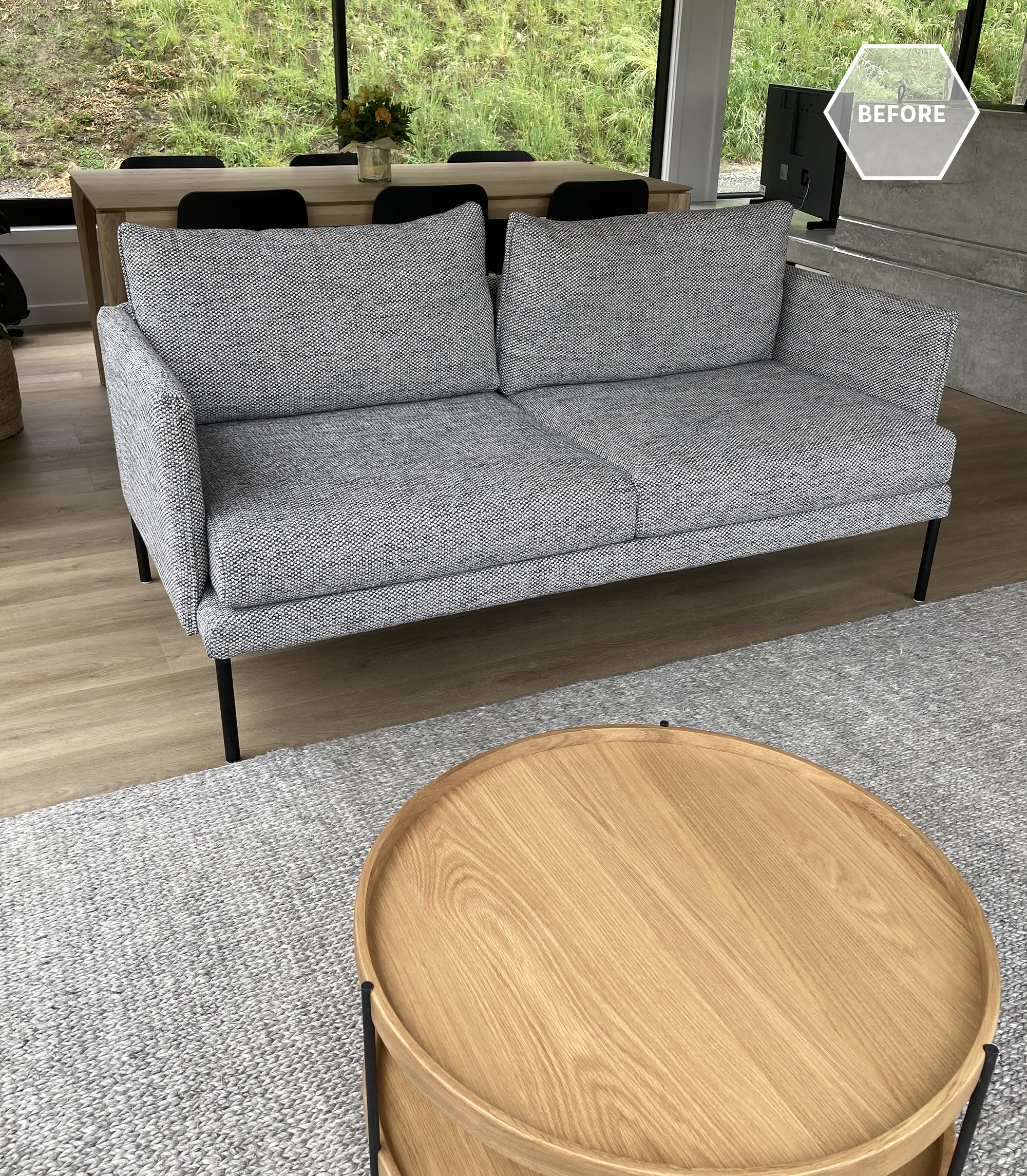
The right rug can totally transform a room, but the key is to get the right size. Don’t get a tiny rug that your coffee table fits on but nothing else. This is the quickest way to make your room look too small and cheap. The golden rule is that the front feet of all of your chairs and sofas sit on the rug. If all of the legs fit on, even better, this will make your room look really spacious.

Under your dining table the rug needs to be large enough to pull the chairs back without them falling off the rug. Yes the larger the rug, the larger the price tag, but it’s something we would recommend getting right. If a hand knotted wool rug is outside of your budget, start with a large jute rug.

I hope you found some advice that you can apply to your own home. We’d love to hear about it if you did - feel free to DM us on Instagram. And if you’d like our help with your interior design journey, whether that’s a new build, or renovation, or just sourcing new furniture, get in touch anytime.

Goldsmith | Before + Afters

We recently finished an amazing kitchen/dining room project. Despite having to deal with lockdowns, supply delays and shortages, it was a fantastic project to work on. It helped that our clients are two of the loveliest people, and we had a great team helping us create our vision.

Our clients have a beautiful architecturally designed home and the kitchen was still in pretty great condition, even after 17 years. But they were ready for a re-fresh and more storage was on the wishlist.

The original kitchen was a U-shape tucked into one end of the room with the dining table taking up a large part of the open-plan space. They have a magnificent view over Napier on the opposite side of the room and the first thing we wanted to do was to capitalise on that by spinning the kitchen around to face the view, also giving our clients a more spacious kitchen to work in.

Because we were proposing quite a radical change to the layout, it was helpful to show our clients 3D renders so they could clearly see our vision, and there was no guesswork involved. It’s also a very important part of our process as it’s a lot easier (and cheaper) to make changes to the renders rather than making physical changes once construction has started. You can see more of our renders here.

Because the kitchen was the first space you see as you enter this open plan living area we wanted the joinery to feel like built-in furniture. When the teak veneer that we wanted to use wasn’t available our joiner, Kakapo Joinery, took an oak veneer and created a series of test pieces with different stains to create the richness we were after for the back lineup. The island has a black stain and we fluted this to add subtle texture.

Because there are a lot of architectural details in the home we wanted to keep aspects of the design clean and simple so we opted for handleless, push-to-open drawers and cupboards. The large pantry required handles, though, as it has pocket doors that can be opened and pushed right in so as not to interrupt flow in the kitchen. So we asked Kakapo Joinery to create gorgeous handles from solid oak that ran the entire height of the pantry for an inconspicuous solution.

In the original design the dining room took up a lot more floor space. Our kitchen design ate into that floor space quite considerable and so required a clever solution.

The hutch dresser could go as the large new pantry and multitude of wide, deep drawers provided ample storage. We then gained valuable space by designing a dining banquette along the back two walls, flowing seamlessly onto the kitchen cabinetry. A new, custom made table could then tuck right up against the banquette.

As we progressed with the dining area we asked Robin from Kakapo Joinery to make a dummy table top to try in-situ on the base so we could get the size and scale just right. Again, it’s more cost effective to make a change to the ply ‘dummy’ top than the real oak top.

Dael (below) is trying it out for size. Note: she is sitting on a cushion to make sure she’s getting a more accurate feel for the finished design. How many cafes have you been to where the bench seating feels too high for the table? That’s because it seems to be a common mistake to make the bench the full height not taking into account the cushion or squab. We use a 100mm thick foam in our squabs, so we need to make the base of our banquettes 100mm shorter.

One of the architectural details of the home was a shelf that ran along the back of the room. When it came to our banquette design we were able to run the back support directly under this so that the shelf could still be used. The upholstery was made by the amazing team of Martin & Ivan and is a gorgeous faux leather.

Another of the home’s architectural features was a lot of angles with different levels and depths. We wanted to simplify this slightly and so the back cabinetry hides a lot of that with a bulkhead above.

We didn’t want to completely loose the subtle angle of the back wall, but we were also trying to avoid any further sharp angles. So Kakapo Joinery created a really beautiful subtle curve in the lower cabinetry, which you can see in the progress image below. In fact all of the curves in our design were introduced to contrast and soften the various angles in the architecture.

We chose to use Corian® as the benchtop material for a number of reasons. We loved the gorgeous organic swirling pattern in caramel and cream tones. It’s a great product to use on curves, and it offers nearly seamless joins.

With the focus on the kitchen being the back lineup in the warm teak-stained oak, we wanted the overhead cupboards (which include a hidden powerpack) to sit quietly. By painting them the same white as the walls they don’t demand too much attention.

The finger tiles are Japanese inspired and we love the repetition of texture and clean vertical lines.

A couple of hidden features we love in the kitchen design, along with the pantry pocket doors, are the interior of the drawers and cupboards which we made black instead of the usual white for an elevated finish. And the hidden corner cupboards on the island. Check out our Instagram Story highlights to see more.

To our clients… thank you so much for allowing us to share these photos and our journey. But most of all for being fabulous clients and trusting us even when we pushed you out of your comfort zone. We recently learnt that the feature that had most worried our client was the built-in banquette, but she trusted our design and bravely went there! Now (as we always find) the part she was most worried about is one of her favourite things. May all our future clients be as brave and trusting :)

Durham | Before + Afters

Sometimes a client will come to us for a colour consult, which then organically grows into a much bigger project. That’s what happened when we worked on this super cool home by Don Pitt Design. Our clients, Dana and Maia, with their two gorgeous kids (one who arrived mid way through this project), wanted their home to be calm and restorative. It had to be practical for their family that includes two dogs as well as the two kids, welcoming to their friends and whanau who they like to entertain, and a sanctuary to retreat to after a busy day.

Once we had selected paint colours for outside and in, Dana came to us for help choosing rugs and coffee tables for the two living areas. The existing sofa in one living area wasn’t proving very practical either, so we chose a custom sofa that would suit the style of the house and covered it in an amazing fabric with a built-in stain resistant technology. We then added custom made Bibby + Brady cushions.

We love the concrete fire surround and window ledge that Don Pitt designed. It creates a divide between the two living areas, helping to zone them, and the window ledge doubles as a place to perch. The Samsung “The Frame” TV sits nicely to the side of the fireplace, looking like a piece of art when not in use.

The oak dining table and black stained chairs have strong, clean lines with subtle design detail that complement the home

Dana and Maia had chosen the two sofas in the second living room and they still looked great, but the rug was very similar in colour, so we moved that to one of the bedrooms and replaced it with a rug that introduced a subtle pattern and contrast. We added a custom made round ottoman to nestle with the oak coffee table we’d chosen, and made some more custom cushions. We even sourced some pieces that look great but are child-friendly, as the ottoman and coffee table are at the perfect height for toddlers.

The little powder room was designed by Don Pitt, but we sourced some accessories to take it to the next level. The little in-set wooden shelf is the perfect place for a few “pretties”.

The hallway leading to the bedrooms is one of our favourite features in the home. One side of the hall has large floor to ceiling windows to let in light and give it a luxurious, spacial feel. The other side has large floor to ceiling sliding doors to each bedroom that can be left open, or closed for privacy and quiet. The doors are such a beautiful, dramatic feature - open or closed.

We had beautiful linen curtains made for the bedrooms that hung from an almost invisible track in the ceiling. In the primary bedroom they wrapped around one corner for additional texture and softness. We designed each bedroom and wanted the primary bedroom to feel extra special, creating that luxury retreat for the hard-working parents.

Dana had already chosen the duvet cover, but we elevated the room by adding the custom made headboard that we designed, along with a linen quilt, Euro pillows, a Bibby + Brady lumbar cushion, oak bedsides, elegant lamps, the oak bench seat, and a stunning piece of art by Rakai Karaitiana.

The middle bedroom needed to be flexible so that most of the time it was a child’s bedroom, but sometimes the two single beds could be pushed together to make a king bed for guests.

There’s a built-in wardrobe on one side of the room but additional drawers were needed. To keep it clean and cohesive we matched the tallboy to the bedside table, and added height to the table with a bedside lamp in mossy green. The print on the wall is another favourite by Rakai Karaitiana.

The last bedroom needed a solution for when the children were sharing the room, so we added the cutest set of bunk beds leaving room for a large bookshelf and some room to play.

We chose white wooden shutters for the narrow, high window. They look clean and smart, let plenty of light in but can also be closed up tight at bedtime.

Thank you so much Dana and Maia for allowing us to share your amazing home, and for being the coolest clients ever! You were a pleasure to work with, we know you love your home as much as we do, and we hope you have many, many happy days in it.