
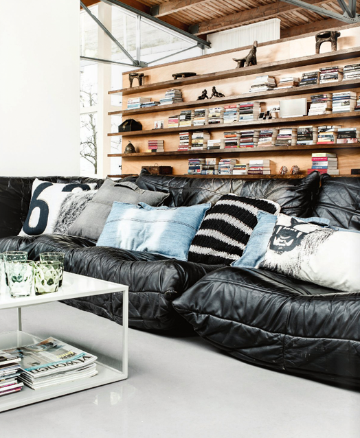
When we're working with our Bibby + Brady interior clients, there are some basic tips and tricks that we use again and again. It seems many Kiwis own black leather sofas. That's not necessarily a bad thing, but they can dominate a room with their heaviness. If that is the case, cushions and throws are your best friend.

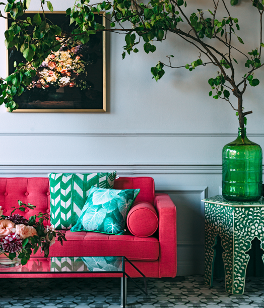
Layering throws, sheepskins and cushions will help to soften your dark sofa, as well as adding great texture.
If there was one item of furniture I would recommend you invest in and don't scrimp on, it's your sofa (and your bed). You spend a lot of time on it, so you want it to be comfy, and you want it to last. With a more expensive sofa you're paying for quality - instead of foam cushions, which will wear out more quickly, you get feather and down cushions. A cheap sofa may have a plywood frame stapled together that just won't last as long as one made from hardwood and held together with glue and dowels, or tongue-and-groove joints. Effectively you will have to replace a cheap sofa a lot quicker than a quality sofa, so my argument is that in the end you're saving money.

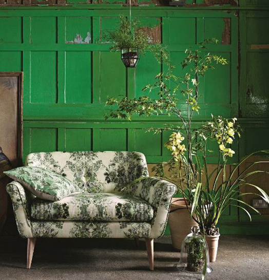
We often look to use a light neutral coloured sofa in our interiors. If you do invest in a quality sofa, a neutral colour will not date and works with so many different looks. A new selection of cushions will transform it when you're ready for a change.

But, of course, we do love our colour at Bibby + Brady. This stunning soft pink sofa with wooden buttons is a winner. It's still quite a neutral tone, adding lovely warmth, and would work in a quiet Scandi room just as well as a more colourful space. It's also available in grey if you prefer.

If you do want to be a bit more dramatic and sophisticated, you can't go past this divine blue velvet sofa with elegant brass legs. It's a darker colour, but the velvet fabric means it's softer than leather. All four of these sofas are available to purchase through us at Bibby + Brady, contact me for more details.

Another of our favourite tips is to take your curtains right up to the ceiling. It will create the illusion of height, and will add instant sophistication.

Often people will hang their curtains just above the window, but you can see from the pic below what a difference it can make hanging them as high as possible. It's an optical illusion, the window on the right looks bigger when in fact they are both the same size. As well as the height, make sure your tracks are wide enough so that when you pull the curtains back you're getting maximum light. This also makes your window look larger, and we all love natural light in our homes.


My final tip for this post has to be about vignettes - my favourite thing in the home. A good vignette will tell a story, as well as make a room look beautifully styled, lived in and loved. The most basic thing to know when you're creating a vignette is to use different heights, shapes and textures.
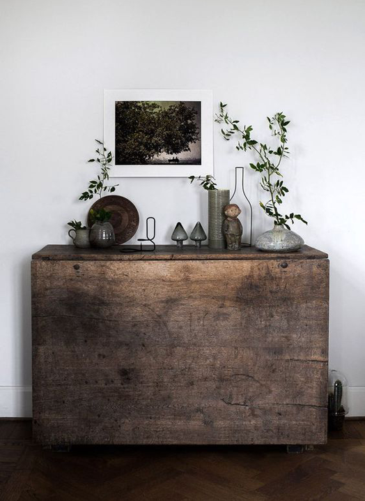
Lamps, flowers and foliage are great for adding height to your vignette. Books are brilliant for grounding smaller objects. As well as books and vases, use more unusual or quirky pieces to express your personality - a camera, a spool of cotton... whatever makes you happy.

Don't just layer from the base upwards, you should also layer from front to back to add depth. Artwork hung or propped up on the wall behind is the best way to do this. Nature always adds amazing life and texture to a display. Sometimes the most beautiful is the most simple, like some branches in a jar.

Remember the space underneath. If it's a console table you can place a basket or a small stool below it. Some side tables have a lower shelf great for a stack of books topped with a bowl or dish. I love the repetition of orange in this vignette (below), it draws your eye up and down over the entire scene.
These are just three tips to help create a stylish home, there are many more. If you want help with your home or workspace, we're here for you. You can send us photos of the area/s you want our advice and we can put together individual tips and tricks especially for you. Of course we can also help you source and purchase the perfect pieces for your home too, be it furniture, fabric, art or homewares. Drop us a line, we'd love to hear from you.
Layering throws, sheepskins and cushions will help to soften your dark sofa, as well as adding great texture.
 |
| 1 | 2 |
If there was one item of furniture I would recommend you invest in and don't scrimp on, it's your sofa (and your bed). You spend a lot of time on it, so you want it to be comfy, and you want it to last. With a more expensive sofa you're paying for quality - instead of foam cushions, which will wear out more quickly, you get feather and down cushions. A cheap sofa may have a plywood frame stapled together that just won't last as long as one made from hardwood and held together with glue and dowels, or tongue-and-groove joints. Effectively you will have to replace a cheap sofa a lot quicker than a quality sofa, so my argument is that in the end you're saving money.
We often look to use a light neutral coloured sofa in our interiors. If you do invest in a quality sofa, a neutral colour will not date and works with so many different looks. A new selection of cushions will transform it when you're ready for a change.
But, of course, we do love our colour at Bibby + Brady. This stunning soft pink sofa with wooden buttons is a winner. It's still quite a neutral tone, adding lovely warmth, and would work in a quiet Scandi room just as well as a more colourful space. It's also available in grey if you prefer.
If you do want to be a bit more dramatic and sophisticated, you can't go past this divine blue velvet sofa with elegant brass legs. It's a darker colour, but the velvet fabric means it's softer than leather. All four of these sofas are available to purchase through us at Bibby + Brady, contact me for more details.
Another of our favourite tips is to take your curtains right up to the ceiling. It will create the illusion of height, and will add instant sophistication.
Often people will hang their curtains just above the window, but you can see from the pic below what a difference it can make hanging them as high as possible. It's an optical illusion, the window on the right looks bigger when in fact they are both the same size. As well as the height, make sure your tracks are wide enough so that when you pull the curtains back you're getting maximum light. This also makes your window look larger, and we all love natural light in our homes.
 |
| 1 | 2 | 3 | 4 |
My final tip for this post has to be about vignettes - my favourite thing in the home. A good vignette will tell a story, as well as make a room look beautifully styled, lived in and loved. The most basic thing to know when you're creating a vignette is to use different heights, shapes and textures.
Lamps, flowers and foliage are great for adding height to your vignette. Books are brilliant for grounding smaller objects. As well as books and vases, use more unusual or quirky pieces to express your personality - a camera, a spool of cotton... whatever makes you happy.
Don't just layer from the base upwards, you should also layer from front to back to add depth. Artwork hung or propped up on the wall behind is the best way to do this. Nature always adds amazing life and texture to a display. Sometimes the most beautiful is the most simple, like some branches in a jar.
Remember the space underneath. If it's a console table you can place a basket or a small stool below it. Some side tables have a lower shelf great for a stack of books topped with a bowl or dish. I love the repetition of orange in this vignette (below), it draws your eye up and down over the entire scene.
 |
| 1 | 2 | 3 | 4 |
These are just three tips to help create a stylish home, there are many more. If you want help with your home or workspace, we're here for you. You can send us photos of the area/s you want our advice and we can put together individual tips and tricks especially for you. Of course we can also help you source and purchase the perfect pieces for your home too, be it furniture, fabric, art or homewares. Drop us a line, we'd love to hear from you.


