
Happy New Year everyone, I hope 2016 is off to a cracker start for you. I spent a week or so over at our family lake house and I really enjoyed the lack of wifi, and just good ole fashion 'chilling out'. But I'm back home now and really excited about what this year will bring. I have exciting plans for my home and for the growth of my business, Bibby + Brady (with Dael Brady), and look forward to sharing it all with you.

In 2016 I continue to (and will always) love white interiors layered with colour, pattern and texture. Shibori, denim and a contemporary take on tartan are favourites of mine. Zhush up your occasional chair by reupholstering the back cushion only in a gorgeous fabric.

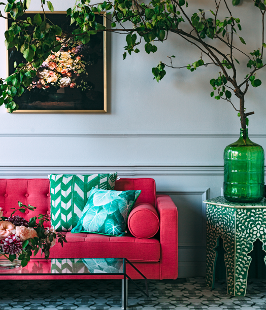
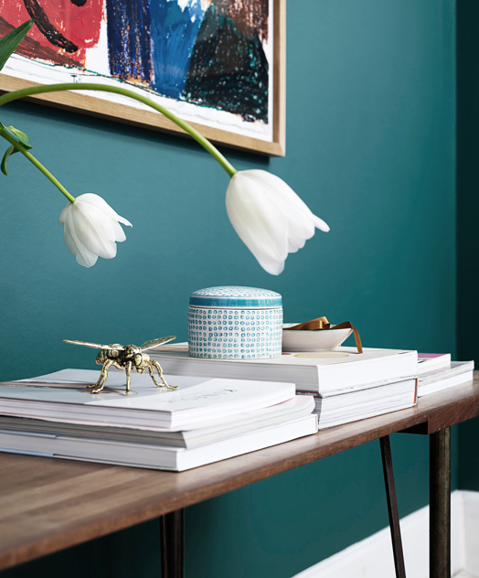
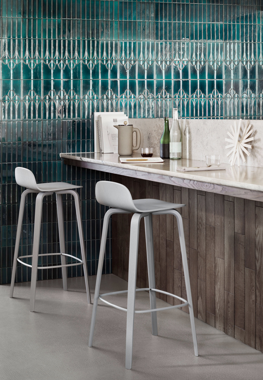
This year I will also be embracing lots of dark walls - think glamorous not gloomy. Layer on warm wood tones, peachy pinks, and shots of brass and copper. Blue is definitely the new black. We use it a lot with our clients and I hope to bring you some of our examples in the near future.


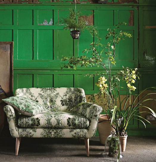
Texture will never go out of fashion and I love the use of panelling on walls to add subtle texture and interest. There are so many fabulous examples that I think I'll have to do a whole seperate blog post to showcase my faves.

Mexico, India and Morocco have the most influence on my style and they do colour so well.
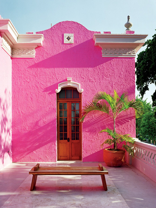

In 1956 fashion editor Diana Vreeland declared that "pink is the navy of India". I absolutely adore hot pink teamed with their slightly muddier tones of cobalt and aqua. The patina of those walls is divine!


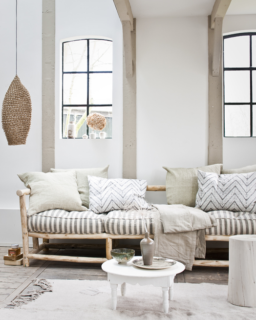
If you're not ready to embrace that kind of colour into your home, don't feel you have to go black, white or beige. Try soft grey, dusky pinks and lilacs, chalky whites and mustard.

What ever you do in 2016, make sure it's "you"! Forget fads and trends, it's all about creating the best possible home for you. Somewhere you will be happy, somewhere you look forward to returning to, a place you love.
In 2016 I continue to (and will always) love white interiors layered with colour, pattern and texture. Shibori, denim and a contemporary take on tartan are favourites of mine. Zhush up your occasional chair by reupholstering the back cushion only in a gorgeous fabric.
This year I will also be embracing lots of dark walls - think glamorous not gloomy. Layer on warm wood tones, peachy pinks, and shots of brass and copper. Blue is definitely the new black. We use it a lot with our clients and I hope to bring you some of our examples in the near future.
Texture will never go out of fashion and I love the use of panelling on walls to add subtle texture and interest. There are so many fabulous examples that I think I'll have to do a whole seperate blog post to showcase my faves.
Mexico, India and Morocco have the most influence on my style and they do colour so well.
In 1956 fashion editor Diana Vreeland declared that "pink is the navy of India". I absolutely adore hot pink teamed with their slightly muddier tones of cobalt and aqua. The patina of those walls is divine!
If you're not ready to embrace that kind of colour into your home, don't feel you have to go black, white or beige. Try soft grey, dusky pinks and lilacs, chalky whites and mustard.
What ever you do in 2016, make sure it's "you"! Forget fads and trends, it's all about creating the best possible home for you. Somewhere you will be happy, somewhere you look forward to returning to, a place you love.
 |
| 1 | 2 | 3 | 4 | 5 | 6 | 7 | 8 | 9 | 10 | 11 | 12 | 13 | 14 |


