
Last year I did a blog post on different interiors I love and why they work. I fully intended to carry these posts on as a regular feature as I thought it could be useful to you, my awesome readers, to help you style and decorate your own homes. It's taken a while to continue the theme, but today I have chosen three quite different looks with my thoughts on "why they work".
First, my all-time hands-down favourite interior designer, Anna Spiro, is a master of colour and pattern. How does she mix so many patterns and have so much happening in this vignette without it looking out of control? To start with, having the wallpaper with a small print in black & white means it doesn't fight with the bolder colours in front. Anna has pulled colours from the Otomi picture on the right and repeated them throughout the collection which unites everything. Your eye is drawn to the bright orange vase first and moves up to the Otomi print, then naturally around the setting. Some solid blocks of colour, like the blue shade, the orange vase and the butterfly background give your eye a place to pause. Each item is grouped neatly - books are perfect to use in vignettes to add height to a piece and ground it.

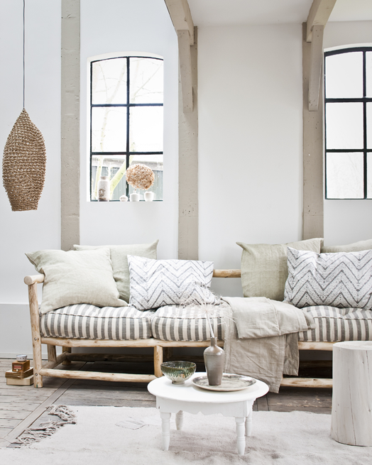
If you are more of a neutral person, to keep your space from looking bland make sure you add lots of texture. This room photographed by Jeroen van der Spek uses subtle tones of white, cream, and soft brown to add dimension. The pattern introduced in the cushions is also subtle but helps to add interest. The stripes echo the panels on the wall behind.
If you want to add a touch more colour, take a leaf out of another of my favourite designer's books. Emily Henderson favours a colour palette of blues and greens, whites and greys, and adds warmth with the natural tones of wood, leather and brass. The painting here sets the palette for the rest of the room. A large neutral rug adds texture, warmth, and anchors the furniture. The round coffee table and poufs help to soften all the straight lines of the windows, fireplace, art etc.

Look out for more "why it works" posts in the near future, and let me know if there are any specific areas you would like me to address.
First, my all-time hands-down favourite interior designer, Anna Spiro, is a master of colour and pattern. How does she mix so many patterns and have so much happening in this vignette without it looking out of control? To start with, having the wallpaper with a small print in black & white means it doesn't fight with the bolder colours in front. Anna has pulled colours from the Otomi picture on the right and repeated them throughout the collection which unites everything. Your eye is drawn to the bright orange vase first and moves up to the Otomi print, then naturally around the setting. Some solid blocks of colour, like the blue shade, the orange vase and the butterfly background give your eye a place to pause. Each item is grouped neatly - books are perfect to use in vignettes to add height to a piece and ground it.
If you are more of a neutral person, to keep your space from looking bland make sure you add lots of texture. This room photographed by Jeroen van der Spek uses subtle tones of white, cream, and soft brown to add dimension. The pattern introduced in the cushions is also subtle but helps to add interest. The stripes echo the panels on the wall behind.
If you want to add a touch more colour, take a leaf out of another of my favourite designer's books. Emily Henderson favours a colour palette of blues and greens, whites and greys, and adds warmth with the natural tones of wood, leather and brass. The painting here sets the palette for the rest of the room. A large neutral rug adds texture, warmth, and anchors the furniture. The round coffee table and poufs help to soften all the straight lines of the windows, fireplace, art etc.
Look out for more "why it works" posts in the near future, and let me know if there are any specific areas you would like me to address.


