Our very first Bibby + Brady client turned out to be a very special client for us. Angie and Ryan had just bought a new house in Tamahere when we started our interiors business last year. Although the house needed work, it was a fantastic blank canvas to start with, and the fact that Ryan is a builder was a definite bonus. Angie had followed the Cush & Nooks blog for some time, so she knew we had a similar design aesthetic. Like a lot of our clients, Angie knew what she liked, but just wanted some help to pull it all together, and to make some of those big decisions - like furniture and fabric purchases.
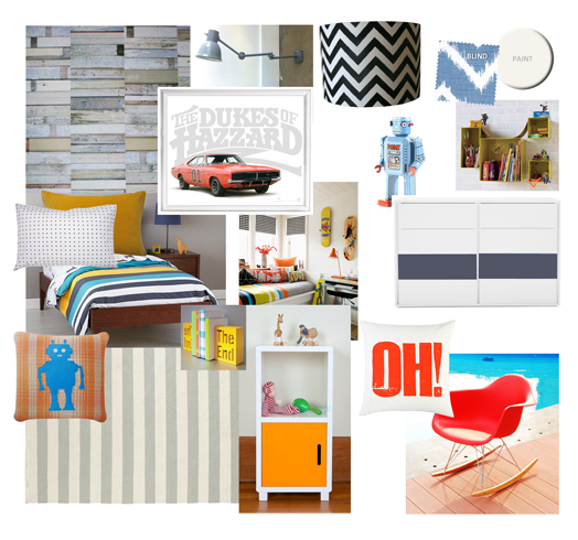
We have worked with Angie and Ryan one room at a time and they have now nearly finished the whole house. With three beautiful children, the kids' rooms were really fun to work on. The brief for their little boy's room was to make it cool and eclectic, nothing too matchy-matchy (that is an official interior design term you know!). It also needed to be a room that would grow with him - he was 4 years old when we designed the room, but Angie didn't want to have to re-do everything in a couple of years.
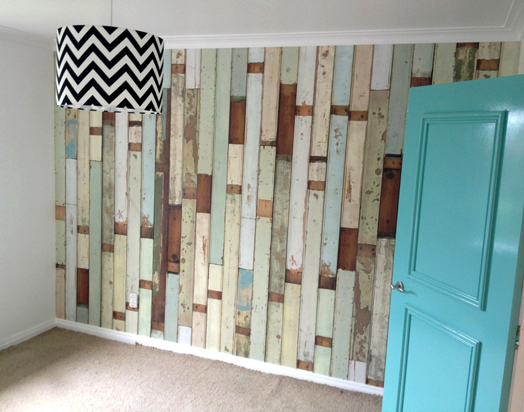
Keeping that in mind we used a cool, rustic wood wallpaper that we knew Angie loved. This will still look great when he's a teenager. We painted the outside of the kids' doors in a glossy colour. The hallway is clean and simple with white walls and black and white family photos, so the colour coded doors make a great impact - soft teal and watermelon pink.
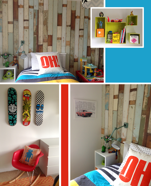
Lots of graphic accessories help to bring fun and life to the room. We suggested customising a set of Ikea drawers by painting two of the drawers dark blue, linking to the striped duvet. A 'Dukes of Hazard' print on the wall was our starting point, as it's very similar to the little boy's favourite toy car.
Feel free to get in touch with either Dael or I if you want to know about anything in the room, or if you'd like our help with your home or business.
We have worked with Angie and Ryan one room at a time and they have now nearly finished the whole house. With three beautiful children, the kids' rooms were really fun to work on. The brief for their little boy's room was to make it cool and eclectic, nothing too matchy-matchy (that is an official interior design term you know!). It also needed to be a room that would grow with him - he was 4 years old when we designed the room, but Angie didn't want to have to re-do everything in a couple of years.
Keeping that in mind we used a cool, rustic wood wallpaper that we knew Angie loved. This will still look great when he's a teenager. We painted the outside of the kids' doors in a glossy colour. The hallway is clean and simple with white walls and black and white family photos, so the colour coded doors make a great impact - soft teal and watermelon pink.
 |
| wallpaper up, light in, door painted (carpet yet to be replaced at this point) |
Lots of graphic accessories help to bring fun and life to the room. We suggested customising a set of Ikea drawers by painting two of the drawers dark blue, linking to the striped duvet. A 'Dukes of Hazard' print on the wall was our starting point, as it's very similar to the little boy's favourite toy car.
 |
| apologies for slightly dodgy photos snapped on my iPhone |
Feel free to get in touch with either Dael or I if you want to know about anything in the room, or if you'd like our help with your home or business.

