Dael & I are currently working with a fabulous Bibby + Brady client up in Auckland. Because we're based in Napier, all of our contact is by email and phone. Steph sent us photos and measurements of her living room - the space she wanted us to help her with - and Dael has had lots of conversations with her, before and after we presented our design concept.
The room is a big space with lots of doors and windows, making it quite a tricky layout. As a lot of people do, Steph and her husband, Richard, had most of their furniture pushed to the edge of the room against the wall. The vintage Eames lounge chair and stool were a keeper, as were the two chandeliers, but they were happy to part with other pieces of furniture.
We recommended keeping the wooden dresser and the small Chinese cabinet, but a new sofa, chair, coffee table and rug were a must. The pink carpet has to stay for now, but the massive wooden batten ceiling was dominating the space. So the first thing we told Steph and Richard to do was freshen the walls with a soft white, and paint the ceiling.
Some people are reluctant to paint out wood, and I definitely love the warmth and texture it brings, but those ceilings were weighing the room down. Steph was so brave, and totally open to our suggestions - she and Richard worked tirelessly to get it done. You can see from the progress photo below how amazing it looks already - light, airy and fresh - and how the lights now become the feature.
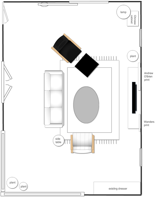
In our floor plan you can see we've moved the furniture into the room, creating a cosy seating area anchored by a large rug. The family watch TV in this room, so we chose a stunning new entertainment unit, and we suggested a picture wall behind it to disguise the TV when not in use. There's good flow through the two doors into the living room, and windows are left unencumbered to take advantage of the light and views. The old lamp base remains but with a new shade, and the dresser and cabinet can be used for little vignettes.
We chose our ultimate sofa and chair, but knew they would be 'splurge' items, so also added a 'save' option to Steph's board. Steph was not afraid to be bold but wanted to keep the character of the house. She loves Mid Century furniture, plants, pattern, and her favourite colours are grey, blue and teal. Like me, she's a fan of Andrew O'Brien's art and her favourite piece of his makes a real statement.
Steph and Richard are working hard to put our look together, and as soon as they do I'll show you 'after' photos. The hardest part of working with e-design client's is not being there to help with this stage, but we have faith that they'll do a great job, and we help in whatever other way we can. If you have a space that you'd like Dael and I to breathe new life into, please get in touch with us.


