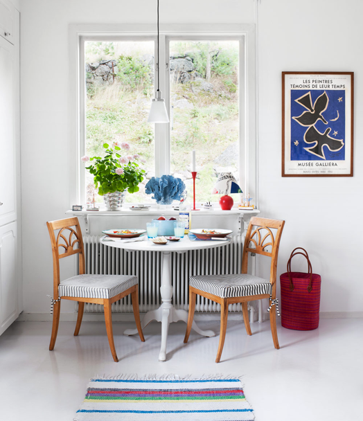
I don't normally blog in the weekend but I had this home tour ready to post yesterday before the day got away on me. It's such a beautiful home, my kind of aesthetic with white walls and layers of colour and pattern. When mixing patterns it's good to vary the size of the pattern - the ticking striped chairs work well with the large paisley table cloth. The wooden chairs bring warmth and balance the blue and white colour scheme.
Artwork is kept simple which, along with the white walls and soft grey floor boards, balances the busyness of the patterned furniture.
A little table setting provides the perfect spot for breakfast, or coffee with a friend. Dael & I often include a similar setting in our Bibby + Brady projects. Whether it's a small dining table like this, or a pair of armchairs with a side table, it's nice to create another space (other than the main living and dining rooms) to relax.
Little groupings like this one in the kitchen is what gives a home it's soul. It's handy to have some things close at hand when cooking, and they if they look fab you can leave them out on display.
The hallway is not exempt from the home's signature look - a splash of pattern with simple, graphic artwork.
Wicker chairs and an umbrella provide another gathering spot on the balcony.
Although the colour and pattern used throughout the home is bright and busy, it works because the palette of red, blue and green is consistent, and the neutral base provides your eye with a place to rest. I love it!


