You've probably all seen the Pantone colours for 2016 - for the first time it's a blend of two shades, rose quartz and serenity. The soft tones are restful and calm, just what we need in our ever-increasing busy lives. Rose quartz is a persuasive yet gentle tone that conveys compassion and a sense of composure. Serenity is weightless and airy, like the expanse of the blue sky above us, bringing feelings of respite and relaxation even in turbulent times.
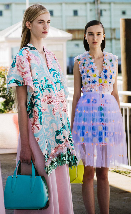
I love the idea of introducing these colours into your wardrobe for a feminine hit. Mix some darker tones in for a bit of depth, as you would if you were highlighting your hair. One overall tone could be a bit boring.
In your home layer the softer tones with warm wood, leather and copper, or a hit of black and white for a more Scandi look.
If you're not much of a pastel lover here are a few other colours I think would look incredible. Maybe 2016 is your year to be bold and step outside the box. I predict that blue will remain popular. Think the azure blues of Morocco and Greece, beautiful cobalt French blues, and the fresh combo of navy and white.
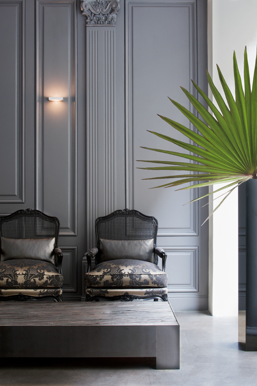
How about grey with a hint of purple for a really sophisticated feel. Look out for more panelling, which I love. It adds subtle texture and is super classy.
Emerald green brings the outside in and looks gorgeous with other jewel tones such as turquoise, sapphire and citrine.
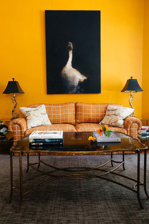
Or why not be really brave and embrace a delicious golden yellow?! It adds so much warmth and energy.
If you need any help with colour in your home, be it paint colours, fabric, or artwork, contact Dael or I. Colour is something we're passionate about and we have a number of tried and tested paint colours and favourite fabrics that we'd love to advise you on.
I love the idea of introducing these colours into your wardrobe for a feminine hit. Mix some darker tones in for a bit of depth, as you would if you were highlighting your hair. One overall tone could be a bit boring.
In your home layer the softer tones with warm wood, leather and copper, or a hit of black and white for a more Scandi look.
If you're not much of a pastel lover here are a few other colours I think would look incredible. Maybe 2016 is your year to be bold and step outside the box. I predict that blue will remain popular. Think the azure blues of Morocco and Greece, beautiful cobalt French blues, and the fresh combo of navy and white.
How about grey with a hint of purple for a really sophisticated feel. Look out for more panelling, which I love. It adds subtle texture and is super classy.
Emerald green brings the outside in and looks gorgeous with other jewel tones such as turquoise, sapphire and citrine.
Or why not be really brave and embrace a delicious golden yellow?! It adds so much warmth and energy.
 |
| 1 | 2 | 3 | 4 | 5 | 6 | 7 | 8 | 9 |
If you need any help with colour in your home, be it paint colours, fabric, or artwork, contact Dael or I. Colour is something we're passionate about and we have a number of tried and tested paint colours and favourite fabrics that we'd love to advise you on.


