Te Awanga Home Design

October was an exciting month for us with the home of one of our long-time clients being photographed for the latest NZ House & Garden magazine. We worked with these clients over a three year period. The first year was dedicated to Chambourcin Cottage, and the next two we slowly moved through their main home, room by room creating a cohesive look. The cottage and the main house are only metres apart.

Both houses were architecturally designed by Steve McGavock, who was the protégé of renowned architect, John Scott. It’s a really special property with a lot of the trademark features found in a John Scott home - high vaulted ceilings, large pivot doors with rimu knob handles, rimu architraves and trims. Set on its own vineyard, the main house is designed so that all of the bedrooms, the living and dining rooms overlook it. There are two wings with the master bedroom, ensuite and ‘snug’ at one end; the office, guest bedroom and bathroom at the other; and the kitchen, laundry, living and dining in the middle.

We used Resene Merino on the exterior of the home to tie in with the cottage opposite. Merino is a light and versatile off-white, and we wanted a freshness without it being too glary. We looked at several different colours for the front door. It was initially painted hot pink, but after much deliberation it was re-painted a golden mustard. We had the outdoor rug custom made to fit the front porch.

Before1.jpg

All of the windows had the original rimu curtain tracks and we wanted to keep these beautiful details. But we did replace the curtains throughout with beautiful soft linen from James Dunlop. The inside entrance rug was also custom made to fit the space. Every room has it’s own rug, all Armadillo&Co from our friends at The Ivy House.

Before2.jpg

It really was a blank canvas for us when we first began this project. We had already explored a lot of the design choices for the base of the house when we designed the cottage. The main living area walls were painted Resene Half Merino, and the dark brown beams painted a sharp black. All the carpet was ripped up and the concrete floors beneath polished.

We commissioned local artist, Billie Culy, to create the stunning artwork in the living room. Billie worked closely with us and our client, Kim, using a colour palette we supplied her with to fit perfectly into the space. We had chosen a Billie Culy piece for the cottage, so it was nice to have that connection between the two houses. The large orange and white rug was also custom made by The Ivy House, and its job was to zone the living area and anchor the furniture.

Before3.jpg

We custom made the window seat squabs and all of the cushions. Every furniture piece was carefully chosen to suit the style of the home, including the vintage Ole Wanscher rocking chair from Mr Bigglesworthy, which we recovered in a mustard wool.

A ladder against the back living room wall leads you up to a cute little loft area which looks down over the living and dining rooms and out to the vineyard. We chose a smart navy blue for the cupboard door and Bruce, our client, painted this along with all of the walls and beams.

Before5.jpg
Before4.jpg

We had a sofa custom made in soft grey linen to fit the space, and added some simple furniture pieces to turn the loft into a place to escape with a good book or a glass of wine (although not too many, as you have to navigate the ladder on the way down).

The loft overlooks the dining room. The linen curtains we had made are so gorgeous. We kept them really simple to work with the clean lines of the architecture, and so as not to distract from the views. The vaulted ceilings meant they had to be a super long drop and they hang off the original rimu tracks.

The dining room also has spectacular views over the vineyards and out to the hills beyond.

Before6.jpg

Because the living and dining rooms are open plan we helped to zone the dining area with a stunning big David Trubridge light above, and a luxurious hand woven midnight blue rug anchors the table. When using a rug under a dining table you need to make sure it’s large enough to pull the chairs out whilst still remaining on the rug.

Before7.jpg

After much deliberation our clients opted to keep the kitchen as it is - the rimu cabinetry is synonymous with the John Scott style. We added some lighter chairs around the breakfast bar. The artwork (below) opposite the dining table is part of a triptych that we had commissioned by textile artist, Jane Denton. We chose a Jane Denton piece for the clients’ cottage, and Kim loved it so much we knew we wanted to incorporate her work into the main house too.

The fireplace in the living room was removed quite early on and made the flow through to the end of the house so much better.

Before8.jpg
Before12.jpg

A beautiful large pivot door separates the living room from the ‘snug’ and master bedroom. The deep teal we chose for the walls of the snug allows the door to stand out, and looks amazing behind the painting we bought from Amber Armitage.

Before9.jpg

With a lot of different textures combined in the fireplace, we decided to simplify it by plastering over the red bricks at the base and painting them black so the fire disappeared into it. We then added a feature tile on the hearth and framed it with rimu.

Before10.jpg

The ‘snug’ is the room that gets the least amount of natural light, and our clients use it to read or watch TV in the evenings. Rather than trying to lighten the room, which can often look a bit flat, we opted to paint the walls a rich, dark teal. A large, plush mustard rug compliments the blue walls and adds cosiness.

We added new linen curtains, a pair of super comfy and stylish armchairs from Hutchinsons, and an antique brass coffee table from Soren Liv. The side table was custom made by WRW & Co. along with a small TV unit (not pictured).

On the adjacent wall we placed a beautiful brass bar cart under our clients print to help ground it.

Before11.jpg

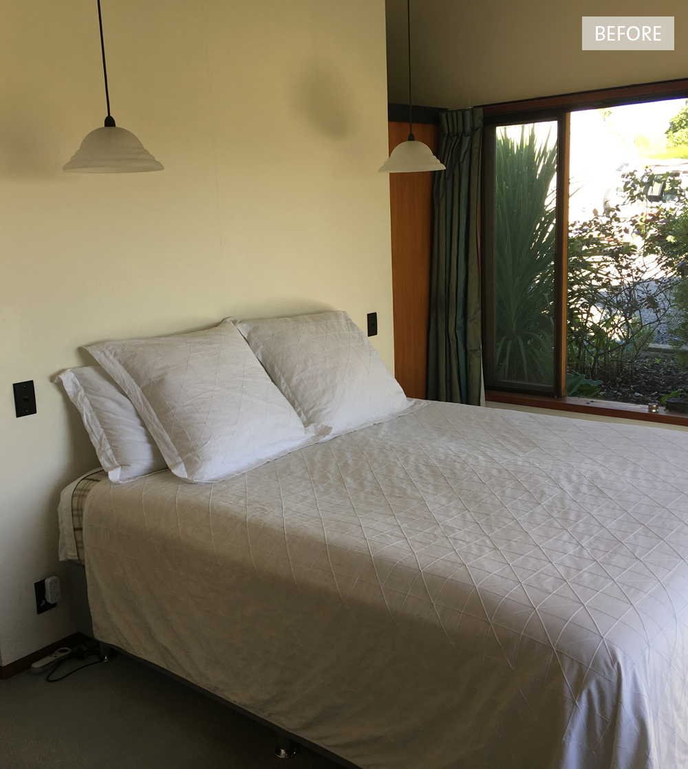
Tucked behind the ‘snug’ and to the side of the living room is the master bedroom, which has ‘his and her’ wardrobes behind the bed. We put a green and white wallpaper on the back wall to reflect the views outside the windows, and brought some warmth in with amber bedside pendants and cinnamon coloured linen from Thread Design. The bedspread is from Seneca, and the custom made cushion pulls all the colours together.

The other wing of the house consists of this small bedroom (below) which we turned into an office, as well as a guest room and guest bathroom. We re-carpeted both of the bedrooms and the office, but still added rugs to each for extra luxury.

Before13.jpg

We painted the walls in the office and guest bedroom a soft and peaceful duck egg blue. We love it here teamed with one of our favourite pink sofas, custom made cushions, and a map of Maine (where Kim is originally from). The touch of black in the lamp and side tables adds a bit of weight and links to the black beams.

photo: Florence Charvin

Before14.jpg

The guest bedroom has new linen curtains like the rest of the house, new bedside tables, a rug, and beautiful new bedding. Other touches are the pottery wall light and pendant we designed, and bench seat (not pictured).

It’s been quite the adventure, and a real pleasure working with Kim and Bruce on their amazing home and their cottage. She really is a very special property and we will miss her! Make sure you check out our blog post about the journey we took with Chambourcin Cottage.

All photos (other than ‘before’ photos) taken by Florence Charvin for the November 2018 issue of NZ House & Garden. With thanks x

Chambourcin Cottage | Boutique Accommodation

2016 has been a brilliant year for Bibby + Brady, and one of the highlights for us has been working with our awesome clients, Kim Brann and Bruce Polderman, on their Te Awanga cottage. Designed and built in 1978 by Hawke's Bay architect, Steve McGavock, it's vaulted ceilings and use of native timber were inspired by renowned New Zealand architect, John Scott.

When we first visited the cottage in April this year we were excited about the potential. The bones were there, and the architectural details were fantastic, but everything was a little tired and it was in definite need of attention. Kim and Bruce had been living in the main house (which is a larger version of the cottage) for several months, and needed our help with paint colour and flooring, as well as what to do with the beams and lighting. The decision was made to start with the cottage. Initially, once renovated, the plan was to rent it out long term, but within the first few weeks it was decided to turn it into boutique accommodation - the perfect couple's retreat, "Chambourcin Cottage".

The first decision we had to make was what to do with the beams. It was quite dark in the cottage on our first visit (mainly due to some of the windows being covered) and the beams felt a bit heavy overhead, so our first instinct was to paint them white and make them disappear. But upon reflection we realised every detail of the architecture was well thought out and the beams were an important part of the design. All of the light and electrical switches were black, as were the negative skirting boards and architraves.

The beams were a dark brown that didn't look like a natural wood colour, so we wanted them to be painted black and the ceiling in Resene Quarter Merino for a crisp contrast. We chose Resene Eighth Lemongrass for the walls of the living room. The soft, peaceful colour with a hint of green complimented the black and white, and because the neutral tone had a touch of colour it helped move and bounce light around the room.

Kim and Bruce hired their own painters and builders who did a fantastic job. Painting the beams was a fiddly job, but the finish is excellent. The old joinery was replaced with new matt black joinery, and the woodwork was brought back to life. We wanted to keep the window treatments simple and unfussy, using white curtains and blinds with matt black accessories (curtains rods and cleats).

When it came to choosing furniture and accessories for the cottage we wanted to create a beautiful retreat with comfort in mind. The scale was important in the small cottage, so although the sofa is large and solid (and super comfy), choosing it in a colour similar to the wall means it takes up less visual space. Accents of velvet and brass introduce a touch of elegance. At the time of these photos the cottage was about 90% finished - this dining table is a stand-in as the brass and marble table we chose won't be ready until early next year; and a few finishing touches like art are still to arrive.

The flooring was old and varied throughout the cottage so we chose to use carpet in the bedroom only. Everywhere else features polished concrete which is both beautiful and practical. David Trubridge pendants in the living room and bedroom suit the style of the house and look amazing. We hung my own Billie Culy print for the photoshoot and we loved it in the space, although it was a little small, so we ordered a much larger one to take it's place.

The bedroom is a really great space. A queen size bed fits snuggly on one side with room for a chair in one corner, and another small wing fits a large wardrobe, a small desk and a loft above.

We painted the bedroom area the same Resene Eighth Lemongrass as the living room, and the beams and ceiling also got the same treatment. We commissioned Francois Guittenit of Le Workshop to make the floating bedside cabinets for us. As the space around the bed was tight, we didn't want heavy bedside tables taking up precious floorspace. They have an airy feeling and work perfectly. Bedside lamps are still to come and our upholsterer, Asha Payton of Little & Fox, is making us an upholstered bedhead.

In the corner adjacent to the bed the beautiful velvet arm chair echoes one we put in the living room. It sits below an artwork by Jane Denton which we love. The simplicity of this piece works really well with the mid century style of the cottage. Beyond is a little courtyard to sit and enjoy a coffee and the spectacular view in the morning, or a glass of wine in the evening.

I love the wardrobe and desk area of the bedroom. Kim and Bruce's builder Lee Tiedemann of Russell Knox Builders did an amazing job putting new doors on the wardrobe and installing the brass inset handles we chose. He also built the shelves to the left of the wardrobe.

I designed a screen for the side of the loft inspired by mid century breeze blocks, and Lee finished it off beautifully with a timber edge. Francois built the loft ladder and the little desk. Beautiful new wool carpet by Cavalier Bremworth was laid in the entire bedroom area.

The original kitchen cabinetry was still in pretty good shape so it was given a new lick of paint and Lee added a wooden chopping board at the far left of the bench and a wooden surround to disguise the range hood.

Kim and Bruce wanted additional storage in the kitchen and a small table and chairs. Because of the tiny space Francois came up with the idea of building a unit that wrapped around one side of the kitchen. This not only gave them cupboards and shelves for storage, but also additional bench space and a breakfast bar overlooking the vineyard. It's the perfect use of the small space.

A small shelf was added above the stainless steel bench and we replaced all of the fluorescent lights throughout the cottage with copper tubular lights. We sourced a beautiful stoneware dinner set and accessories, and gorgeous hand blown glassware. All these details add to the experience for the lucky couples who choose to stay at Chambourcin Cottage.

On the other side of the kitchen is the front entrance and a hallway that runs down past the toilet and bathroom to the back door. When we started this project there were three different kinds of flooring from the back door through to the living room. Now it looks really smart with polished concrete flooring the entire length, softened by the occasional rug.

We designed a floating vanity similar in style to our bedside cabinets and Francois built and installed it in the hallway by the back entrance. Once again we wanted it to be floating to create a sense of airiness and space, and the large mirror above it reflects light around.

Opposite the vanity is the tiny bathroom. Although it caused a few heads to be scratched with things that cropped up along the way, we're really proud of this space as it's so awesome! We chose a small hexagon tile and the entire room is tiled from floor to ceiling. Matt black accessories pay homage to the original design details, and to add warmth we introduced accents of wood, brass and leather.

The outside of the cottage has come along way since we took this first photo (below) in April. We carried on the black and white colour scheme from inside, and worked with our favourite garden designer, Yo Kjestrup of Yo Designs, on the garden at the front. We wanted to create a garden with clean lines in keeping with the mid century style, and Kim and Bruce also wanted to direct people down past the French doors to the main entrance just beyond. Yo came up with a clever design using dark stained planter boxes to stop people from automatically entering through the French doors while also creating another private patio space.

We are so delighted with this little cottage, and Dael and I both love it so much we were ready to move in ourselves, as was our photographer Florence when she visited to take the photos. If you're looking for somewhere to get away for a relaxing and romantic break, I can't speak highly enough of Chambourcin Cottage in Te Awanga, Hawke's Bay. The views are spectacular over the boutique vineyard, Heretaunga Plains, and the Kaweka and Huiarau Ranges beyond, it really is a special place! Your hosts, Kim and Bruce, are the loveliest people and will be able to advise you on all the amazing things there are to offer around their beautiful coastal region. Tell them we sent you ;)

Click here to read more about this project and to see 'before' images.

Messervy House For Sale

Matt and Kate Arnold discovered the Messervy House whilst on a walk down a quiet cul-de-sac in their hometown of Christchurch. After talking to it's owner, they learnt that it had been designed for her family in 1964 by architect Allan Mitchener, and she'd lived happily in it ever since. Matt and Kate kept in touch with Biddy Messervy, and when the time came for her to move out, they bought the house off her.


As only the second owners, Matt and Kate spent last year restoring Messervy House back to her former glory. They painted inside and out in the original colours, replaced the cork flooring and cracked windows, had new linen curtains made, re-wallpapered, and replaced the kitchen benchtop. Everything was carried out with the intention of maintaining the original design of the house, and using the original materials where possible.


Now that she's finished, Messervy House is on the market, and it's very important to Matt and Kate that her new owners are design enthusiasts who will fully appreciate her. Not only the highly imaginative design, but also the effort that has gone into her restoration. The house has a stream at the back with a footbridge connecting to Ilam fields and gardens, and it's a nice walk across the park to the University of Canterbury.


For more information about the house and how you can view and/or buy it, click here. I asked Matt a few questions about the restoration process, read on for his answers.


What was the biggest obstacle you had to overcome?
Finding cork tiles. We hit a national shortage, nobody had them. Kate called almost every Bunnings in New Zealand and sniffed out anybody who had cork tiles stashed away. We scrounged together just enough by buying them in small packets from all over the country. We almost went down the route of parquet floors, but finally got the cork.


Tell me more about the wallpaper you used?
The house originally had wallpaper, which is slightly unusual for a modernist house, but it seemed to work. The old wallpaper was done for, it was torn, faded and stained, but finding a replacement was surprisingly difficult. Have you ever shopped for wallpaper? It's bewildering. We finally settled on a seagrass, but at the last minute we spotted the green arches designed by Claesson Koivisto Rune (architects we really admire) and we were away.


Do you have any advice to help people find the right architect or draftsman for their project?
Go straight to Michael O'Sullivan.


You've done such a fantastic job with this home, will you be taking on another restoration or renovation in the future?
I think we will. There are lots of these wonderful little houses in and around Christchurch designed in the 50s and 60s that are perhaps a little bit under-appreciated. And when they're made of concrete, like this one, they don't rot or leak, and all you need is some white paint and enthusiasm. I think with these types of places, the less you do the better, really.


photography: Sam Hartnett


I wish you luck Matt and Kate, and to all my readers... if you are interested in buying this beautiful home, or know someone who might be, get cracking! I have a feeling it may be snapped up quickly.