I know I'm a bit behind the 8 ball when it comes to this revamp on a well known clothing store in Auckland, but when I came across it recently I knew I wanted to blog about it - not only to share it with those of you who haven't seen it either, but also to have it in my archives for easy future access. I just love it!
Glassons is a New Zealand fashion chain store. It's priced to be accessible to all women,
but it's marketing has always been pretty slick. Not all the stores look as cool as this one in Auckland's Queen Street, however. The team responsible for the revamp is Studio Gascoigne, a multi-talented group who work across architecture, interior design, branding and identity.
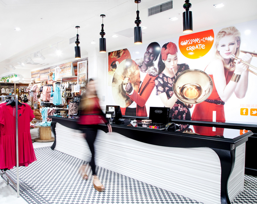
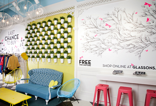
The 57m long shop features a series of different zones or 'rooms' that enable the customer to experience the spaces as if they're walking through a villa. At the front is the spacious salon, the library is in the centre, and towards the rear is the conservatory complete with a 'green' wall of pot plants and a sky blue ceiling. A central catwalk and tall glass pivot doors lead to a luxurious fitting room.
Unashamedly girly, the shop features button-backed sofas, balloons and a giant unicorn.
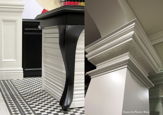
The architectural details are gorgeous - beautiful ceiling roses and ornate Victorian verandah fretwork. Teamed with contemporary lighting and mounted animal heads the shop is fun and quirky with the element of surprise to make you smile.
Closing the gap between the on-line and off-line shopping experience, a designated web lounge consists of interactive built-in iPad stations and free Wi-Fi. It's easy to see why this is an award-winning space. To me, retail shopping is not just about the products, it's the experience. Creating an atmosphere that draws people in, delights them, and makes them want to come back. Studio Gascoigne have definitely achieved that, don't you think?!
but it's marketing has always been pretty slick. Not all the stores look as cool as this one in Auckland's Queen Street, however. The team responsible for the revamp is Studio Gascoigne, a multi-talented group who work across architecture, interior design, branding and identity.
Unashamedly girly, the shop features button-backed sofas, balloons and a giant unicorn.
The architectural details are gorgeous - beautiful ceiling roses and ornate Victorian verandah fretwork. Teamed with contemporary lighting and mounted animal heads the shop is fun and quirky with the element of surprise to make you smile.
Closing the gap between the on-line and off-line shopping experience, a designated web lounge consists of interactive built-in iPad stations and free Wi-Fi. It's easy to see why this is an award-winning space. To me, retail shopping is not just about the products, it's the experience. Creating an atmosphere that draws people in, delights them, and makes them want to come back. Studio Gascoigne have definitely achieved that, don't you think?!


