Architectural + INTERIOR Inspiration | High House

I recently came across 'High House', a major home renovation by Dan Gayfer Design, and was so inspired that I knew I had to share it with you. Located in Fitzroy North in Melbourne, the homeowners were determined to have their inner city lifestyle without compromising on the size they needed for their young family. From the street the house sits quietly amongst it's neighbours, but the inside and back of the house has been turned into a modern and functional home with a spacious, airy feel.

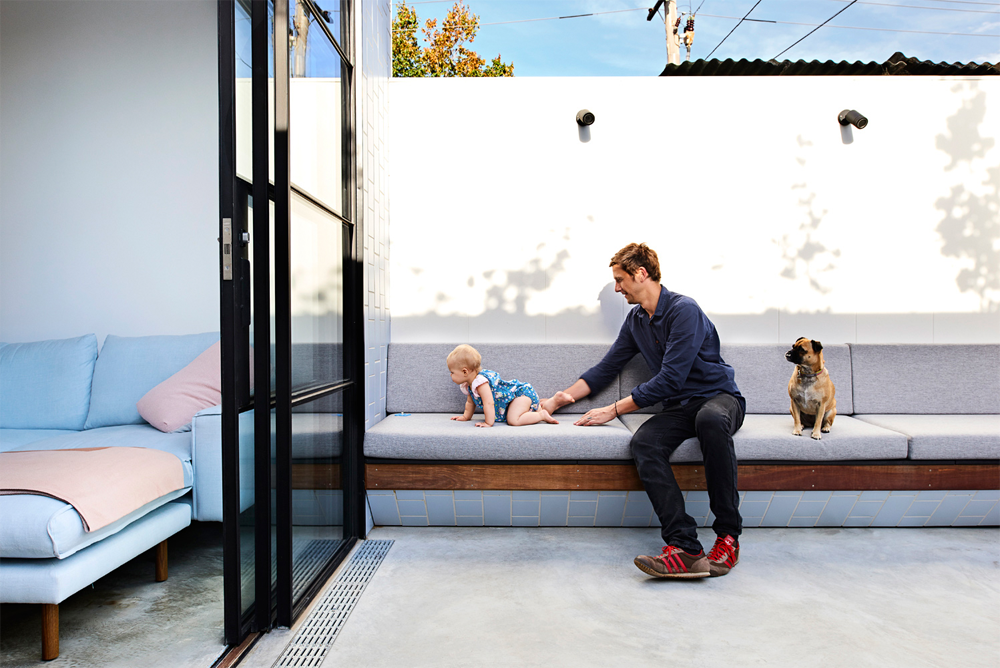
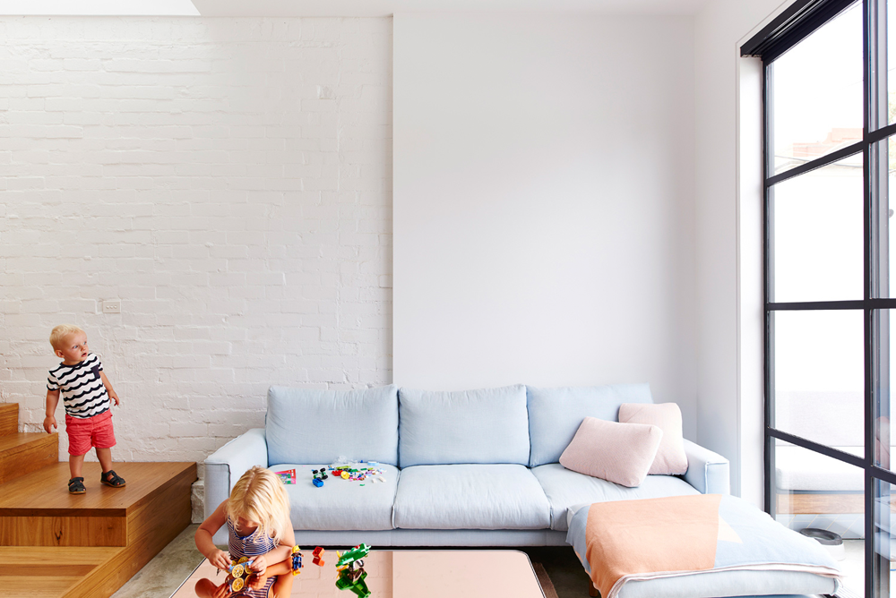
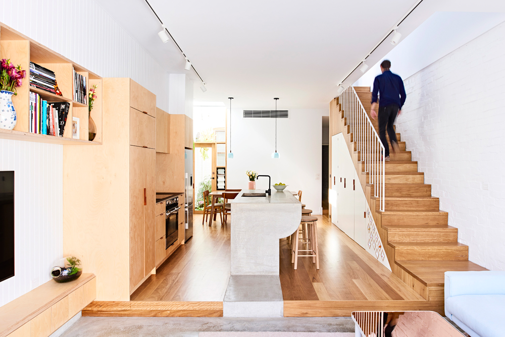
The house is a mere five metres wide but the clever use of built-in furniture helps to maximise the space and it's functionality. The clean lines and the simple colour palette also add to the sense of cohesion and simplicity. I love how the height of the sofa is mirrored by the outdoor bench seat. Also, take note of the powder blue tiles featured on the base of the outdoor bench and the outside back wall, as they are repeated in the downstairs bathroom creating a visual link.

Perhaps my favourite feature is the concrete bench top and how it runs down between the wooden floorboards to the concrete floor beyond. The tiles used in the splash back and under the island bench 'speak to' the tiles used in the two bathrooms and outdoor spaces.

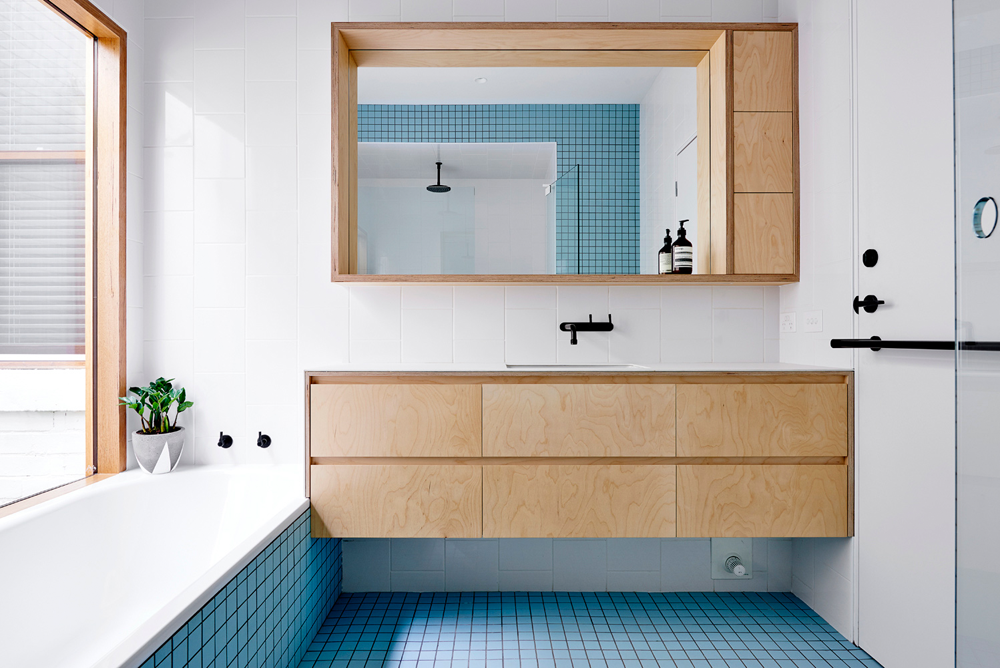
In both bathrooms the built-in cabinetry is kept very simple allowing the coloured tiles to be the hero. The matt black fixtures complete the look and compliment the dark grout.

Some of the cutest house models ever!

Purple velvet is an unexpected touch, and I love subtle surprises like that.

Although I have huge admiration for the design of this home, I would love to see a piece of art above the bed or a headboard in a soft linen or velvet. But I'm crazy about those bedside lights with their pink base that pulls your eye through to the ensuite.

Those gorgeous tiles are repeated on the bedroom balcony, as the blue ones were downstairs.

Each space and every detail is so well thought out, I think this home is super special! To see more work by Dan Gayfer Design head to their website.

Messervy House For Sale

Matt and Kate Arnold discovered the Messervy House whilst on a walk down a quiet cul-de-sac in their hometown of Christchurch. After talking to it's owner, they learnt that it had been designed for her family in 1964 by architect Allan Mitchener, and she'd lived happily in it ever since. Matt and Kate kept in touch with Biddy Messervy, and when the time came for her to move out, they bought the house off her.


As only the second owners, Matt and Kate spent last year restoring Messervy House back to her former glory. They painted inside and out in the original colours, replaced the cork flooring and cracked windows, had new linen curtains made, re-wallpapered, and replaced the kitchen benchtop. Everything was carried out with the intention of maintaining the original design of the house, and using the original materials where possible.


Now that she's finished, Messervy House is on the market, and it's very important to Matt and Kate that her new owners are design enthusiasts who will fully appreciate her. Not only the highly imaginative design, but also the effort that has gone into her restoration. The house has a stream at the back with a footbridge connecting to Ilam fields and gardens, and it's a nice walk across the park to the University of Canterbury.


For more information about the house and how you can view and/or buy it, click here. I asked Matt a few questions about the restoration process, read on for his answers.


What was the biggest obstacle you had to overcome?
Finding cork tiles. We hit a national shortage, nobody had them. Kate called almost every Bunnings in New Zealand and sniffed out anybody who had cork tiles stashed away. We scrounged together just enough by buying them in small packets from all over the country. We almost went down the route of parquet floors, but finally got the cork.


Tell me more about the wallpaper you used?
The house originally had wallpaper, which is slightly unusual for a modernist house, but it seemed to work. The old wallpaper was done for, it was torn, faded and stained, but finding a replacement was surprisingly difficult. Have you ever shopped for wallpaper? It's bewildering. We finally settled on a seagrass, but at the last minute we spotted the green arches designed by Claesson Koivisto Rune (architects we really admire) and we were away.


Do you have any advice to help people find the right architect or draftsman for their project?
Go straight to Michael O'Sullivan.


You've done such a fantastic job with this home, will you be taking on another restoration or renovation in the future?
I think we will. There are lots of these wonderful little houses in and around Christchurch designed in the 50s and 60s that are perhaps a little bit under-appreciated. And when they're made of concrete, like this one, they don't rot or leak, and all you need is some white paint and enthusiasm. I think with these types of places, the less you do the better, really.


photography: Sam Hartnett


I wish you luck Matt and Kate, and to all my readers... if you are interested in buying this beautiful home, or know someone who might be, get cracking! I have a feeling it may be snapped up quickly.

South African Beauty

The use of natural materials and the amazing indoor/outdoor flow are just two of the things that drew me to this beautiful South African home. Owners Matt and Victoria Bresler hired Meyer+Vorster Architects to create an easy-going contemporary home for themselves and their three young children.


Located next to a vineyard, the outlook is stunning and they've capitalised on that by having lots of floor to ceiling glass and big sliding doors that open the home up to the outdoors.


The interior style is simple but beautiful with lovely attention to detail. I love the master bedroom's Kandy wallpaper from Elitis, it's nice to have one hero piece in the bedroom, and because everything else is kept simple it allows the wallpaper to shine. Also, aren't the little bedside table and sitting-down lamp adorable?!


The textures of the wood, concrete and glass are beautiful and really practical for the young family.


This staircase by Stable Marketing might be my most favourite part of the house. I love that the larger steps on the right allow a place to display pieces, and the oak balustrade or divider to the left is gorgeous. Yes, I could happily live here!

photographs: Warren Heath | styling: Danielle Howard


Thank you to House and Leisure for allowing me to feature this beautiful home.