Our clients came to us in February 2024 as they were about to undertake an extensive renovation of their home. They had bought the house for the location and the spectacular view with the goal to eventually renovate and create their ideal home. They lived in the house for several years and learnt what they loved and didn’t love, what worked and what didn’t.
photo: Florence Charvin
After exploring several possible directions, they decided to stay within the original footprint of the home but, essentially, completely rebuild it. Architect Brent Scott of Citrus Design Studio had worked with our clients to develop the design, and they’d hired Redington Construction for the build, and Moth Light for all of the lighting. Already they were in great hands, but were still feeling overwhelmed with the myriad of decisions they had ahead of them, which is completely understandable. This is where we came in, and our brief included choosing materials for the kitchen, bathrooms, laundry, window treatments, flooring, elevator, as well as all of the furniture and the spatial plan.

Before - The original home had an elevator from the garage to the first floor which was retained but seriously updated.
photo: Florence Charvin
One of the first things we do is work with our clients to understand their vision, their style and how they live or want to live in the space. Luckily these home owners had done their homework and were able to provide us with a selection of images that gave us a really clear direction. They loved natural textures and a very soft, neutral palette, and had fallen in love with a Hinuera stone which was to be used in the entrance, leading you upstairs, cladding the fireplace, and down the hall to the back terrace. This gave us an excellent jumping off point for the colour palette.
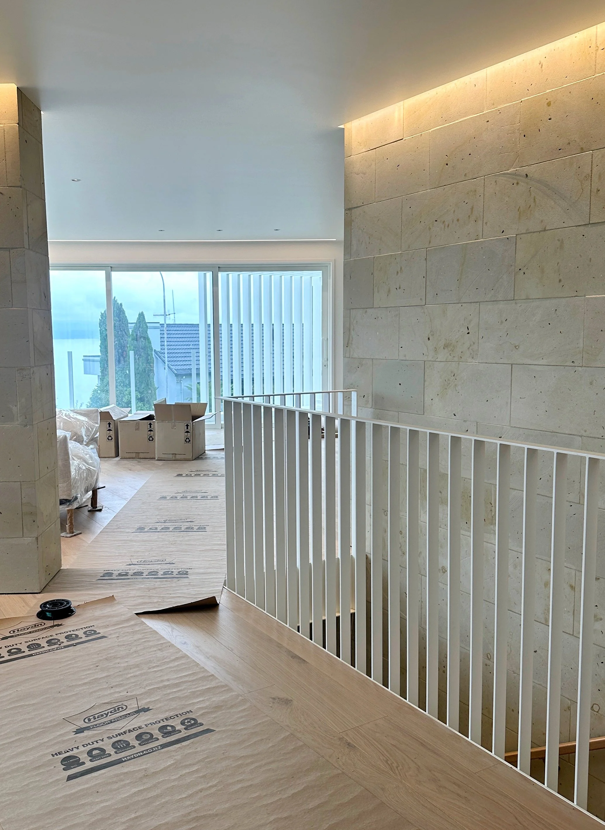
Progress - Hinuera stone is a major feature in the home and played an integral part in our choice of colour palette.
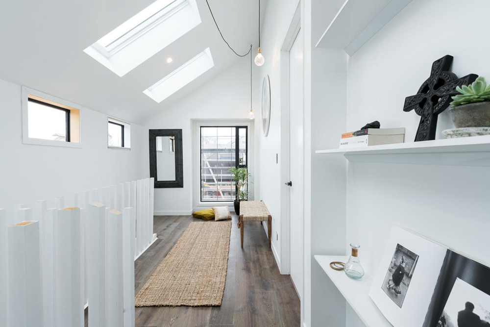
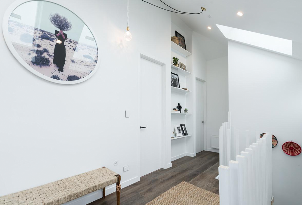
We designed the balustrade (which was originally supposed to be glass) in fine white powder coated steel. We love the texture it brings and how it reflects the fins on the outside of the house, and how the clean, straight lines juxtapose the natural finish of the stone wall. We also love that our clients trusted our choice and allowed us to push them out of their comfort zone. It’s now one of their favourite features.
photo: Florence Charvin

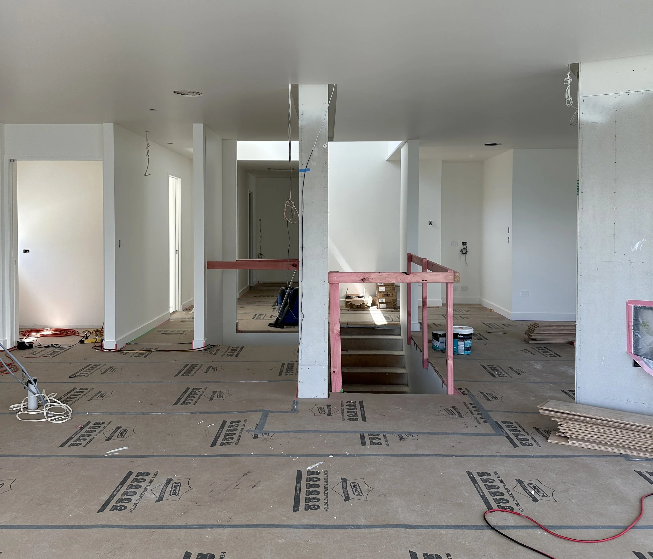
Before - the long, narrow living room was separated from the rest of the house by multiple doors and walls.
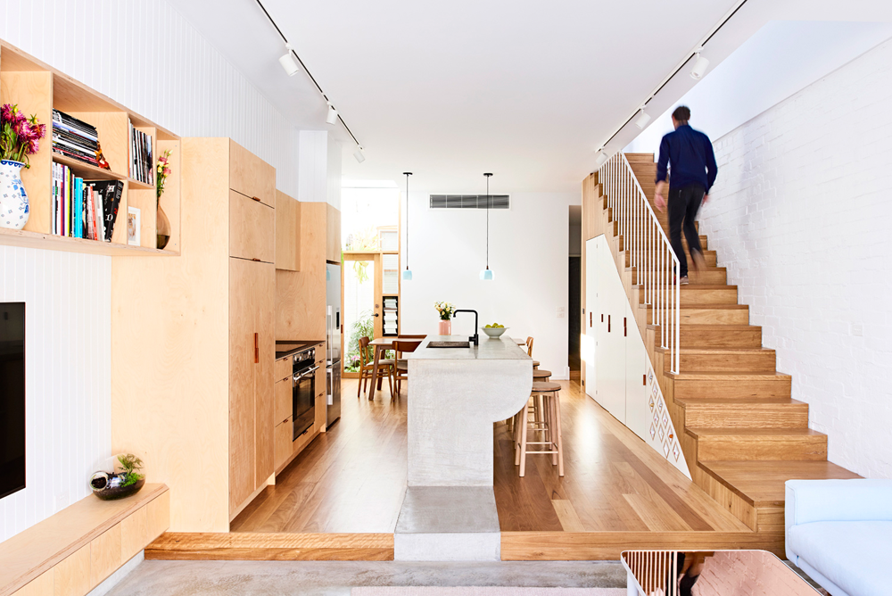
Citrus Studios designed the main living areas to be more open and interconnected. The wall between the stairs and living room was replaced with the balustrade, and the wall separating the living room from the open plan kitchen, dining and family room was opened up and in its place a double sided fireplace was installed. This creates more of a light, spacious feel while still cleverly providing separate zones.
photo: Florence Charvin
One of our challenges was to choose the right furniture pieces for the living areas which, as you can see from our furniture plan below, come out at an angle from the back of the house. The living room at the top of the stairs is where the family retreat in the evenings to watch tv. The curved modular sofa was the perfect choice to soften the various angles around it and create a cosy, inclusive setting.
photo: Florence Charvin
Progress - the view from the dining area looking back towards the stairs and elevator, and bedrooms beyond.
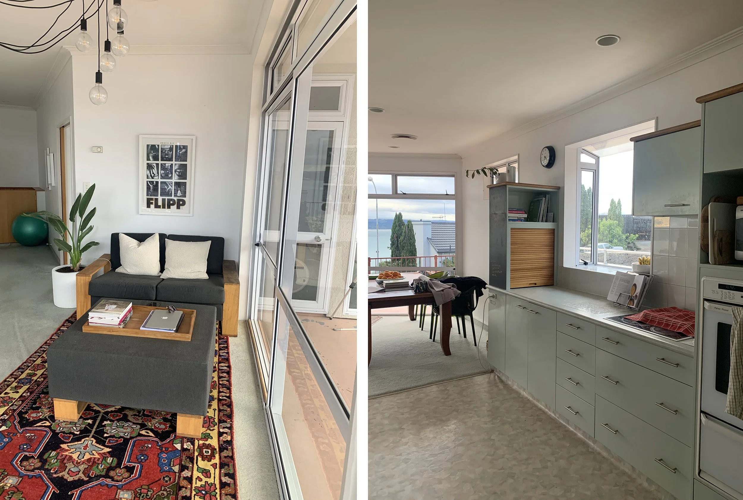
Before - the open plan family room, dining and kitchen were originally separated from the main living room.
Previously the deck off the family room was quite small and not terribly functional as an outdoor space. So the architect “borrowed” space from here to push the family room out making this more useable. He then created a space on the deck around the corner for some outdoor furniture.
photo: Florence Charvin
We created another seating area in the new family room which is zoned by the large wool rug. The corner sofa faces out towards the stunning view, and it can also be moved around 180° to face the fire on those few really cold months, if our clients want. This is the perfect setting for daytime relaxing or with friends before dinner.

Progress - the builder installed the longest recessed curtain track we’ve ever done!
The window treatments in this area took some consideration. The clients didn’t want to block the view and didn’t really need privacy from this angle, but the room gets a lot of sun coming through the floor to ceiling glass. We wanted curtains to add a softness to the space so we chose an organic open weave sheer that could be pulled across to diffuse the harsh sun when needed. The builders were amazing installing the longest recessed curtain track we’ve ever used, and at night it looks beautiful with the soft strip lighting in front.
photo: Florence Charvin
photo: Florence Charvin
The dining table features curved ends which, again, bring a softness to the angled room. The use of green is repeated throughout in small doses amongst the soft neutral palette, reflecting the nature outside. These dining chairs look quite beautiful as the light diffuses through them.
photo: Florence Charvin

Before - the kitchen undertook a major transformation!
photo: Florence Charvin
Molloy Joinery created the kitchen we designed using ivory oak veneer that complimented the flooring, and a porcelain bench and splash back with a subtle organic pattern. The kitchen has a clean, simple finish, which our clients wanted in their open plan space, with a small butlers pantry at the end to house the coffee machine, small appliances and a second sink.
photo: Florence Charvin
photo: Florence Charvin
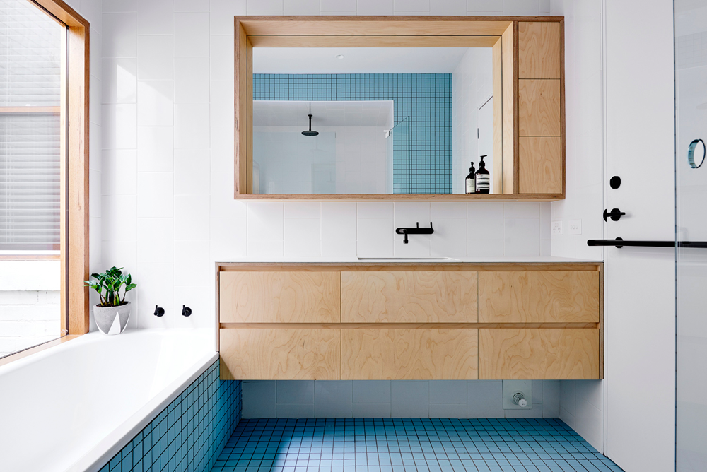
For a sense of cohesion we repeated the ivory oak veneer and porcelain bench in the laundry and bathrooms.
photo: Florence Charvin

Before - built-in custom joinery does wonders to update and tidy the new laundry.
photo: Florence Charvin
photo: Florence Charvin

Before - the landing and hallway have been tidied and simplified, these doors led to the old laundry, powder room and bathroom.
We love creating a bit of drama in a tiny powder room! We gave our clients two designs - one featuring these stunning dark liquorice coloured glass tiles, and a second in a soft, neutral colour. We’re so pleased they chose the darker option. In a room where you only spend a minute or so at a time you can afford to be bold!
photo: Florence Charvin
photo: Florence Charvin
photo: Florence Charvin
The family bathroom, above, and the primary bathroom, below, repeat the materials from the kitchen and laundry, with the addition of these large format tiles featuring a subtle linear texture. The gun metal fixtures add a touch of depth.
Progress - the tiler did a fantastic job installing and mitring these tiles with their linear texture.
photo: Florence Charvin
The primary bedroom continues the neutral colour palette with layers of soft texture to create a quiet space to retreat to at the end of a busy day.
photo: Florence Charvin

Progress - a walk-in wardrobe is a luxury and a way to keep the bedroom calm and uncluttered.
photo: Florence Charvin

Before - the outside has also had a major transformation!
it’s important that the exterior of the house reflects the interior, so the colour of the window joinery, the walls and roof paint are all a soft, warm white.
photo: Florence Charvin
Thank you to our incredibly awesome clients who trusted us with their beautiful home and allowed us to share it with you! To see even more images of the home you can visit our portfolio.