Bazaar Boutique | Before + Afters

Bazaar Boutique is a luxury fashion store based in our local neighbourhood, the seaside village of Ahuriri, Napier. It’s always been a treat to pop in and see what beautiful clothes and accessories are in-store, and we’ve had a special interest in the business since it was started by two young women in 2012, the same year that we started Bibby + Brady.

In 2023 the business was bought by Vicki Meech who was excited to merge her business experience with her love for beautiful clothing. Naturally Vicki wanted to put her mark on the store and give it a makeover. Working with local company, Your Solutions, who are specialists in commercial fit outs, the plan was to renovate as quickly as possible so as not to have the doors closed for too long.

We worked closely with Vicki on the design and new look. We chose a beautiful warm white paint from Aalto Paint for the walls and a slightly deeper shade for the floor, which was then sealed. This provided a beautiful neutral base to layer all of the gorgeous clothes and accessories on to, allowing them to shine. The new paint colour infused with subtle tones of raw umber and yellow oxide pigments, brings a soft welcoming glow to the space.

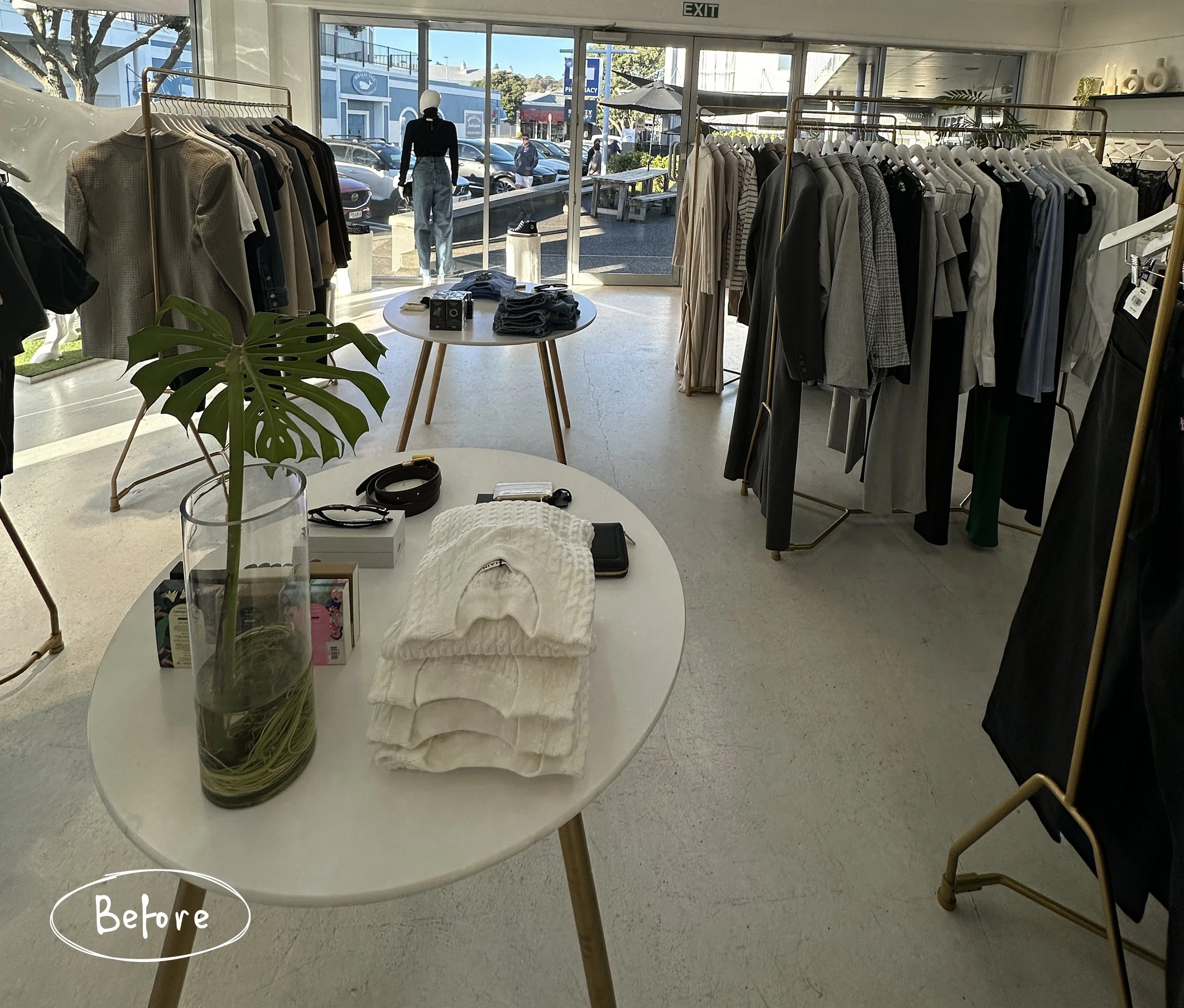
One of the most noticeable changes in the space is the relocation of the counter and the dressing rooms. Previously the check-out area was a large table to the side of the entrance with the dressing rooms on the far side. The table was a good size for display on top, but the space beneath was underutilised and lacked storage.

Now the counter is positioned in prime position straight ahead of the entrance. The scalloped front and sides adds subtle texture and hides the open shelving on the far side which is perfect for storing the printer, bags and much more.

When you stepped out of the dressing rooms previously you were visible to anyone in the shop. Removing the old dressing room walls and building a new one facing the back wall provides a lot more privacy.

The curved wall adds a softness, which is important in a small space where you want customers to be able to move around freely. The curves were repeated in the arched doorways and the mirrors on the opposite wall.

You can now open the curtains and use the mirrors inside and outside of the dressing room to see your outfit. Even if you step out you’re still tucked away from most of the store if you prefer your privacy. We used stunning linen fabric from James Dunlop for the curtains and luxurious wool carpet underfoot from Bremworth.

Another custom joinery piece sits in the middle of the store. It provides a place to display some of the accessories with more valuable storage below, and is also a lovely point of interest for customers when they first arrive.

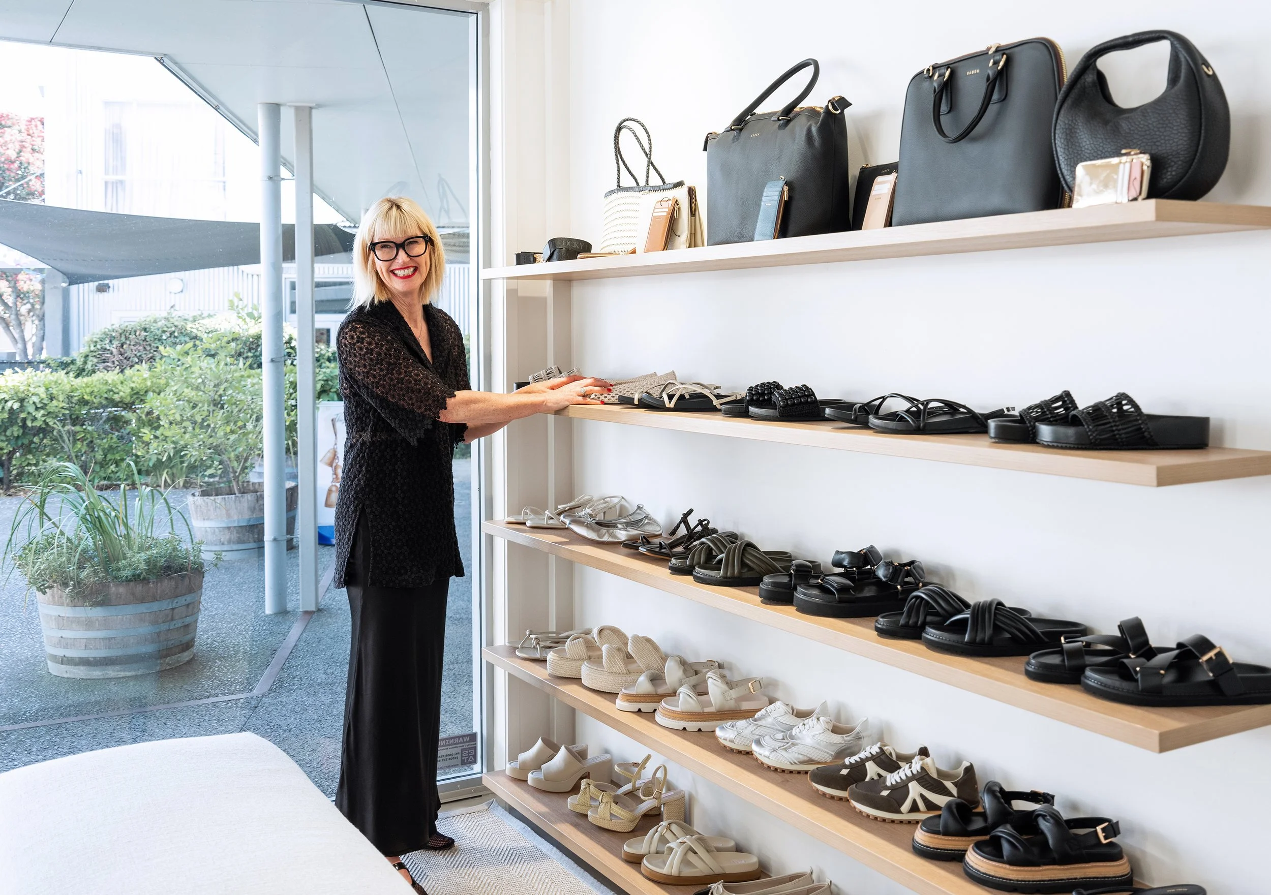
Lastly, new shelving was added to display jeans, handbags and shoes - staple pieces in every girl’s wardrobe.

Working with Vicki and helping bring her vision to life was a joy. If you’re in Napier make sure you pop into Bazaar Boutique, there are exciting new things arriving all the time. Vicki, Krissy and their team will would love to help you find your perfect outfit. You can see all of the photos of the newly renovated store in our portfolio.

Cameron | Before + Afters

We recently finished '‘phase 2” of a renovation for some favourite clients of ours. The family of seven live in a beautiful old villa that they’re gradually breathing new life into, honouring her original architecture but creating better space, flow and aesthetics. We began this journey several years ago in the kitchen/dining area, which you can see here. This latest renovation involved transforming a mostly unused family room, a dark hallway, and the addition of a small downstairs bathroom.

You can see from this section of the plan (above) by our friends at Architecture HDT - old plan on the left, new on the right - how we’ve closed the entrance to the family (rumpus) room and added French doors, borrowed some space from an adjoining office to create the bathroom, removed an old structure outside the family room, and replaced the small window along this wall with the original office window.

The brief for the family room was to make a space where the whole family could come (or the kids and their friends) to hang out, watch movies, and to make it a more inviting room to be in.

Previously the room featured heavy wood panelling, and quite a large raised stage at the back of the room which cut the room in half, limiting the furniture placement. The TV was tucked into the corner of the room on an angled built-in cabinet with a large unused fireplace taking pride of place. The small leadlight window sits awkwardly on top of the panelling.

This large leadlight window in the adjoining office needed to come out to make room for the new bathroom, so it made perfect sense to use it in the family room to replace the smaller one and let it more light.

We knew we wanted to remove the heavy panelling, but the style of the home really suited wall panelling, so we drew up a plan for the builder to follow with new panelling that had a lighter touch. Brendan Grant (the builder) did a brilliant job with our panelling design, and the entire renovation of this lovely old girl.

Taking the stage right back to just two small steps gave us so much more floor space, so we had a large corner sofa custom made along with a large round ottoman that could tuck under the new oak coffee table. The ottoman can double as seating when needed, and the new orientation of the seating allowed the family to take in the beautiful view out to the pool and beyond. A large rug zones the seating area, a warm white softens and lightens the room, and new curtains in a gorgeous fabric are hung as high as possible for a sophisticated finish.

The wall which previously was the focal point of the room has had quite a transformation. The panelling, built-in units, fireplace and hearth were removed. One of the main things we were asked to do in this room was create a space for a baby grand piano that is a family heirloom but hadn’t previously been able to fit anywhere. We boxed out the right side of the wall, covering the fireplace and creating a built-in shelving unit, also creating a nook for the piano.

The open shelves gave our clients the opportunity to display some favourite pieces, adding personality and interest. The cupboards below store all those things you may not want on display.

The office was cut in half so that a bathroom could be added downstairs. Previously family and friends had to go all the way upstairs to find the first bathroom. The downstairs addition has been life-changing, and great for when the kids want to jump through the shower after a swim.

We chose to clad the walls in HardieGroove™ to add that texture, but also, because it’s suitable for bathrooms, it meant we didn’t need to tile these walls. We added plenty of hooks for all the kids’ towels.

Inside the shower we used a marble chevron tile that echoed the herringbone flooring in other areas of the house. The tapware is all brushed platinum which is a slightly more sophisticated finish compared to chrome.

The last part of this renovation involved transforming the hallway that leads from the kitchen and dining area down to the family room and new bathroom. It’s the centre of the home with stairs leading up to the second floor, but it had a dark feel, once again with a lot of heavy wood panelling.

We knew that by painting the panelling it would instantly lighten and brighten the space, but we understood that this was a big thing to ask our clients. So we created 3D imagery to show them what we wanted to do and this gave them the courage to take the plunge. You can see we kept some of the wood in its natural state, but painted all of the walls.

In the render we had lighter panelling with two shades darker on the walls above, but we ended up flipping that and are really pleased with the end results. New carpet was put throughout to add a cosiness and warmth, it also dulls the noise of kids running up and down the stairs.

Once again we’d like to thank our clients for allowing us to share their home with you all, and for the trust they put in us and our designs. We have loved watching their incredible home transform and seeing how much more functional, as well as beautiful, it has become for them.

Goldsmith | Before + Afters

We recently finished an amazing kitchen/dining room project. Despite having to deal with lockdowns, supply delays and shortages, it was a fantastic project to work on. It helped that our clients are two of the loveliest people, and we had a great team helping us create our vision.

Our clients have a beautiful architecturally designed home and the kitchen was still in pretty great condition, even after 17 years. But they were ready for a re-fresh and more storage was on the wishlist.

The original kitchen was a U-shape tucked into one end of the room with the dining table taking up a large part of the open-plan space. They have a magnificent view over Napier on the opposite side of the room and the first thing we wanted to do was to capitalise on that by spinning the kitchen around to face the view, also giving our clients a more spacious kitchen to work in.

Because we were proposing quite a radical change to the layout, it was helpful to show our clients 3D renders so they could clearly see our vision, and there was no guesswork involved. It’s also a very important part of our process as it’s a lot easier (and cheaper) to make changes to the renders rather than making physical changes once construction has started. You can see more of our renders here.

Because the kitchen was the first space you see as you enter this open plan living area we wanted the joinery to feel like built-in furniture. When the teak veneer that we wanted to use wasn’t available our joiner, Kakapo Joinery, took an oak veneer and created a series of test pieces with different stains to create the richness we were after for the back lineup. The island has a black stain and we fluted this to add subtle texture.

Because there are a lot of architectural details in the home we wanted to keep aspects of the design clean and simple so we opted for handleless, push-to-open drawers and cupboards. The large pantry required handles, though, as it has pocket doors that can be opened and pushed right in so as not to interrupt flow in the kitchen. So we asked Kakapo Joinery to create gorgeous handles from solid oak that ran the entire height of the pantry for an inconspicuous solution.

In the original design the dining room took up a lot more floor space. Our kitchen design ate into that floor space quite considerable and so required a clever solution.

The hutch dresser could go as the large new pantry and multitude of wide, deep drawers provided ample storage. We then gained valuable space by designing a dining banquette along the back two walls, flowing seamlessly onto the kitchen cabinetry. A new, custom made table could then tuck right up against the banquette.

As we progressed with the dining area we asked Robin from Kakapo Joinery to make a dummy table top to try in-situ on the base so we could get the size and scale just right. Again, it’s more cost effective to make a change to the ply ‘dummy’ top than the real oak top.

Dael (below) is trying it out for size. Note: she is sitting on a cushion to make sure she’s getting a more accurate feel for the finished design. How many cafes have you been to where the bench seating feels too high for the table? That’s because it seems to be a common mistake to make the bench the full height not taking into account the cushion or squab. We use a 100mm thick foam in our squabs, so we need to make the base of our banquettes 100mm shorter.

One of the architectural details of the home was a shelf that ran along the back of the room. When it came to our banquette design we were able to run the back support directly under this so that the shelf could still be used. The upholstery was made by the amazing team of Martin & Ivan and is a gorgeous faux leather.

Another of the home’s architectural features was a lot of angles with different levels and depths. We wanted to simplify this slightly and so the back cabinetry hides a lot of that with a bulkhead above.

We didn’t want to completely loose the subtle angle of the back wall, but we were also trying to avoid any further sharp angles. So Kakapo Joinery created a really beautiful subtle curve in the lower cabinetry, which you can see in the progress image below. In fact all of the curves in our design were introduced to contrast and soften the various angles in the architecture.

We chose to use Corian® as the benchtop material for a number of reasons. We loved the gorgeous organic swirling pattern in caramel and cream tones. It’s a great product to use on curves, and it offers nearly seamless joins.

With the focus on the kitchen being the back lineup in the warm teak-stained oak, we wanted the overhead cupboards (which include a hidden powerpack) to sit quietly. By painting them the same white as the walls they don’t demand too much attention.

The finger tiles are Japanese inspired and we love the repetition of texture and clean vertical lines.

A couple of hidden features we love in the kitchen design, along with the pantry pocket doors, are the interior of the drawers and cupboards which we made black instead of the usual white for an elevated finish. And the hidden corner cupboards on the island. Check out our Instagram Story highlights to see more.

To our clients… thank you so much for allowing us to share these photos and our journey. But most of all for being fabulous clients and trusting us even when we pushed you out of your comfort zone. We recently learnt that the feature that had most worried our client was the built-in banquette, but she trusted our design and bravely went there! Now (as we always find) the part she was most worried about is one of her favourite things. May all our future clients be as brave and trusting :)