JULL BATHROOM | BEFORE + AFTERS

At Bibby + Brady our aim is to create homes that are a joy to be in. Not only because they look beautiful, but because the functionality of the design changes they way our clients live, making everything easier and more enjoyable. The most rewarding part of the process for us is to see our designs come to life and witness the transformation of the space and life for it's owners.

This is a bathroom we recently renovated as part of a larger home renovation. The room is used by the children of the house and guests.

The layout of the room actually worked well and by leaving the plumbing in the same place we saved time and money for our clients. We wanted a fresh look but one that was still relevant to the character of the villa, so we removed the wall tiles and clad the entire room in Hardie™ Groove lining. We retained a dado rail but took it much higher to line up with the top of the tiles in the shower.

We chose a soft blue paint colour and wrapped it over the walls, ceiling, the door and all the frames to create a soothing, calm space. It also helps to blur the lines in a small room where there are a lot of elements.

The vanity is a similar shade to the walls and by having a wall hung option with air underneath, it creates a more spacious feeling in the small room. A custom mirror runs up to the dado line, and the curved bottom edges of the mirror along with the wall lights add a nice softness to juxtapose the straight lines. Touches of pink and watermelon red are a beautiful contrast to the blue.

The bath tucks neatly into the left hand corner of the room and features a lovely curved right edge, which, again, adds a softness to the small room.

We removed the old shower box and created a new modern shower with simple custom made glass walls on two sides. Inside we chose tiles with an artisanal handmade effect with subtle undulation. A large recessed niches provide a spot for shampoo and soap, with a smaller one below handy for shaving legs.

Because we kept the room very tonal and calm, we could afford to have a bit of fun with the floor tiles. The terrazzo-look tiles combine all of the colours in the rooms - blue/green, pink, black and white.

Colour always plays a big part in our designs, even if it's a neutral palette. By saturating the room in this soft blue we've created a calm, welcoming space, and have been selective with the small bursts of visual stimulation.

Despite what's going on in the world right now, home should always be a place for respite, to relax and recharge. We would love to help you create this in your home. Our goal will always be to effortlessly blend functionality with aesthetics, and make a house feel like a home. If you’re interested in working with us you can fill out this form to tell us more about your project.

See more of this beautiful family home here.

Starting fresh in 2023

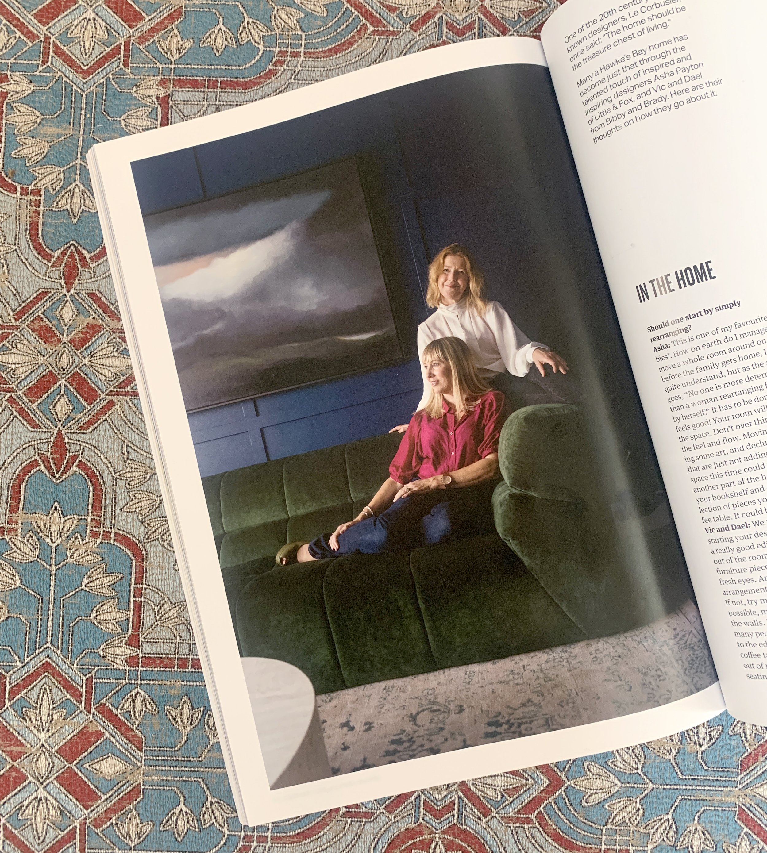
We recently appeared in the first issue of Bay Buzz for 2023 which was all about ‘refresh and renew’. It’s packed with great advice from many experts on how to refresh and renew your mind, body, career, business and home, as well as the planet. We highly recommend picking up a copy to read all about it.

The new year is a brilliant time for new beginnings and a new, fresh look for your home. We love transforming our clients’ homes and seeing the positive effect it has on them, their family and their lifestyle. We wanted to share with you some of the tips and advice we gave Bay Buzz (plus a few extra) to make changes in your home that don’t require a big, expensive renovation but can make the world of difference.

LAYOUT & FLOW : :

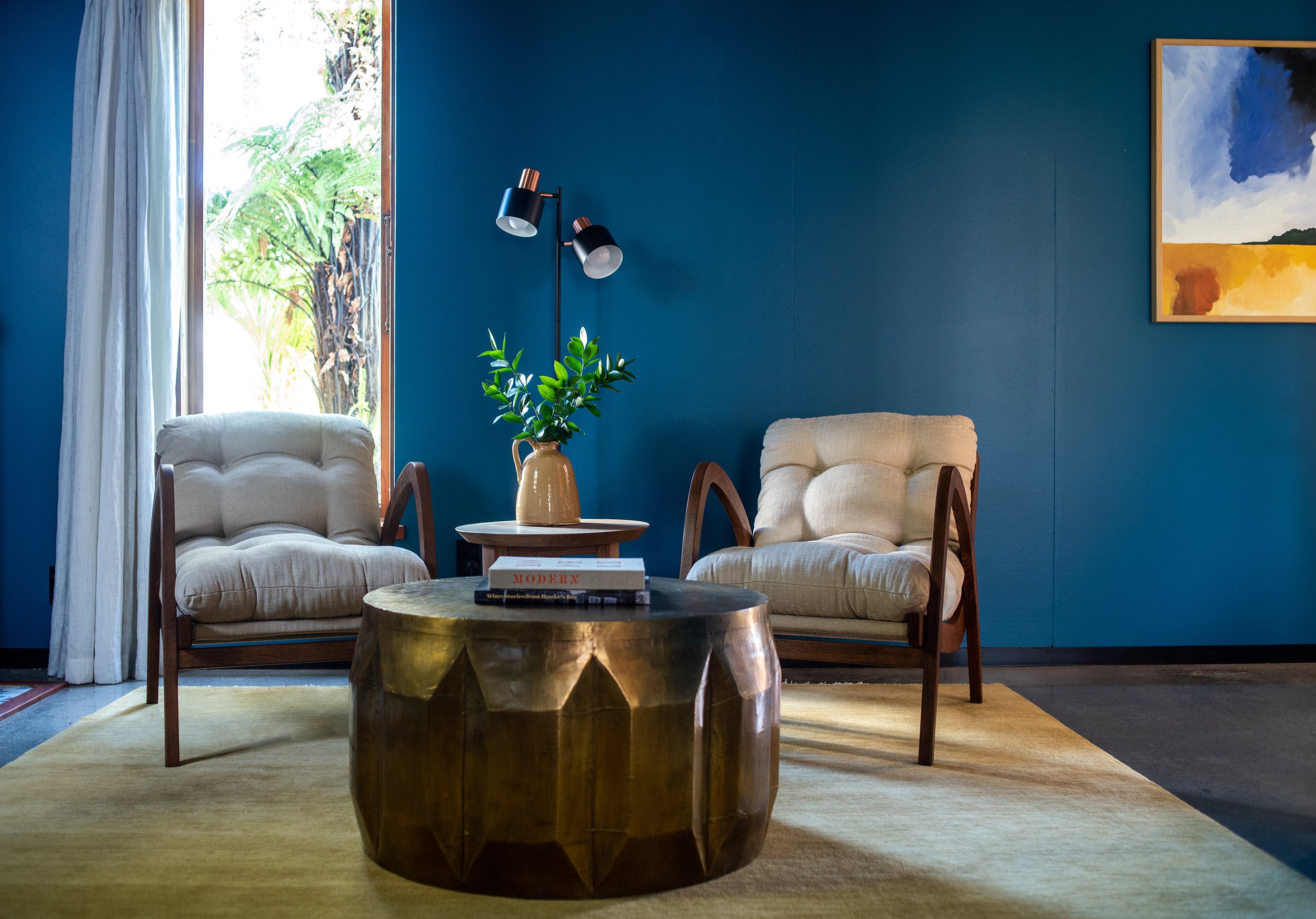
We always recommend starting your design process with a really good edit. Take everything out of the room except for the large furniture pieces and look at it with fresh eyes. Are you happy with the arrangement, does it have good flow? If not, try moving furniture around. If possible move furniture away from the walls. It always surprises us how many people push all their furniture to the edge of the room and have their coffee table floating in the middle out of reach and disconnected, or the seating is too far apart to function socially. If your room is large enough, try pulling your furniture in to create cosy, social settings. It might take a few moves before you get it right, and this process may also highlight areas that are lacking or need changing. For example, you may need a bigger coffee table, or to add side tables... That’s ok, this is all part of the process to get the best looking and best functioning room for you.

SHOP FROM YOUR HOME : :

Once you’re happy with your furniture layout move onto the decor. Put all of your accessories together in another space, perhaps on the dining table or kitchen bench, and ‘shop’ from your collection. Look at each piece and consider whether you would buy that if you saw it in a shop today. Only put back those pieces you love, and don’t feel you have to put them back in the same place. You may want to move some pieces to another spot or to other rooms in the house. We regularly move pieces around our homes to refresh each space.

Create groupings with your items. We like to put odd numbers of items together - 3, 5, sometimes 7 or 9. But three seems to be the magic number to keep your eye moving for a more interesting visual experience. Another way to create interest is to have a mix of shape, size and texture. Experiment and play around, there is a real skill to styling and you’ll get better the more you do it.

Books are a favourite tool of ours. We use them as plinths to ground and elevate smaller objects. They also add an element of design and reflect your interests. Look for books about things you love, but also keep in mind the colour of the book and the graphic nature of the spine and cover and how that will work in your room. Sometimes the colour of the hardback book beneath the jacket can be quite different giving you two options in the one book.

FILL THE GAPS : :

If there are any gaps after the process of shopping from your home, you now have specific pieces you can look for, so you can shop with purpose. We love that final layer in a home, it’s the one that adds your personality. Keep scale in mind. Large-scale pieces like a large lamp, balanced with a large vase add drama and interest and create a less cluttered look than a lot of tiny pieces would. We try not to have any decor pieces smaller than an orange, which is a good rule to remember. Often larger pieces make a space feel more luxurious and expensive. Give it a try.

PAINT : :

Without a doubt painting your room is the least expensive way to create impact. Look at existing pieces in your room like furniture, art, curtains and flooring and choose a colour that will be harmonious. We’ll often pull the paint colour out from one used in a piece of art or the rug.

We’re not fans of the feature wall, it’s the quickest way to make your room look dated. Instead we encourage you to go for it and paint your entire room. Don’t forget the trims and ceiling, we’ll often paint them a fresh white, but on occasion we’ll paint the trims, and even the ceiling, the same colour as the walls. If done right it looks incredible and is especially effective in media rooms and powder rooms to create a cocooning feel.

ELEVATE YOUR WALLS : :

We love to use wall paneling to elevate a room and add architectural detail in an otherwise plain room. There are lots of different styles to choose from - v-groove, box moulding, board & batten, wainscoting. The style of your home will dictate which style of panelling you choose. If you’re handy with the tools you could apply the panelling yourself, otherwise talk to your local builder or handyman.

We used a chunky box moulding in Dael’s media room (above) in her 1940’s home; and a finer, more subtle panelling for our clients’ character villa (below).

UPDATE YOUR HANDLES : :

It’s amazing what a difference an updated handle can make in your kitchen, wardrobe, dresser etc. Knobs are easy to replace as there is only one hole, but if you have a D handle measure the distance between the two centre holes and look for new handles with the same centre handle distance. This will save you having to fill holes if the new handles are a different size.

Overhead cupboards in the kitchen can sometimes look more contemporary if you take the handles off completely, fill, sand and paint them and add a push-to-open mechanism on the inside.

INVEST IN NEW LIGHTING : :

Replacing old pendants and lamp shades can change the look of a room quite dramatically. If possible add dimmers to your lights so you can create different ambience for different situations. Make sure to hang your pendants at the right height. This will be dependant on factors such as the scale of your light and the height of your ceilings. Kitchen pendants will often be hung 70-80cm above the bench, and over a dining table we’ll start with 75cm higher then your table top. Each space will be slightly different, we use our eye to get it just right, but these are good measurements to start from.

INVEST IN A RUG : :

The right rug can totally transform a room, but the key is to get the right size. Don’t get a tiny rug that your coffee table fits on but nothing else. This is the quickest way to make your room look too small and cheap. The golden rule is that the front feet of all of your chairs and sofas sit on the rug. If all of the legs fit on, even better, this will make your room look really spacious.

Under your dining table the rug needs to be large enough to pull the chairs back without them falling off the rug. Yes the larger the rug, the larger the price tag, but it’s something we would recommend getting right. If a hand knotted wool rug is outside of your budget, start with a large jute rug.

I hope you found some advice that you can apply to your own home. We’d love to hear about it if you did - feel free to DM us on Instagram. And if you’d like our help with your interior design journey, whether that’s a new build, or renovation, or just sourcing new furniture, get in touch anytime.

Cameron | Before + Afters

We recently finished '‘phase 2” of a renovation for some favourite clients of ours. The family of seven live in a beautiful old villa that they’re gradually breathing new life into, honouring her original architecture but creating better space, flow and aesthetics. We began this journey several years ago in the kitchen/dining area, which you can see here. This latest renovation involved transforming a mostly unused family room, a dark hallway, and the addition of a small downstairs bathroom.

You can see from this section of the plan (above) by our friends at Architecture HDT - old plan on the left, new on the right - how we’ve closed the entrance to the family (rumpus) room and added French doors, borrowed some space from an adjoining office to create the bathroom, removed an old structure outside the family room, and replaced the small window along this wall with the original office window.

The brief for the family room was to make a space where the whole family could come (or the kids and their friends) to hang out, watch movies, and to make it a more inviting room to be in.

Previously the room featured heavy wood panelling, and quite a large raised stage at the back of the room which cut the room in half, limiting the furniture placement. The TV was tucked into the corner of the room on an angled built-in cabinet with a large unused fireplace taking pride of place. The small leadlight window sits awkwardly on top of the panelling.

This large leadlight window in the adjoining office needed to come out to make room for the new bathroom, so it made perfect sense to use it in the family room to replace the smaller one and let it more light.

We knew we wanted to remove the heavy panelling, but the style of the home really suited wall panelling, so we drew up a plan for the builder to follow with new panelling that had a lighter touch. Brendan Grant (the builder) did a brilliant job with our panelling design, and the entire renovation of this lovely old girl.

Taking the stage right back to just two small steps gave us so much more floor space, so we had a large corner sofa custom made along with a large round ottoman that could tuck under the new oak coffee table. The ottoman can double as seating when needed, and the new orientation of the seating allowed the family to take in the beautiful view out to the pool and beyond. A large rug zones the seating area, a warm white softens and lightens the room, and new curtains in a gorgeous fabric are hung as high as possible for a sophisticated finish.

The wall which previously was the focal point of the room has had quite a transformation. The panelling, built-in units, fireplace and hearth were removed. One of the main things we were asked to do in this room was create a space for a baby grand piano that is a family heirloom but hadn’t previously been able to fit anywhere. We boxed out the right side of the wall, covering the fireplace and creating a built-in shelving unit, also creating a nook for the piano.

The open shelves gave our clients the opportunity to display some favourite pieces, adding personality and interest. The cupboards below store all those things you may not want on display.

The office was cut in half so that a bathroom could be added downstairs. Previously family and friends had to go all the way upstairs to find the first bathroom. The downstairs addition has been life-changing, and great for when the kids want to jump through the shower after a swim.

We chose to clad the walls in HardieGroove™ to add that texture, but also, because it’s suitable for bathrooms, it meant we didn’t need to tile these walls. We added plenty of hooks for all the kids’ towels.

Inside the shower we used a marble chevron tile that echoed the herringbone flooring in other areas of the house. The tapware is all brushed platinum which is a slightly more sophisticated finish compared to chrome.

The last part of this renovation involved transforming the hallway that leads from the kitchen and dining area down to the family room and new bathroom. It’s the centre of the home with stairs leading up to the second floor, but it had a dark feel, once again with a lot of heavy wood panelling.

We knew that by painting the panelling it would instantly lighten and brighten the space, but we understood that this was a big thing to ask our clients. So we created 3D imagery to show them what we wanted to do and this gave them the courage to take the plunge. You can see we kept some of the wood in its natural state, but painted all of the walls.

In the render we had lighter panelling with two shades darker on the walls above, but we ended up flipping that and are really pleased with the end results. New carpet was put throughout to add a cosiness and warmth, it also dulls the noise of kids running up and down the stairs.

Once again we’d like to thank our clients for allowing us to share their home with you all, and for the trust they put in us and our designs. We have loved watching their incredible home transform and seeing how much more functional, as well as beautiful, it has become for them.