Starting fresh in 2023

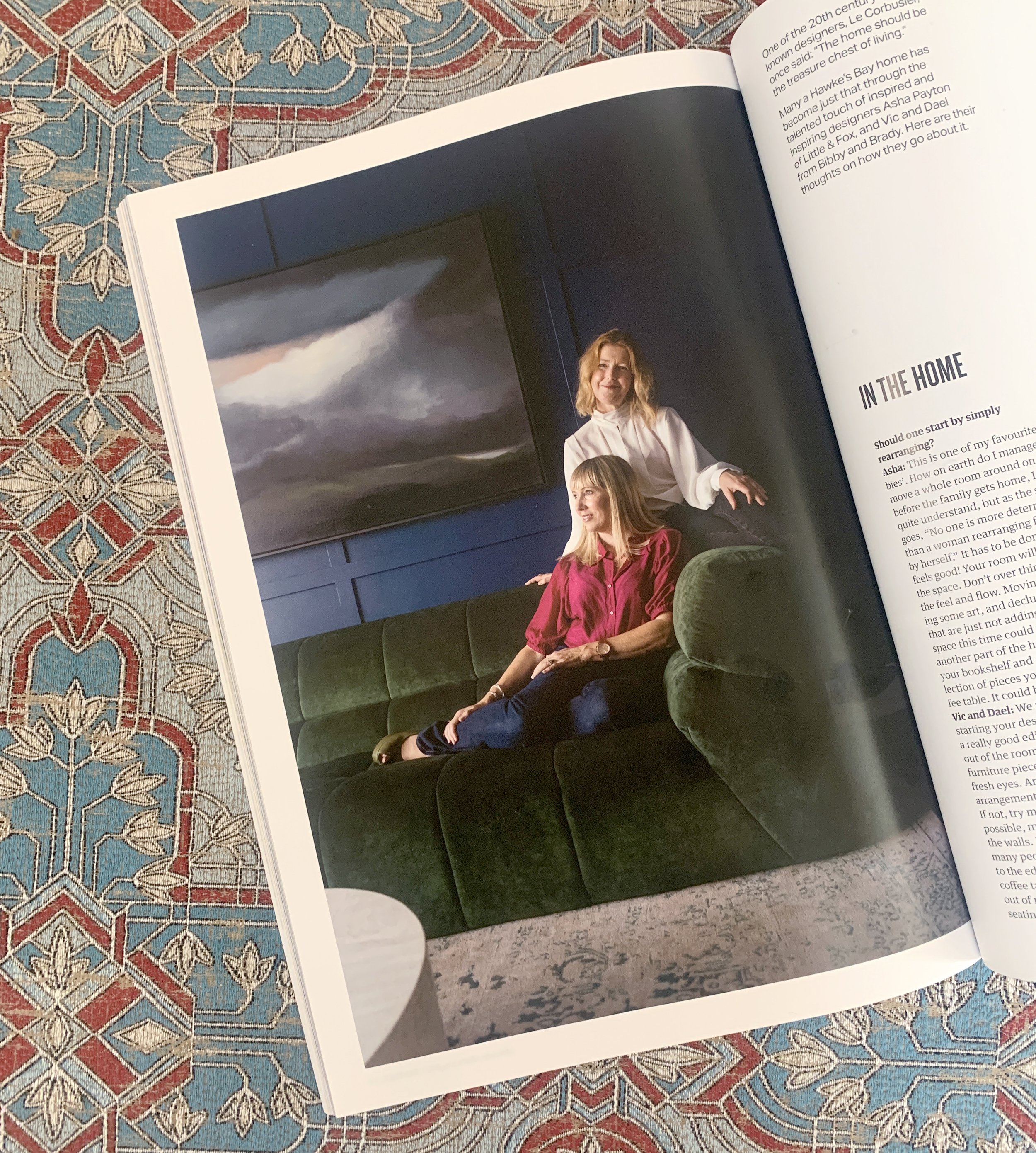
We recently appeared in the first issue of Bay Buzz for 2023 which was all about ‘refresh and renew’. It’s packed with great advice from many experts on how to refresh and renew your mind, body, career, business and home, as well as the planet. We highly recommend picking up a copy to read all about it.

The new year is a brilliant time for new beginnings and a new, fresh look for your home. We love transforming our clients’ homes and seeing the positive effect it has on them, their family and their lifestyle. We wanted to share with you some of the tips and advice we gave Bay Buzz (plus a few extra) to make changes in your home that don’t require a big, expensive renovation but can make the world of difference.

LAYOUT & FLOW : :

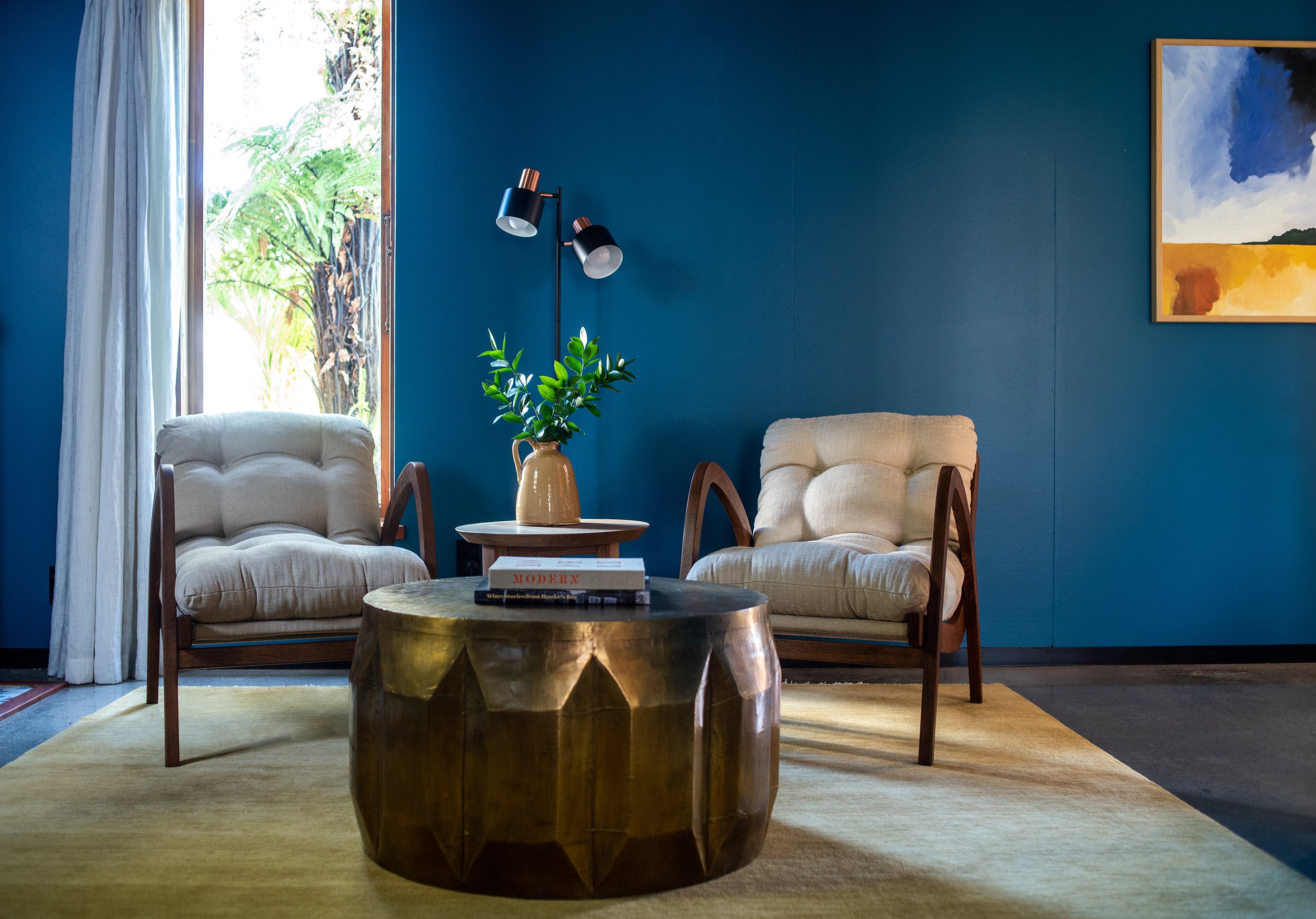
We always recommend starting your design process with a really good edit. Take everything out of the room except for the large furniture pieces and look at it with fresh eyes. Are you happy with the arrangement, does it have good flow? If not, try moving furniture around. If possible move furniture away from the walls. It always surprises us how many people push all their furniture to the edge of the room and have their coffee table floating in the middle out of reach and disconnected, or the seating is too far apart to function socially. If your room is large enough, try pulling your furniture in to create cosy, social settings. It might take a few moves before you get it right, and this process may also highlight areas that are lacking or need changing. For example, you may need a bigger coffee table, or to add side tables... That’s ok, this is all part of the process to get the best looking and best functioning room for you.

SHOP FROM YOUR HOME : :

Once you’re happy with your furniture layout move onto the decor. Put all of your accessories together in another space, perhaps on the dining table or kitchen bench, and ‘shop’ from your collection. Look at each piece and consider whether you would buy that if you saw it in a shop today. Only put back those pieces you love, and don’t feel you have to put them back in the same place. You may want to move some pieces to another spot or to other rooms in the house. We regularly move pieces around our homes to refresh each space.

Create groupings with your items. We like to put odd numbers of items together - 3, 5, sometimes 7 or 9. But three seems to be the magic number to keep your eye moving for a more interesting visual experience. Another way to create interest is to have a mix of shape, size and texture. Experiment and play around, there is a real skill to styling and you’ll get better the more you do it.

Books are a favourite tool of ours. We use them as plinths to ground and elevate smaller objects. They also add an element of design and reflect your interests. Look for books about things you love, but also keep in mind the colour of the book and the graphic nature of the spine and cover and how that will work in your room. Sometimes the colour of the hardback book beneath the jacket can be quite different giving you two options in the one book.

FILL THE GAPS : :

If there are any gaps after the process of shopping from your home, you now have specific pieces you can look for, so you can shop with purpose. We love that final layer in a home, it’s the one that adds your personality. Keep scale in mind. Large-scale pieces like a large lamp, balanced with a large vase add drama and interest and create a less cluttered look than a lot of tiny pieces would. We try not to have any decor pieces smaller than an orange, which is a good rule to remember. Often larger pieces make a space feel more luxurious and expensive. Give it a try.

PAINT : :

Without a doubt painting your room is the least expensive way to create impact. Look at existing pieces in your room like furniture, art, curtains and flooring and choose a colour that will be harmonious. We’ll often pull the paint colour out from one used in a piece of art or the rug.

We’re not fans of the feature wall, it’s the quickest way to make your room look dated. Instead we encourage you to go for it and paint your entire room. Don’t forget the trims and ceiling, we’ll often paint them a fresh white, but on occasion we’ll paint the trims, and even the ceiling, the same colour as the walls. If done right it looks incredible and is especially effective in media rooms and powder rooms to create a cocooning feel.

ELEVATE YOUR WALLS : :

We love to use wall paneling to elevate a room and add architectural detail in an otherwise plain room. There are lots of different styles to choose from - v-groove, box moulding, board & batten, wainscoting. The style of your home will dictate which style of panelling you choose. If you’re handy with the tools you could apply the panelling yourself, otherwise talk to your local builder or handyman.

We used a chunky box moulding in Dael’s media room (above) in her 1940’s home; and a finer, more subtle panelling for our clients’ character villa (below).

UPDATE YOUR HANDLES : :

It’s amazing what a difference an updated handle can make in your kitchen, wardrobe, dresser etc. Knobs are easy to replace as there is only one hole, but if you have a D handle measure the distance between the two centre holes and look for new handles with the same centre handle distance. This will save you having to fill holes if the new handles are a different size.

Overhead cupboards in the kitchen can sometimes look more contemporary if you take the handles off completely, fill, sand and paint them and add a push-to-open mechanism on the inside.

INVEST IN NEW LIGHTING : :

Replacing old pendants and lamp shades can change the look of a room quite dramatically. If possible add dimmers to your lights so you can create different ambience for different situations. Make sure to hang your pendants at the right height. This will be dependant on factors such as the scale of your light and the height of your ceilings. Kitchen pendants will often be hung 70-80cm above the bench, and over a dining table we’ll start with 75cm higher then your table top. Each space will be slightly different, we use our eye to get it just right, but these are good measurements to start from.

INVEST IN A RUG : :

The right rug can totally transform a room, but the key is to get the right size. Don’t get a tiny rug that your coffee table fits on but nothing else. This is the quickest way to make your room look too small and cheap. The golden rule is that the front feet of all of your chairs and sofas sit on the rug. If all of the legs fit on, even better, this will make your room look really spacious.

Under your dining table the rug needs to be large enough to pull the chairs back without them falling off the rug. Yes the larger the rug, the larger the price tag, but it’s something we would recommend getting right. If a hand knotted wool rug is outside of your budget, start with a large jute rug.

I hope you found some advice that you can apply to your own home. We’d love to hear about it if you did - feel free to DM us on Instagram. And if you’d like our help with your interior design journey, whether that’s a new build, or renovation, or just sourcing new furniture, get in touch anytime.

Covid-19 and what lies ahead

2020 started out as our best year to date. We had some amazing clients and projects on the go, as well as in our pipeline. We were really excited about the year ahead. Then along came Covid-19 and threw one mighty large spanner in the works! Yes, we had to postpone several consultations with new clients, and push out finishing dates of some existing projects, but we’ve been lucky that we’ve been able to continue working from our homes to some extent. Design work continues and Dael has been able to talk to clients and suppliers on the phone and via Zoom meetings. And one benefit of being at home and having a bit more time is that we finally started our IGTV channel, posting short videos with design tips to Instagram and Facebook. Something we’ve been meaning to do for a while now.

Living in Lockdown has been a massive adjustment for all of us, but it’s been so cool to see the innovative ways individuals and businesses have been coping. Our hearts go out to all those who have experienced heartbreak and stress, I can’t even imagine how tough that has been. As an eternal optimist I like to find a silver lining, and for me there have been a few…

Slowing down, literally smelling the roses, spending quality time as a family, regular exercise and creating new rituals, not to mention that the planet has been given the opportunity to ‘breathe’ and recalibrate. It kinda makes you wonder! It’s given us all time to realise what is most important in our lives, and one thing that Dael and I know, but we hope that you are all realising now too (if you hadn’t already), is how important your home is.

We’ve all been spending more time in our homes than we probably ever have before, and if you love your home, that will have made this time so much better. People who don’t value beautiful interiors may think it’s just superficial and shallow, but whether you realise it or not you are greatly affected by your surroundings. A good design not only transforms the interior, it transforms the lives of the people living there. If our designs are contributing to more happy, content people in this world, then how cool is that?!

There are a few simple things you can do right now to make your home more enjoyable. Start by decluttering and editing. Piles of clutter can cause you stress. Look to see if there are certain areas that are constantly being used as a dumping ground. Can you add a basket to collect the abandoned shoes, or a pretty box for mail and paperwork? Make sure that items on display that have a practical use look good too.

Create vignettes around your house made up of things you love, maybe they have a memory or story attached. It’s amazing how they’ll make you happy when you see them. Start with just one surface and have a play, when you feel more confident try another surface. Move pieces around regularly to keep your home feeling fresh. We give you lots of tips in our videos, so check them out if you haven’t already.

Add greenery. We talk about this a lot, but it’s a really simple way to inject life, texture and interest into your home. You don’t even need to go to a florist (although we’re all for supporting your local florist, especially now), you can just take you secateurs into your own garden and cut off a few branches.

Paint is one of the simplest ways to transform a room, it can literally change the mood of a space. We have an online colour course that you can download and do at home anytime. It teaches you how to choose a colour palette that will be just right for your home. Whilst in Level 3 (and 4 before) we’re offering a 20% discount, so go check it out.

As we head towards Alert Levels 2 and then 1, I hope that we will all adopt a new normal. Take whatever positives you found whilst in Lockdown - slow down, spend more time with loved ones, exercise more, get creative, whatever you discovered (or re-discovered) that is going to enhance your life. Travelling overseas won’t be happening in the near future, but why not see more of our own country, support local tourism, and support local businesses as much as possible.

At Bibby + Brady we work with some incredible local businesses and NZ furniture manufacturers (the sofa above is a great example of one of our NZ made creations). This means we will be able to continue to create beautiful spaces, no matter what. If you decide that you want to spend that money you had put aside for overseas travel on a new kitchen, or a complete house renovation, maybe even a new build, then get in touch with us so we can put you into our calendar, or you can fill in this form. We can work with you right from the planning stage, through to the install. We can project manage the entire reno if you want us to, we have some fantastic tradies and suppliers so you can rest assured that the job will be done to our high standards.

Wishing you all the best, and remember better times are yet to come. Stay safe, stay healthy, and for now, stay home. Vic + Dael x

Entrances | where first impressions count

If you haven’t already, hop over to our Instagram page or our IGTV channel to watch Dael’s video with tips for creating a beautiful entrance into your home. To help illustrate some of Dael’s tips I’ve put together this blog post for you. An entrance is vital for creating a good first impression and giving your visitors a taste of what’s to come, and we also like it to have some practical solutions to make our lives easier.

The most important piece of furniture in your entry is a console table. These are designed to be tall enough for you to drop your keys, mail etc as you walk in, and narrow enough so as not to take up too much valuable walking space. A console with drawers is handy for storing items you don’t want on display, but another option is to add storage baskets underneath. The image above is a great example of style and practicality coming together - a lamp to greet your visitors at night; a purely decorative piece for interest; a lidded box to store your keys; a vase of flowers for texture, interest and a beautiful scent; a mirror to bounce light and let you check yourself before heading out; and baskets for storing the dog’s lead, the kids’ shoes etc.

Get creative and playful with your entrance table. Art is a great alternative to a mirror, and remember not to hang it too high, you want it to have a connection to the table and vignette below it. In the image above they’ve hung the artwork off-centre and balanced it with the large clam shell and branches. Simple branches or greenery from your garden can be used instead of fresh flowers and will likely last a lot longer while still adding texture and life. In place of a lamp, if you don’t have a power point handy, add a candle.

I love the image above! The styling is deliberately simple allowing the beautiful pieces to shine. Instead of a console table, a small cabinet has plenty of hidden storage within. The artwork is hung off-centre and anchored below by the small black table, which would be handy for dropping keys on as you enter. The vases are in a group of three (the magic number when styling), and create a simple but interesting grouping of varying shapes and sizes. The touches of black add depth and lead your eye around from the table to the lamp and back across to the artwork. This is a simple but clever way to link everything together.

If you’re lucky enough to have the space for a piece of furniture with storage, you should definitely take that option. Just think of all the things you could hide in there, and the first impression your visitors will have is how tidy and organised you are. This piece (above) has been custom made and built in to the alcove. Talk to your local cabinet maker, joiner or interior designer if you want a custom piece for your entrance.

Dael and I sometimes look to use wallpaper in our clients’ entranceways when we want to create a real impact. It’s a space that you pass through rather than sit and spend time in, so you can afford to be a bit brave if you want to. Don’t be afraid to hang artwork on top of your wallpaper, it looks amazing and breaks up the pattern, helping to create a focal point around the console table.

Bold colour also creates a sense of “wow”. Use the space to express your personality. I love the mix of traditional, pretty pieces with textural tribal masks in the image below.

If you have stairs in your entrance take advantage of the wall under the stairs to create ‘a moment’. A bench seat works really well, and then follow the sloping line of the stairs with artwork and/or a floral or greenery arrangement.

If you have room a row of hooks in your entrance way is super handy for hanging coats, hats etc. Just make sure it doesn’t look too messy, that’s not a great first impression. Dael has hers tucked away behind the door on the opposite side from her console table. That way your eye is drawn to the table and not the hooks.

Don’t worry if your entranceway is small, there are still things you can do to create something fabulous. With the space below they’ve kept it simple with the the largely white artwork and small white, leggy table not taking up too much visual space. There’s enough room to drop your bag and throw your keys on that table.

Even a tiny floating shelf will do the trick, and mirrors are always great for bouncing light around and creating the illusion of space.

My dream house would have a large, welcoming entrance, and in this case you can have fun with the scale of your furniture and lighting. Dael and I both love a large, round table a few metres inside the door. Style the top with flowers or greenery, a tray for your keys and favourite decor pieces.

If not centring the table in the entrance, but it’s still a large space, make sure you play with the scale of your pieces. In the image below a large entry rug welcomes you with a large statement chandelier filling the space above. The console table is chunky and wider than a conventional one and the pieces on top are also substantial in size.

Finally, it’s not unusual to have a home where you walk straight into a living room or perhaps a kitchen. In this situation we try to create a sense of an entry by having a table or surface where you can still pop your keys etc. The image below has a long console behind the sofa. This creates a seperate hall like space between the living room and entrance.

I hope that’s given you a little inspiration, and now that we all have a bit more time on our hands with the Covid-19 lockdown in place, you can have a play with yours. Again, make sure you watch Dael’s video on our Instagram page. Stay safe, stay home and make that home an awesome place to be!


image source: 1 | 2 | 3 | 4 | 5 | 6 | 7 | 8 | 9 | 10 | 11 | 12 | 13 | 14 | 15 | 16 | 17