This post is a very special one for me. Last Friday Dael & I went on a little road trip to visit two of our favourite Bibby + Brady interior design clients. I'll be bringing you photos from both houses over the next few days, starting with this fabulous family home in Hamilton. We got so many great photos I'm going to run them over two posts.
Angie and Ryan, along with their three adorable kids, were our first official clients. I remember being so excited to get Angie's first email titled 'Help!' They'd just bought their 1980's home in Tamahere, and were trying to decide where to start. Angie has great style and lots of ideas, and Ryan is a fantastic builder, but (like a lot of our clients) they just needed help to pull everything together.
A few words from Angie... "I love colour, design and pretty things so when we purchased our home and started the first room reno (our bedroom) I was so excited! Firstly I had to decide on the right shade of grey paint and I was completely overwhelmed with all the options... and then I needed to choose curtain fabric and the choices were endless... my mind was buzzing as I knew what I liked but I couldn't envision it altogether and it was consuming my indecisive mind!!
Luckily for me, after reading the Cush & Nooks blog daily, Vic announced Bibby & Brady had launched. Dael & Vic listened to our brief and budget, checked out my pinterest boards, and a week later presented us with the PERFECT moodboard for our bedroom. It was comfortable, stylish, functional and we were so impressed with what they had created that we instantly asked them to help with other rooms in our home too. One year later, two million emails, lots of hard work by my hubby, and we have amazingly functional rooms that are comfortable, beautiful and reflect us perfectly. We are thrilled with their service and can't recommend them highly enough to anyone. They have saved us SO much money, and time, with their expertise. They are such super cool ladies, honest and their design eye is bang on." Angie xx
See why we love her so much?! The home is not completely finished, there are still a few things left on the 'to do' list. But Angie and Ryan have done an incredible job in the last year. I'll show you some before and after photos of the bedrooms, starting with the master bedroom, and tomorrow I'll show you the living areas.
Because the hallway from the master bedroom down to the landing is quite narrow we kept it simple, painting it all white other than the two doors leading to the kids' rooms. These we had painted glossy blue and watermelon pink. A collection of black and white photos is the only other decoration.
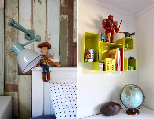
Our brief for Mack's room was to keep it 'boysy' but something that would grow with him, and not be too young. They wanted a fun, eclectic look, definitely nothing matchy-matchy! His favourite colour is orange, but it's unfortunately not Angie's, so we included enough to keep Mack happy, but not to overwhelm his mum.
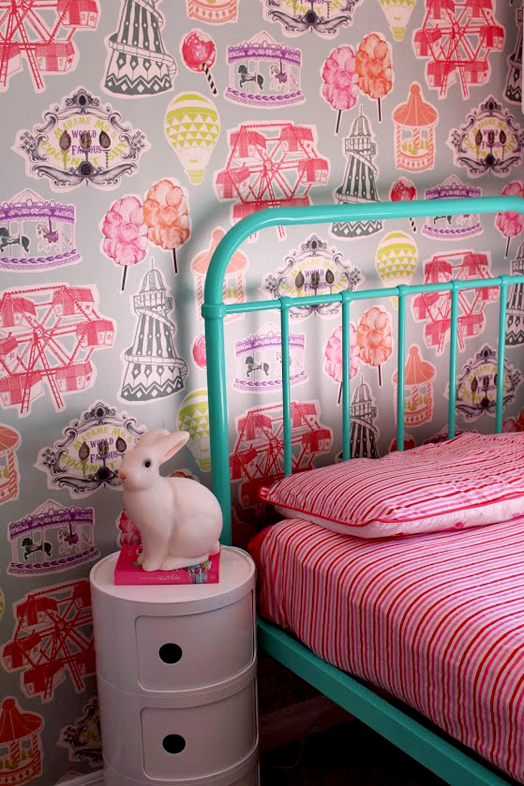
Tilly and Lulu share a room and we used their duvet covers and two existing pieces of art as our jumping off point. The room features two different wallpapers on facing walls, and Angie had the new beds powder coated a complimentary mint green. New light shades and blinds were a must in both childrens' rooms, as well as some new furniture pieces.
I can't wait to show you more tomorrow, so make sure you come back for part two.


