Following on from yesterday's post where I showed you the bedrooms that Dael & I designed, here are the living areas we've designed for Angie and Ryan - our wonderful Bibby + Brady clients. The hallway coming from the bedrooms opens up onto a small landing. Doors off one end lead to the bathroom and laundry, and the other end takes you to the main living areas and entrance.
A gorgeous gold and white Ferm Living wallpaper covers the landing, and a beautiful Juju hat adds texture and a focal point as you come down the hall. At the end of the landing is a small cupboard housing the home office. On our recommendation, Ryan built shelving for the computer, books and filing. It can be closed away behind the door, but the Anna Spiro wallpaper is so gorgeous, it's often left open.
The dining room is the first room you see when you enter the house, and it's also a thoroughfare to the other rooms. We used a large round dining table, big enough for the whole family and more. Round edges mean it's easy to walk around as you head for the landing or living room. The round mat and low-hung light anchor the table in place and makes sure that it's not just floating in the large open space.
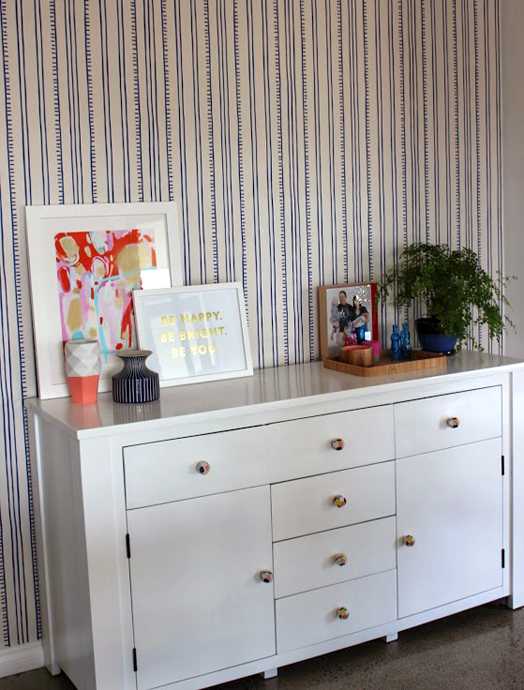
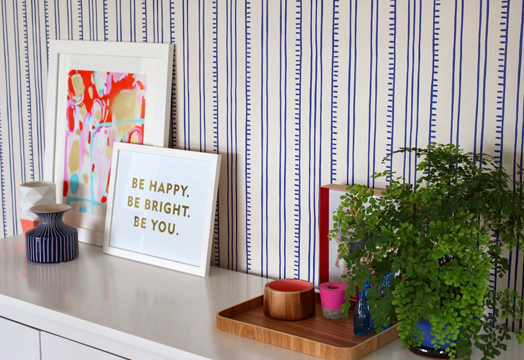
Angie and Ryan transformed their existing cabinet with paint and cute new handles. This provides lots of storage for the busy family and a place to display some favourite knick knacks. Another Anna Spiro wallpaper runs the entire length of the main wall, and it's vertical stripes add a sense of height and space.
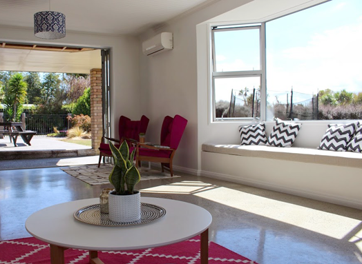
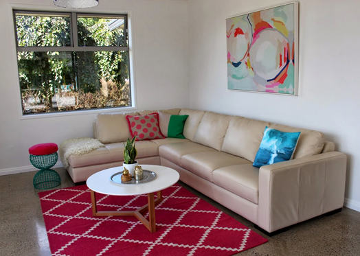
One of the most recently renovated rooms is the open plan living area. Carpet has been replaced with polished concrete floors - really practical with little feet running in and out the large bi-fold doors. Rugs help to zone different areas and soften the concrete. Blinds and curtains are yet to come, but you can see the difference the new white windows make (previously brown aluminium).
I think my favourite space in this home is the entranceway. Angie agreed with me that it's the place to make a great first impression. It was an exciting and, at the same time, truly hard day when we purchased the divine vintage brass console table for Angie and Ryan - I would've dearly loved this in my own home!
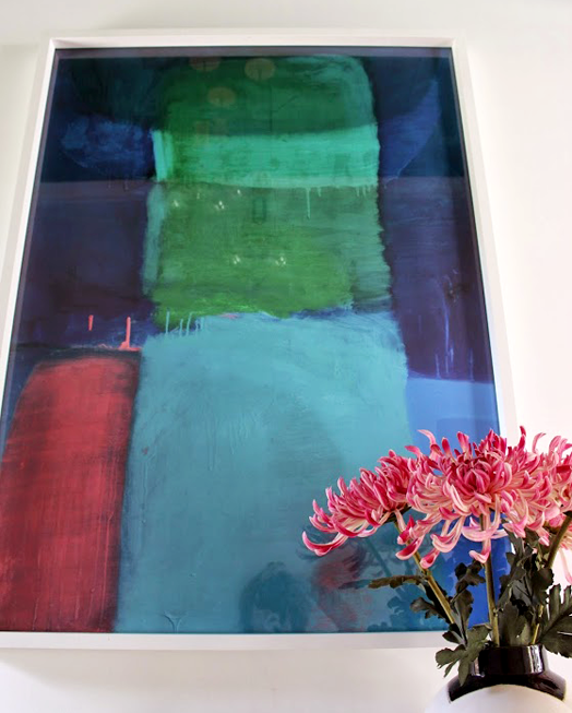
The doorway beyond the entrance creates a small alcove allowing us to paint the entrance ceiling bright Kelly green. It creates a 'wow' and brings a bit of the outside in. You're greeted by a stunning piece of artwork, and a black and white runner that leads your eye inside.
As I mentioned yesterday, there are still a few bits and pieces to finish off, but I can honestly say that the transformation of Ryan and Angie's home over the last year has been massive. If you would like to know where any of the pieces are from, or would like Dael and I to help you with your interior project - residential or commercial - please get in touch. Thanks so much Angie and Ryan for allowing us to share your home - you guys are the best!


