The Block NZ is back on our screens, much to the delight of my three daughters and myself, and I'm sure a lot of you guys too. Aptly named "The Block Villa Wars" the teams were forced to get competitive within minutes of meeting, as they had to choose their favourite house. Strategic thinking back-fired for two of the couples who chose a less desirable house to try and throw the others off their scent. But alas, they were forced to create their guest bedroom in the houses they selected, meaning two couples worked in house 1, and two in house 2. Join me in the coming weeks as I run through each room reveal and give you my feedback.
Taking out the first room with a score of 16 out of 20, and also the first challenge, Taranaki couple, Cat and Jeremy look like the couple to beat at this early stage. Proving that nice guys do indeed win, they have shown some talent and great design flair in their first room.
They based their room design around a piece of art, which is a great idea. The colour palette is soft and relaxing - perfect for a guest bedroom. The cool blues and mint greens are balanced by soft pinks, mustard and lots of blonde wood.
I thought the soft grey wall colour (Dulux Godley Head) with the white trims was beautiful, and brought a modern touch while still keeping the traditional bones of the room. The furniture and light choices were great too. My only criticisms are the mirror could've been twice as big, and I have a pet hate of scrunched up throws! I would've preferred the throw laid smoothly over the end of the bed, or removed all together.
But on the whole, I thought the styling was really well done by Cat and Jeremy, and I'm excited to see what is to come from this couple.
In second place with a score of 13 out of 20 were Christchurch couple, Brooke and Mitch. These guys were keen to show their modern, contemporary style, and although I love a mix of old and new, I think they missed the mark a bit with this room.
I think they should've kept the base of the room more in keeping with the villa style - bigger skirting boards and more traditional looking doors - and then added their modern touch in the furniture and accessories. Also, the bedhead, which is lovely, gets lost against the similar coloured wall behind. A slight contrast would've made all the difference here. Finally, a long low set of drawers would've been a better fit for the shape of the room.
Now to the good stuff! Brooke and Mitch have got loads of potential. The colour palette is great, the seagrass wallpaper adds beautiful texture and is very on-trend, and their workmanship looks excellent. I'm sure we'll see lots of great things moving forward.
Close behind in third place with a score of 12 out of 20 were Auckland duo, Jamie and Hayden. I can tell this team is going to be fun to watch. They're not afraid the push the boundaries and get creative, as they proved with their dark charcoal walls (Dulux Mt Inaccessible) and wood feature wall.
I actually loved the feature wall before it was painted, but I know Hayden was wanting to create an urban feel with the contrasting black and white. What I love is the texture the wall creates. I would definitely utilise the talent of their builder, Martin (Maree and James' builder in Season 3), to the max if I was them.
Even though it's a guest bedroom, this room lacks storage. Although the freestanding wardrobe is cute, it's not quite enough, and built-in storage under the bed would've been much better then the collection of baskets that's there.
Although they styling is a bit basic, I think Jamie and Hayden will get better as they go, and I'm sure they will have plenty of surprises in store for us in future weeks.
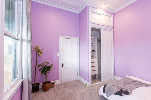
Trailing at the back with a very low score of 5.5 out of 20 were the pint-sized sisters from Hamilton, Sarah and Minanne. It was a tough first week for the sisters who tackled the restoration of their beautiful original battened ceiling, taking a lot of their time and effort.
Unfortunately that left very little time for dressing and styling their room, which left a lot to be desired. Although they made some brave colour choices, they were a bit too jarring!
The only way is up now for Sarah and Minanne, and I really hope we see something wonderful from them in the next room, which is a kid's room - time to get really creative.
What did you think of the first rooms, and have you picked you favourite team yet? Find out more and see all of the room reveals here (as well as where to buy products used in the rooms).


