Modern Bohème

I have a hard time describing my design aesthetic mainly due to the fact that it's several styles merged together. I love a global, Bohemian vibe, with a touch of luxe, a bit of Zen, and a tiny bit of traditional influence. When I came across the beautiful home of LA interior designer Katie Hodges recently it made me smile - "Modern Bohème" is what she calls her style. She likes to mix contemporary design elements with her love of vintage, Bohemian textiles. I think that fits me well too.


When you're an interior designer, you work on lots of clients' homes, all with differing aesthetics and lifestyles. Your own home is the truest representation of you, and the key is to create a home that makes you happy. "There's no better feeling than waking up every morning being surrounded by things you love," says Katie.


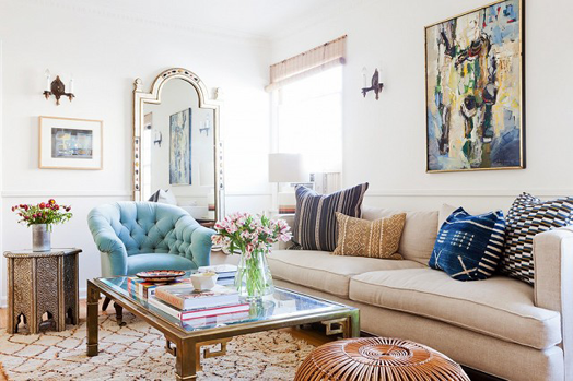
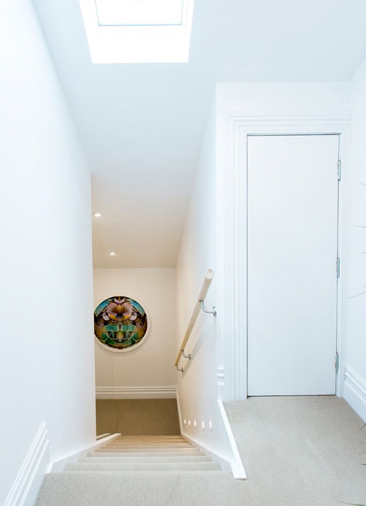
Katie's aim was to create a space that was inviting and warm, layered and collected, yet modern and clean. She truly is a girl after my own heart!


Even though she is only renting this one bedroom apartment, Katie plans to be here a while so she decided to have a dining banquette built-in. Although she won't be able to take it with her when she moves, she enjoys every single day that she gets to sit at it.


The little dining area is the space that really epitomises her - cushions covered in vintage textiles sit happily with the clean, modern lines of the Tulip table and Bertoia chairs.


With no wardrobe in her bedroom, Katie has cleverly installed an Ikea wall unit to house her shoes and accessories. It's slim form and white cupboards means it disappears into the wall and allows the shoe collection to shine.


photos by Amy Bartlam


If you'd like to see more of Katie's home pop over to My Domaine. In the meantime let me leave you with more of her wise words... "When you truly love the foundation pieces you own, the rest comes naturally".

The Block Villa Wars | Laundry + Stairs Reveal

The contestants on The Block Villa Wars thought laundry and stairs week was going to be easy compared to past weeks, but it turned out to be a really tough one for most. Brooke wasn't happy when her laundry failed to be installed first, which put all her tradies behind schedule. She caused a bit of a stir by storming off the site, but came back composed. A mis-measure meant their hero piece (an American oak feature wall by their stairs) was too short, and their builders were forced to do some quick thinking to come up with a solution. Despite all this drama the pair finished the week with yet another win.

Brooke and Mitch: 1st place | 18 points

With an extra large space, Brooke and Mitch were able to add a small powder room next to their laundry, which is a definite bonus for buyers. The laundry space is clean and functional, but once again (in my opinion) lacking any kind of "wow".


I love American oak, so I do like the feature wall, even with the tacked on piece at the top. The stairway is clean and tidy, but screaming out for some beautiful art on the wall, don't you think?


Sarah and Minanne: 2nd equal place | 16.5 points

Bridesmaids again, the girls came equal second with Cat and Jeremy. I like that they used black marble tiles as their laundry splash back, which ties in with their main bathroom. Loads of bench space makes it very functional, but it's still a little underwhelming in terms of style and design flair.


Another wood feature on the stairs, but as Sarah and Minanne don't have as big a budget as Brooke and Mitch they had to use a more cost effective pine. It still looks great, and adds warmth and texture. Space at the top of the stairs has been turned into a study nook. It's a good thought to utilise the space, I just wonder whether you'd want to study or work in this particular spot. I'd rather have a beautifully styled console table with a piece of art that would make me smile every time I came up and down the stairs.


Cat and Jeremy: 2nd equal place | 16.5 points

These guys usually have a bit more flair than the others, and remain my favourites because of that. They certainly haven't gone crazy in their laundry either, but have some nice touches like the washing basket, the hooks on the wall, and the little space under the washing machine and dryer for shoes.


Cat and Jeremy also had room for a small bathroom, and I love the repetition of circles in their mirror and the artwork on the stairs. Love the choice of artwork (they've used art as a feature throughout their home), and the scale is great, it's nice to have something substantial as a focus in the stairway.


Jamie and Hayden: 3rd place | 15 points

You have to give them some credit - they are often coming in at the back of the pack, but each week they say that "this is their week", and they haven't been swayed from their black and white theme. The addition of a large fridge in the laundry will be appealing to buyers, and all four of the laundries are fantastic in acting as mudrooms where bags, shoes, sports gear etc can be stored before entering the rest of the house.


Jamie, acting as project manager, butted heads with her builder this week, but they managed to put their differences aside and finish all of their spaces.


All of the teams' spaces are functional, clean and tidy, but am I the only one wanting more?! I know budgets are tight for some teams, and the timing for all is insane, but everyone seems to playing very safe. Perhaps because Brooke and Mitch are winning continuously with their minimal look, the others teams are adopting this look too (?) I'm a big believer that small spaces like toilets and laundries should have personality too. Because you don't spend long periods of time in them, you can afford to be a bit adventurous - bring in wallpaper, pattern, colour, life. Maybe this week :)

Blue & White at The Bach

I absolutely love the combination of blue and white - it's fresh, it's classic, and it's timeless. It's also a great colour choice for a bach, and if done right will give a chic, relaxed look. Team it with white panelled walls, warm wood and natural textures and materials.


via


This home in Sweden is a great example of how to use blue and white to create an airy, comfortable and inviting space. My favourite spot is the back bedroom with bunk beds covered in classic checked linen, and a little curtain for privacy.


Another Swedish home, I absolutely love this one with it's shots of pink to warm up the blue and white. The use of old pieces of furniture, flea market finds, and fabrics picked up on travels tells a great story about this home.


If you have a holiday home, or you want this relaxed feel in your own home, try using blue and white ticking fabric, plaid and checks, paisley and ikats. Lots of white panelling, touches of wood and leather, and blue and white ceramics.