
Sunday night gave us our first insight into the design style of the four new Block teams, and I was pleasantly surprised. The first week can be tough as contestants are still finding their feet and have so much to learn, but some great rooms were revealed. Week 1 was almost like a trial run, as all four teams worked side by side in House 5, leaving Peter Wolfkamp's team to prepare the other four houses for the following week. The 'Girls vs Boys' theme saw the two girls teams' scores combined, and the two boys teams' scores combined for this first week. The girls came out ahead giving them a total prize pool of $10,000, and when the top scorers, Niki and Tiff, were given the opportunity to choose how they split the winnings with Emma and Courtney, they very diplomatically split it 50/50.
Niki and Tiff: 1st Place - 16 points (8 from Fiona and 8 from Paul)
The girls seemed to cruise through their first week on The Block with fantastic organisation and budgeting skills taking a lot of the stress out of it. Each team was told that they must use wallpaper in their room, and Niki and Tiff played it pretty safe using a very subtle white textured wallpaper on the wall around their living room window.

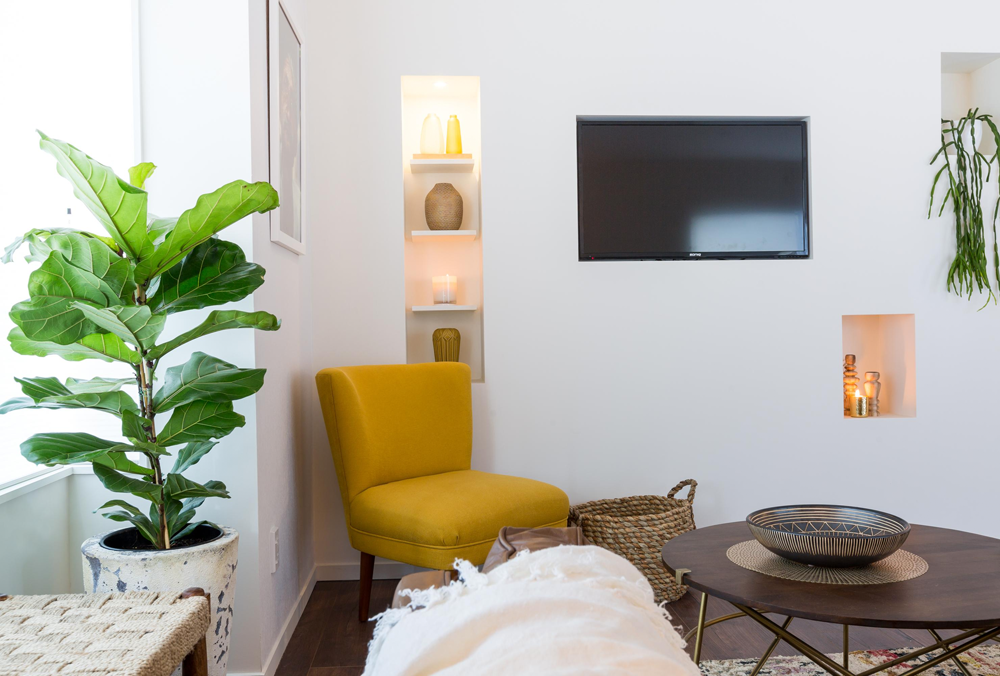
They chose a tribal theme using a beautiful earthy colour palette. I love the use of texture, their furniture choices, and their styling is pretty good too. The only criticism I have is that, although I like the tall inset shelving to the left of the TV, I don't feel the smaller ones on the right were necessary. They feel a bit random and 'bitsy'. Oh and if I'm being really picky, I would've liked the rug to be a bit bigger. But overall, a great effort, I look forward to seeing more from these two.


Emma and Courtney: 2nd Equal Place - 12 points (5 from Fiona and 7 from Paul)
Emma and Courtney were also very organised and calm in their first week, and they did a great job on the master bedroom. Another subtle wallpaper choice, the textured charcoal wall adds depth and a bit of drama to the room. I like the girls headboard, bedside tables, and lights. With the dark wood and touches of brass I think the wall would've looked even more stunning, and a nicer tonal contrast if it was a deep moody blue.


Beautiful texture introduced in the throw, pillows, plant, wall hanging and curtains helps to add softness. Although it's hard to see in these photos, what let the girls down were a few details like door handles not being attached, and the wardrobe not being finished inside. But on the whole I really like this room.


Dyls and Dylz: 2nd Equal Place - 12 points (6 from Fiona and 6 from Paul)
These boys surprised me the most. As a couple of qualified builders I knew they had that side covered, but I wasn't sure how they would go with the design. They did some really nice things with their dining room - far too much wood going on for my taste, but they did a fantastic job with the soft white linen curtains hung right from the ceiling, which help to soften the room. I like the idea of the wood wallpaper (although that isn't my favourite design), but a contrast in the table would've been nice, maybe a wooden base with a white top. Or keep the wood table and choose a different wallpaper.


The rug is a nice touch to ground the table, but it's far too small. You should be able to sit all of your chairs on the rug, and be able to pull them out without getting tangled in the edge of the rug. A round or smaller square table would've worked better in this space, and I think a big statement piece of art on the wall would've looked amazing instead of those little inset shelves (and help to break up all the wood). But the light is pretty cool and I think the boys did well with styling the table too.


Sam and Emmett: Last Place - 5.5 points (2.5 from Fiona and 3 from Paul)
Poor Sam and Emmett, they definitely had the most stressful week, falling behind the other teams in terms of progress, and they tried really hard but didn't quite make it with the design. Their builders came up with the idea of setting the bed back into a niche in the wall and surrounding it with shelving, and this works really well, as does the window seat, which I love. But the choice of wallpaper was atrocious, and the wall colour wasn't great either. I applaud the fact that they wanted to use colour, but perhaps a deep teal for drama, or a really soft duck egg for a peaceful feel would've been better.


They chose the same bed as Emma and Courtney, but although it's very nice, it's fighting with the wallpaper and blue shelving. You should choose one thing in your bedroom to be the hero - maybe the headboard, or a piece of art over the bed - and everything else should compliment it. The boys also had a lot of poor finishes due to a race to finish the room in time, but they did complete their wardrobe inside, and I love their little desk. Hopefully it's onwards and upwards from now for these boys.


The final twist for the week was the key and padlock... As the winners of the last challenge, Sam and Emmett were able to choose whether they took the padlock to lock their house and keep it safe, or the key to steal another team's house. Genuine nice guys, they opted to take the padlock. BUT... the key was then, controversially, accepted by second place getters in the challenge, Emma and Courtney. This is the first time in all of The Block NZ history that anyone has chosen to take another team's house, and let me tell you, it didn't go down well with Dyls and Dylz! It was their house that Emma and Courtney brazenly took. How will this play out? Has it started a war, or will the Double D's see it for what it really is, a tactical move and nothing personal? We shall see. Check out more on the TV3 website, and come back here in a weeks time for our next roundup.


