Favourite Space | Hayden Borrie

We’re starting 2019 with one of our “Favourite Space” blog posts, where we introduce you to another one of our clever and creative friends, and show you the space they most love to hang out in. Last year we had a meeting with Hayden Borrie after several people suggested we should meet. And they were so right… you see, Hayden is this super talented guy with an engineering and design background, and he was busy developing a range of beautiful products suitable for both residential and commercial environments. It wasn’t long after our first meeting that we employed his services to help us create a stunning black steel shower frame for a client of ours (we hope to have photos of this soon for our portfolio). Since then we’ve worked on other projects with Hayden and look forward to many more.

For this shoot Dael and I headed out to Hayden’s home with our photographer Florence in tow to photograph his family room. Hayden shares his home in the Esk Hills with his wife, Megan and their two children Roman, 6 yrs, and Fern, 3 yrs. Hayden and Megan bought the section after returning from London, and proceeded to do a huge amount of work on it themselves. They hired architect, Andrew Young, and local construction firm, Robinson Built, but also had a lot of input into the design process. Megan managed the project and all the tradies, and the couple designed the kitchen, installing the island bench themselves, as well as tackling all of the painting and landscaping.

Hayden’s range of self-designed shelving and storage is called smpl. - born out of the desire to create a shelving system for his own home. Longevity was an important factor so they are built to last with powdercoated steel frames and shelves; and wanting a sense of cohesiveness throughout his home, the range also includes bathroom accessories.

Not restricted to residential, the smpl. range is great for commercial settings as well. Hayden designed and installed the shelving at our favourite local coffee establishment, Crazy Good (see below).

Right Hayden, time for a few questions so we can get to know you a bit better…

B+B - What is your favourite space?

HB - It’s what we call our 'family' room, but it’s really just all one big space including the family room, kitchen, dining and lounge.

What do you love most about your space?

The 'openness' of the view out to the north west, while being hunkered into the hill to the east; and it feels like the heart of the house.

What do you love about what you’ve created for Crazy Good?

Modularity and 'the system' (you'll probably hear me say that a lot). It's going to need a bit of customer learning, but the system in CG would equally be at home in a commercial environment or residential housing.

What’s your favourite time if the day?

Late evening. That's when the gears start turning, and can easily go into the wee smalls :) No distractions (I love my family, really), and you can just get on with it.

Who or what inspires you?

Simplifying unnecessarily complicated products and processes. I’m not a big fan of superfluous details, rather I prefer basic 'functional aesthetics'. I love modularity and re-use of components through a design. 

George Nelson would be one of my main influences. He's one of the originators of American Modernism, and I love the simplicity in his products, particularly during his time at Herman Miller. Yes, he may have taken credit for a few too many designs of others (!), but there's no doubt he pushed design into places it hadn't been before.

What are you reading/listening to?

I’ve been listening to 'The Roots' lately for designing, and 'Royal Blood' for hard work! Reading even for fun is usually pretty technical. :)

Sweet or savoury?

Definitely savoury!

Favourite drink?

Pour-over Chemex coffee, black.

Favourite item you own?

My Chemex pour-over 6 cup. I like the precise process of it, and that it’s the same every single time.

What are your goals for 2019?

To develop my smpl. product range further, and to continue to provide 'fresh' solutions for custom interiors (mainly from a manufacturing perspective)

Oh and do more mountain biking and fishing!

Thank you so much Hayden for allowing us into your home. To all our readers, make sure you go and check out Hayden’s website to learn more about his smpl. range, and follow him on Instagram and Facebook to keep up with all his new work and product design.

Neighbourhood Eats Cookbook

Introducing this beautiful cookbook filled with treasured family recipes from the Napier Central School neighbourhood…

Dael and I are thrilled to have played a small part in this beautiful cookbook, “Neighbourhood Eats”, which features mouth-watering, tried and trusted recipes from the Napier Central School community. The book is a school fundraiser to raise money to help save their school pool, which needs major refurbishments.

I know when you envisage a school cookbook you might think photocopied pages and spiral binding, but not this cookbook! Neighbourhood Eats is the most beautiful hardback book filled with 275 recipes and more than 300 incredible original photographs shot by our favourite photographer, Florence Charvin.

Every family has at least one or two favourite recipes. You know the ones handed down from your grandmother; the ones that have a story that goes with them, and a history; the ones that have been experimented with and adjusted until they’re just right. Put together in one stunning book, the recipes and the stories in Neighbourhood Eats will make their way into your kitchen and your heart.

The recipes in this book are a perfect reflection of the cultural diversity found at Napier Central School. As well as Kiwi kids, they have pupils whose backgrounds include Thai, Swedish, Scottish, Malaysian, Japanese, Indian, Australian, Irish, Middle Eastern, Greek, Italian, and German, to name a few. Also scattered through the book are recipes from some well known New Zealanders - Jacinda Ardern, Peter Gordon, and Jospeh Parker have all donated their favourite recipe.

Behind the scenes there has been the most incredible group of people working tirelessly to make this book a reality. A group of volunteer cooks made up of mums, dads, grandmothers and teachers, cooked all of the recipes. Members of the Napier Central PTA organised and oversaw the photoshoots, liaised with the graphic designer, recruited sponsors, organised printing, donating their time all in an effort to help their childrens’ school.

The name Neighbourhood Eats came about because of the huge effort put in from the whole community - parents, teachers, pupils and local businesses. Sponsorship support from a large number of local businesses covered all of the production costs, which means that 100% of the profits can go directly into the Napier Central School “save the pool” fund. Between us Dael and I have five daughters, all of whom are past pupils of this wonderful school, so we were very happy to be able to help with this project, sponsoring the ‘soups and breads’ chapter.

The Neighbourhood Eats cookbook costs $45 and can be ordered from their great looking website (built by Kathryn McGarvey). What a brilliant gift it would make, so why not grab a few copies for your mum and your sister too, knowing that you’ll be giving a fantastic gift as well as contributing to a worthy cause. I’m sure these are going to fly out the door, so don’t miss out, order your copy today.

Te Awanga Home Design

October was an exciting month for us with the home of one of our long-time clients being photographed for the latest NZ House & Garden magazine. We worked with these clients over a three year period. The first year was dedicated to Chambourcin Cottage, and the next two we slowly moved through their main home, room by room creating a cohesive look. The cottage and the main house are only metres apart.

Both houses were architecturally designed by Steve McGavock, who was the protégé of renowned architect, John Scott. It’s a really special property with a lot of the trademark features found in a John Scott home - high vaulted ceilings, large pivot doors with rimu knob handles, rimu architraves and trims. Set on its own vineyard, the main house is designed so that all of the bedrooms, the living and dining rooms overlook it. There are two wings with the master bedroom, ensuite and ‘snug’ at one end; the office, guest bedroom and bathroom at the other; and the kitchen, laundry, living and dining in the middle.

We used Resene Merino on the exterior of the home to tie in with the cottage opposite. Merino is a light and versatile off-white, and we wanted a freshness without it being too glary. We looked at several different colours for the front door. It was initially painted hot pink, but after much deliberation it was re-painted a golden mustard. We had the outdoor rug custom made to fit the front porch.

Before1.jpg

All of the windows had the original rimu curtain tracks and we wanted to keep these beautiful details. But we did replace the curtains throughout with beautiful soft linen from James Dunlop. The inside entrance rug was also custom made to fit the space. Every room has it’s own rug, all Armadillo&Co from our friends at The Ivy House.

Before2.jpg

It really was a blank canvas for us when we first began this project. We had already explored a lot of the design choices for the base of the house when we designed the cottage. The main living area walls were painted Resene Half Merino, and the dark brown beams painted a sharp black. All the carpet was ripped up and the concrete floors beneath polished.

We commissioned local artist, Billie Culy, to create the stunning artwork in the living room. Billie worked closely with us and our client, Kim, using a colour palette we supplied her with to fit perfectly into the space. We had chosen a Billie Culy piece for the cottage, so it was nice to have that connection between the two houses. The large orange and white rug was also custom made by The Ivy House, and its job was to zone the living area and anchor the furniture.

Before3.jpg

We custom made the window seat squabs and all of the cushions. Every furniture piece was carefully chosen to suit the style of the home, including the vintage Ole Wanscher rocking chair from Mr Bigglesworthy, which we recovered in a mustard wool.

A ladder against the back living room wall leads you up to a cute little loft area which looks down over the living and dining rooms and out to the vineyard. We chose a smart navy blue for the cupboard door and Bruce, our client, painted this along with all of the walls and beams.

Before5.jpg
Before4.jpg

We had a sofa custom made in soft grey linen to fit the space, and added some simple furniture pieces to turn the loft into a place to escape with a good book or a glass of wine (although not too many, as you have to navigate the ladder on the way down).

The loft overlooks the dining room. The linen curtains we had made are so gorgeous. We kept them really simple to work with the clean lines of the architecture, and so as not to distract from the views. The vaulted ceilings meant they had to be a super long drop and they hang off the original rimu tracks.

The dining room also has spectacular views over the vineyards and out to the hills beyond.

Before6.jpg

Because the living and dining rooms are open plan we helped to zone the dining area with a stunning big David Trubridge light above, and a luxurious hand woven midnight blue rug anchors the table. When using a rug under a dining table you need to make sure it’s large enough to pull the chairs out whilst still remaining on the rug.

Before7.jpg

After much deliberation our clients opted to keep the kitchen as it is - the rimu cabinetry is synonymous with the John Scott style. We added some lighter chairs around the breakfast bar. The artwork (below) opposite the dining table is part of a triptych that we had commissioned by textile artist, Jane Denton. We chose a Jane Denton piece for the clients’ cottage, and Kim loved it so much we knew we wanted to incorporate her work into the main house too.

The fireplace in the living room was removed quite early on and made the flow through to the end of the house so much better.

Before8.jpg
Before12.jpg

A beautiful large pivot door separates the living room from the ‘snug’ and master bedroom. The deep teal we chose for the walls of the snug allows the door to stand out, and looks amazing behind the painting we bought from Amber Armitage.

Before9.jpg

With a lot of different textures combined in the fireplace, we decided to simplify it by plastering over the red bricks at the base and painting them black so the fire disappeared into it. We then added a feature tile on the hearth and framed it with rimu.

Before10.jpg

The ‘snug’ is the room that gets the least amount of natural light, and our clients use it to read or watch TV in the evenings. Rather than trying to lighten the room, which can often look a bit flat, we opted to paint the walls a rich, dark teal. A large, plush mustard rug compliments the blue walls and adds cosiness.

We added new linen curtains, a pair of super comfy and stylish armchairs from Hutchinsons, and an antique brass coffee table from Soren Liv. The side table was custom made by WRW & Co. along with a small TV unit (not pictured).

On the adjacent wall we placed a beautiful brass bar cart under our clients print to help ground it.

Before11.jpg

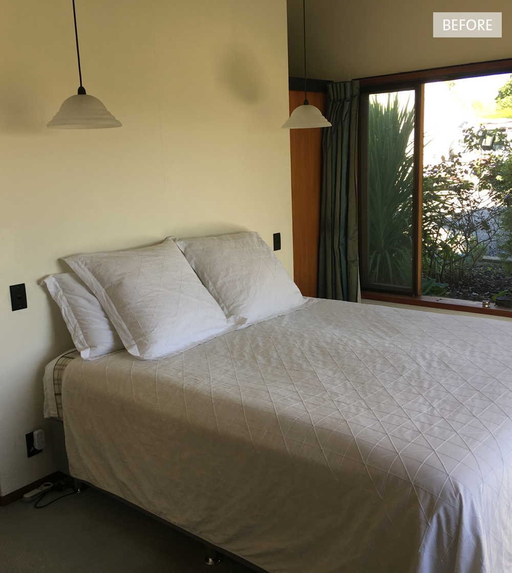
Tucked behind the ‘snug’ and to the side of the living room is the master bedroom, which has ‘his and her’ wardrobes behind the bed. We put a green and white wallpaper on the back wall to reflect the views outside the windows, and brought some warmth in with amber bedside pendants and cinnamon coloured linen from Thread Design. The bedspread is from Seneca, and the custom made cushion pulls all the colours together.

The other wing of the house consists of this small bedroom (below) which we turned into an office, as well as a guest room and guest bathroom. We re-carpeted both of the bedrooms and the office, but still added rugs to each for extra luxury.

Before13.jpg

We painted the walls in the office and guest bedroom a soft and peaceful duck egg blue. We love it here teamed with one of our favourite pink sofas, custom made cushions, and a map of Maine (where Kim is originally from). The touch of black in the lamp and side tables adds a bit of weight and links to the black beams.

photo: Florence Charvin

Before14.jpg

The guest bedroom has new linen curtains like the rest of the house, new bedside tables, a rug, and beautiful new bedding. Other touches are the pottery wall light and pendant we designed, and bench seat (not pictured).

It’s been quite the adventure, and a real pleasure working with Kim and Bruce on their amazing home and their cottage. She really is a very special property and we will miss her! Make sure you check out our blog post about the journey we took with Chambourcin Cottage.

All photos (other than ‘before’ photos) taken by Florence Charvin for the November 2018 issue of NZ House & Garden. With thanks x