What we want to see more of in 2025

2025… it feels like an auspicious year, a quarter of a century! Over the last week I’ve had a lot of fun scouring the internet to get some insights into what this year may bring for the world of interiors. I am so inspired and so excited to let you know that one of the main themes seems to be individuality and authenticity. With everything that has happened over the last few years and with what the world is facing, our homes, more than ever, are our havens. They need to reflect our own unique style and be less cookie-cutter. Our homes should be filled with history, character and personality, a place to recharge and fill our cup.

Whilst we don’t necessarily like to follow trends, we prefer our designs to be timeless and ageless with a sense of permanence, there are definitely some slow-burning design characteristics that we are loving and will look to introduce, or continue to use in our designs.

The Pantone® colour for 2025 is Mocha Mousse. A warming, brown hue imbued with richness, it nurtures us with its suggestion of the delectable qualities of chocolate and coffee, answering our desire for comfort. Combining this colour with warm creams, dark chocolates, and burnt coppers is a beautiful answer for those who love a neutral colour palette.

We’ve been moving away from a palette of more cool grey based tones for several years now. The use of these warm tones is cosy and welcoming, like a warm hug.

There are no straight lines in nature and we’ve always loved to work with circles and curves in our designs. It’s a wonderful way to soften the lines and angles found in most architecture - walls, windows, doors - although even a lot of these are being created in arches and soft curves right now. We’re continuing to embrace this attribute as more and more of our suppliers are producing stunning curved furniture and accessories. With an amazing group of skilled furniture manufacturers and contractors at our fingertips we can custom design pieces if we can’t find exactly what we want. The curved and organic forms emphasise the warm, comforting environment that people are craving.

Alongside natural form we continue to love natural materials like wood, wool, linen, stone etc. But we’re juxtaposing those earthy textures with the gorgeous shine of metal and glossy, highly lacquered paint finishes.

Another thing that I’m so happy about is the normalisation of rich, deep colours in our interiors. This is especially exciting for those of us who crave a touch more colour in our homes. Colour can be just as sophisticated as the beautiful neutral palettes of above. I’m seeing a lot of rich reds, burgundys, and deep, browny pinks, as well as our favourite earthy greens and steely blues.

The high gloss paint finish on the cabinetry in this room is contrasted with the dryness of the velvet sofa and the wool rug. And take note of the built-in bookshelves, as custom built-in furniture is another feature we’ll continue to see in 2025.

Coloured kitchens are here to stay, no longer do you have to stick to plain white especially now we’re using a lot of integrated appliances that are hidden behind cabinetry doors. A lot of kitchen cabinetry is designed to look more like furniture.

Natural elements like wood and stone are still popular and look stunning surrounded by rich colours. Don’t forget that art isn’t confined to the living and bedrooms, bringing artwork into traditionally utilitarian space such as kitchens, bathrooms and laundries is a way to emphasise your personality and individuality.

Just another way we’re seeing curves used in our homes is the resurgence of bullnose bench tops. They provide a smooth, comfortable surface to lean against, accentuating a sense of warmth and safety in our homes.

In the bathroom below they’ve used a double bullnose bench top and repeated the look at the top of the splash back. In both images the combination of green with dark brown wood is divine and borrowed straight from nature.

Combining red and green together might be a scary concept for some, but because they’re complementary colours it makes perfect sense. I love the boldness and playfulness of the kitchen below, it’s a great example of the unique, personality-driven design we hope to see more of. The burgundy and cream glossy tiles surrounding the cooktop are the hero, and complemented beautifully by the sage green cabinets and peachy pink walls.

The use of scallops, ruffles and curved edges will be prevalent this year. Using them in small touches such as lamp shades and cabinet handles is a great way to introduce this look into your home. There’s an emphasis on hand crafted pieces, treasures and trinkets in your home that bring you joy and spark memories.

Built-in furniture will always make a home look more finished and intentional. We’ve transformed many of our clients’ homes by designing custom built-in pieces to fill nooks and small spaces. Storage is always welcomed, especially clever storage that utilises the space well. The cabinetry below in a child’s room is not only fantastic storage, but showcases what we want to see more of - bold colours teamed with pattern and personality. They key to mixing this much bold colour is to keep the palette reigned into three or four hues, in this case - red, green, blue and yellow.

Maximalism has been on the rise for a couple of years. The look we’re loving hints at maximalism… less cluttered, more brave and unique. The use of bold patterns; embellishments like ruffles, fringes and piping; sculptural forms and colour drenching.

To summarise, be bold but exercise restraint. Add curves, softness and fun into your home. Surround yourself with things that bring you joy. You do you! And if that means a disco ball inspired rangehood in your kitchen - go for it! I hope you leave this blog post filled with inspiration and excited about the possibilities.

Bazaar Boutique | Before + Afters

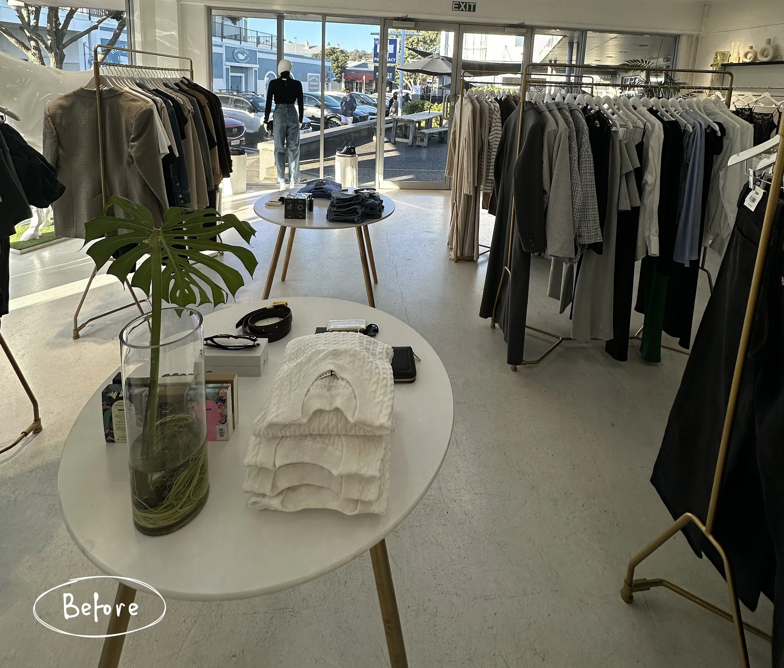
Bazaar Boutique is a luxury fashion store based in our local neighbourhood, the seaside village of Ahuriri, Napier. It’s always been a treat to pop in and see what beautiful clothes and accessories are in-store, and we’ve had a special interest in the business since it was started by two young women in 2012, the same year that we started Bibby + Brady.

In 2023 the business was bought by Vicki Meech who was excited to merge her business experience with her love for beautiful clothing. Naturally Vicki wanted to put her mark on the store and give it a makeover. Working with local company, Your Solutions, who are specialists in commercial fit outs, the plan was to renovate as quickly as possible so as not to have the doors closed for too long.

We worked closely with Vicki on the design and new look. We chose a beautiful warm white paint from Aalto Paint for the walls and a slightly deeper shade for the floor, which was then sealed. This provided a beautiful neutral base to layer all of the gorgeous clothes and accessories on to, allowing them to shine. The new paint colour infused with subtle tones of raw umber and yellow oxide pigments, brings a soft welcoming glow to the space.

One of the most noticeable changes in the space is the relocation of the counter and the dressing rooms. Previously the check-out area was a large table to the side of the entrance with the dressing rooms on the far side. The table was a good size for display on top, but the space beneath was underutilised and lacked storage.

Now the counter is positioned in prime position straight ahead of the entrance. The scalloped front and sides adds subtle texture and hides the open shelving on the far side which is perfect for storing the printer, bags and much more.

When you stepped out of the dressing rooms previously you were visible to anyone in the shop. Removing the old dressing room walls and building a new one facing the back wall provides a lot more privacy.

The curved wall adds a softness, which is important in a small space where you want customers to be able to move around freely. The curves were repeated in the arched doorways and the mirrors on the opposite wall.

You can now open the curtains and use the mirrors inside and outside of the dressing room to see your outfit. Even if you step out you’re still tucked away from most of the store if you prefer your privacy. We used stunning linen fabric from James Dunlop for the curtains and luxurious wool carpet underfoot from Bremworth.

Another custom joinery piece sits in the middle of the store. It provides a place to display some of the accessories with more valuable storage below, and is also a lovely point of interest for customers when they first arrive.

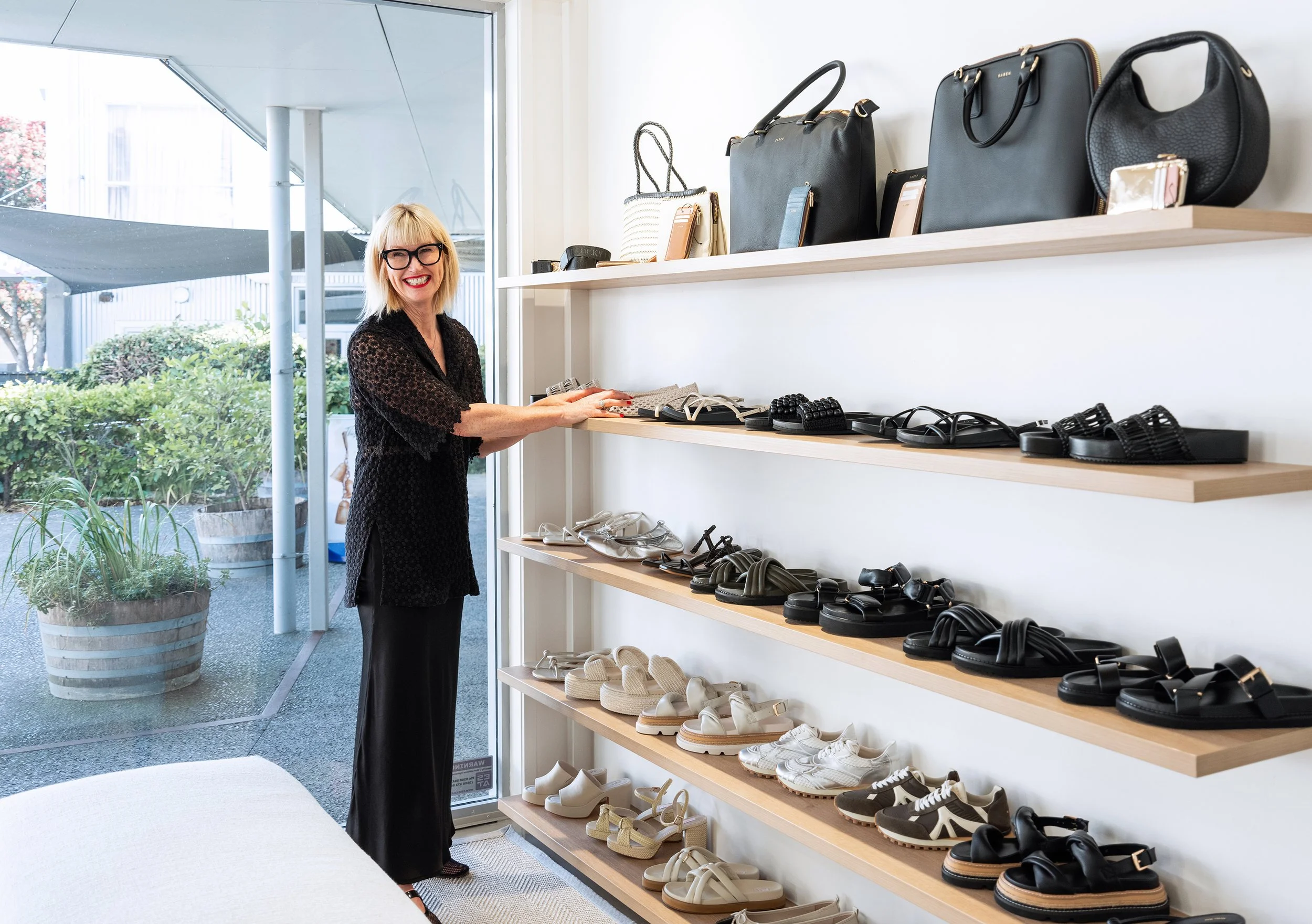
Lastly, new shelving was added to display jeans, handbags and shoes - staple pieces in every girl’s wardrobe.

Working with Vicki and helping bring her vision to life was a joy. If you’re in Napier make sure you pop into Bazaar Boutique, there are exciting new things arriving all the time. Vicki, Krissy and their team will would love to help you find your perfect outfit. You can see all of the photos of the newly renovated store in our portfolio.

Priestley Renovation | Before + Afters

One of our favourite things to do is to work with returning clients. It means we’ve already developed a relationship, learnt how they live and what they like, and that a trust has formed between us. We had designed a dining room, living room and sunroom for this family five years ago, so it was wonderful to be called back when they were ready to renovate their kitchen and a small living space off the kitchen.

The clients’ brief included a more functional kitchen space where they could have more than two people in there at a time, and an allocated area with power for their coffee machine. They also said the current desk off the kitchen wasn’t working with the curved top, and the living space was used all the time but they knew it could be better.

The space plan we designed shows the removal of a door into the dining room to allow for an extra large pantry. To the side of this we left an area for the coffee machine, and the existing window was to be replaced with a longer picture window creating a more balanced and aesthetically pleasing look. Although our clients were initially unsure about removing the dining room door, they now fully appreciate having much more storage space, and it’s only an extra few steps to use the neighbouring door.

Our 3D visual made it easy for our clients to imagine their new kitchen

The kitchen before with a smaller window and bench top and exposed rangehood

A progress photo shows the new window installed

The clients liked the colour of their old walls but we decided to use that as inspiration for the lower cabinetry and keep the walls and upper cabinets white for a lighter, more spacious feel. We replaced the exposed rangehood with a powerpack concealed behind a cupboard with additional storage cupboards either side. By painting them white and keeping them handle-less they almost disappear making the newly enlarged view the hero. We worked alongside our joiners, Classic Kitchens, who created and installed the kitchen and living room bookshelf to their usual high standard.

Previously the coffee machine took up precious workspace on the bench

The removal of the dining room door made it possible to fit large pantry storage next to the fridge and still leave a space for the coffee machine. Tucking it around the corner leaves plenty of room on the main bench for food prep and dishes, and it’s a lovely space for our clients to make their coffee while taking in the amazing view outside.

The door to the left was removed leaving the door to the right as the remaining access to the dining room and hallway

We removed the existing flooring of tiles and carpet and ran wood flooring throughout the kitchen and living room. By having the same flooring in both spaces it creates a much better flow and sense of spaciousness.

Our 3D visual

The existing kitchen had a small desk running between it and the living room, but the curved desktop meant it wasn’t terribly practical. We had the option of using the space for an additional storage cabinet, but the clients decided that they would like to keep it as a desk if it was more usable.

The desk before, and then removed awaiting an upgrade

The living room is a lovely space with an existing deep built-in window seat. Despite having two other living areas, the family spend a lot of time in this room. We knew we could make it more inviting and functional with the right furniture and layout.

The old furniture felt a bit disconnected, we immediately wanted to pull everything closer together

Our 3D visual

We recovered the window seat in a smart olive green indoor/outdoor fabric, as it gets a lot of sun, and placed a comfy two seater sofa opposite to create a cosy social setting. A custom wool rug was made to fit the space and ground the furniture so it didn’t feel like it was just floating in the room.

We included lots of curves in the furniture to help with the welcoming, cosy feel. The wooden coffee table and side table both have a gorgeous chunkiness to them. Although it might sound counterintuitive, overscale furniture, art or fixtures can actually make a space feel larger rather than smaller, and they evoke an air of warmth and comfort.

In the living room before everything was pushed to the edges of the room leaving a large empty space in the centre.

On the back wall there was a recessed nook which our clients had filled with a freestanding bookshelf. We designed a built-in bookshelf to replace this. Built-in cabinetry will always look more polished and purposeful and will elevate your room. We kept the cabinetry consistent with the adjoining kitchen for a sense of cohesion.

The freestanding bookshelf fit the space quite well but looked a wee bit messy

Having cupboards at the bottom allows practical storage for items our clients don’t necessarily want on display, with the top shelves perfect for displaying some favourite pieces.

The finished result is a space that is highly functional for the family of four (plus the four legged family members). But it’s not all about practicality, you also want your home to look great and be inviting. As we like to say… A well-designed home sets the stage for a life well-lived. It promotes well-being and allows you to relax, recharge, and re-energise.