When I first heard that The Block teams had their entranceways to complete, I thought it would be a fairly easy week. But once I realised that it also entailed their stairways and additional landings and hallways I knew it was a much bigger than I first anticipated. It turned out to be the hardest week so far and not one of the teams were able to complete their spaces in time.
Dyls and Dyls won the "Block Stars" challenge with their acrobatic routine which gave them the ability to completely knock out another team from judging. It was no surprise that they chose front runners Niki and Tiff, which was a good call as the girls once again got the highest score. Emma and Courtney won a game changer challenge during the week which gave them the "-1 point" and they used that against the Double D's. So finally Emma and Courtney won a room reveal - even without playing the -1 the would've just pipped D+D.
Emma and Courtney: 1st place - 10 points (5 from Fiona and 5 from Paul)
The scores were all on the low side because there was so much left unfinished, but 10 points was enough to won this week. The repetition of black accents was nice in the girls' entrance. I like the clean lines of the console and the large round mirror which is a nice contrast to all the straight lines. Even better would've been a runner and a little bit more styling on the console, but that can all be added.

I like the mix of materials used on the stairs - wood, glass and chrome. Judge, Paul Izzard, really seemed to enjoy this week's judging with all of the architectural elements, and I agree that the slight overhang on the stair treads was a nice detail here.

A previous challenge win meant E+C got to commission a piece by artist, Greer Clayton. The piece she created for the girls is beautiful, and it goes to show what an impact a large scale artwork makes. The size is perfect for the space, and I like that the girls' console and styling are both simple as it allows the art to shine.


Dyls and Dylz: 2nd place - 8.5 points (4.5 from Fiona and 5 from Paul and a -1 from E+C)
Big Dyls designed and created his dream floating staircase for their home, and it was quite spectacular. Unfortunately a slight error in measuring put each tread out by 3mm, and meant they couldn't complete the stairs in time for the reveal. An extra step will have to be added in the coming weeks. I love the really large front door, and the plugs under the stairs mean a console table with a lamp could be added, which would look great.

The panelled doors look really nice down the hallway. The lights up the stairwell were a little too simple. In a stairwell where there is no furniture, you can afford to be more adventurous with your lighting choice. As Fiona said, treat it like a piece of art or sculpture.

The wall opposite the door is crying out for a lovely big piece of art. It would be a great focal point as you enter, but this can be added at a later date.


Sam and Emmett: 3rd place - 7.5 points (3.5 from Fiona and 4 from Paul)
Sam and Emmett had a rough week with flooding and failing to pass initial pre-line inspections, and their house was perhaps the most unfinished. I'm not a "red" fan so don't love their front door, but I know it's good luck in some cultures so I'm sure some prospective buyers will like it.

The window revealing a glimpse of the wine cellar as you descend the stairs is a clever feature and will also appeal to many.

The boys need to take a lesson in scale from Emma and Courtney. The artwork at the bottom of the stairs is far too small.

I photoshopped it to show you the size I think looks better. When it comes to art, if in doubt, always go bigger...

Also, the hall table is sweet, but the mirror is too small, and the styling a bit small and insignificant. Once again, these are all details that can be rectified, if not by S+E then by the new owners.

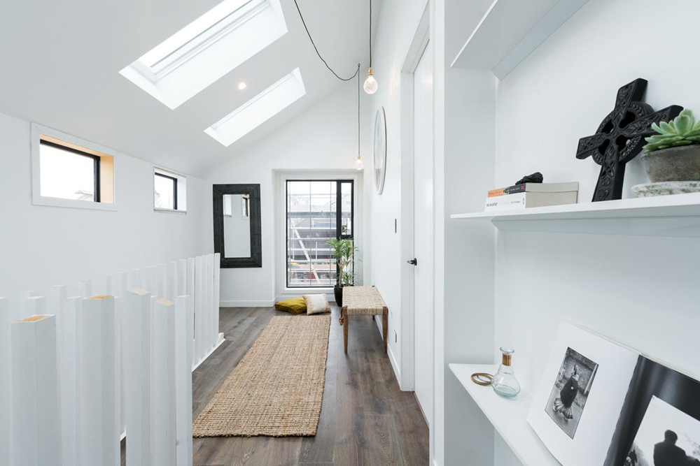
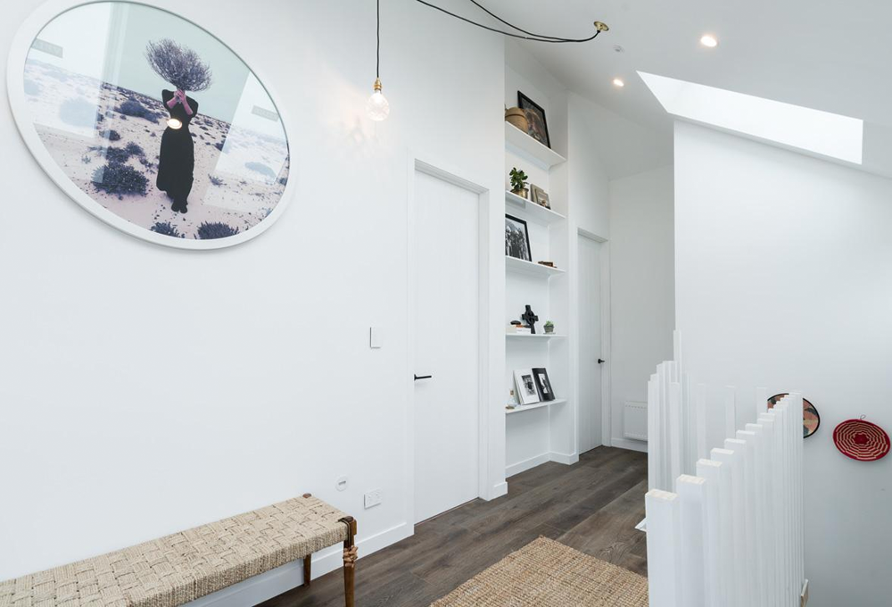
Niki and Tiff: taken out of judging by D+D through a challenge - 11 points (5.5 from Fiona and 5.5 from Paul)
My favourite of all the spaces, and the reason why is that Tiff gets all of those little details right. She knows how to work with scale and texture. The artwork is cool, I love the moody colours.

The white staircase with space between the steps creates a light, airy feel. It also allows the art and accessories on display to take centre stage.


The girls were the only team to use a hall runner, which I think is always a good idea for adding softness, texture, and sometimes colour and pattern. The large landing created a space that was almost another room in itself. The large window and the sky lights are brilliant - natural light is always a winner. I love the bench seat, but as the judges said, the cushions on the floor aren't that practical. A small chair, or even a pouf would've been a better choice, or nothing at all.
The round artwork is divine. A lot of people have been asking on our Facebook page where the girls get all their artwork, and I think Tiff sources it from a photostock library and then has it framed. Clever girl, and the round frame is fab - it's different, which I know Tiff always strives for, and it softens and contrasts the straight lines. Dael & I use circles as much as possible in our designs. A room will always be filled with straight lines and angles, so the introduction of circles and curves will be welcomed.
What will this week bring? Tune in for the action and drama, and for more pics and information, pop over to the TV3 website.