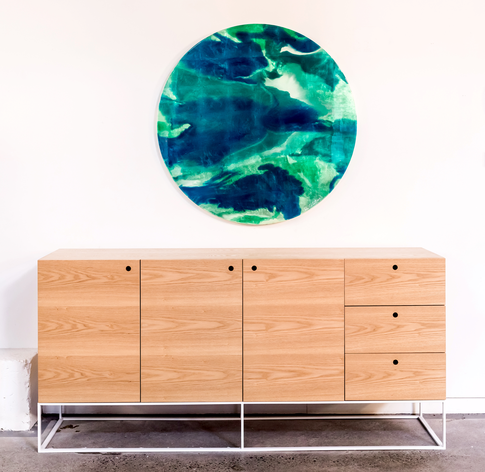
One of our favourite artists, Rae West, just happens to live right on our doorstep - Hawke's Bay is full of so many talented people! When she recently offered us one of her spectacular original tondo's for our showroom, we jumped at the chance. Her work is super beautiful, she uses resin and ink, and this particular piece also has gold leaf for an extra layer of subtle shine. It's quite hard to capture the beauty on camera, believe me when I say this art is even better in 'real life'.
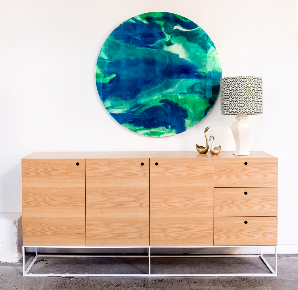
We decided to combine Rae's piece with a little styling demo, and show you how we styled the console in our showroom in six simple steps. Styling flat surface like consoles, coffee tables and bookshelves is one of our favourite things to do. In my home I'm constantly changing things around to suit a new piece I've found, or just to keep things fresh and interesting.
It can be hard to know how to get the right balance, and how to make it look pretty but also have functionality. To help you get started (if you're new at this), we'll run you through our steps and explain why we've used certain pieces:
Step 1: We like to start with a large piece of art, or a mirror can look great too. Hang it just above your console - too high and it can look disconnected from what's going on below it.
Step 2: A lamp is a great starting point. It adds height as well as light for functionality. We've chosen a lamp with a fabric shade we had custom made. The shade will soften the light rather than having directional light like a desk lamp.
Step 3: Add something sculptural or quirky, purely for fun. We liked the curves of the swans next to the round artwork and the curve of the lamp. The brass links to the subtle gold found in Rae's artwork (although it's hard to capture this on camera).
Step 4: Books are a great tool for grounding objects, they act like a little platform for smaller pieces like bowls or vases. They also add a bit of weight and squareness to balance the curves. If you're anything like me (book crazy!) you'll love the chance to have some of your favourite coffee table books on display.
Step 5: To balance the right side we added a large floral arrangement. It's always great to add fresh flowers or greenery. They bring life and add another sculptural and textural element. We were lucky enough to have this stunning arrangement by Laura Jeffares, but if you don't have access to Laura, a pot plant in a beautiful planter will do the job, or grab your secateurs and snip some greenery from your garden.
Step 6: We could've left it at that last step, but that little space to the right of the vase felt like it needed something. A little dish, bowl or tray is handy for throwing your keys, sunglasses etc in as you walk in the door. It's a functional piece and also another low, horizontal element to balance the height of the vertical pieces - it's all about the balance.
So there you go, six simple steps to create a pretty good looking console. We've kept our colour palette consistent with greens and blues to compliment the artwork, and pinks, gold, and the light wood of the console to balance those cool tones.
This beautiful artwork is for sale, so if anyone is interested in purchasing a stand out piece for their home, please get in touch with us. You're welcome to come and see the art in our showroom so you can truly appreciate it's beauty. Make an appointment to make sure we're not in a meeting or out and about, as we'd love to give you our full attention.


