The Block Kid's Room | Girls vs Boys

Sorry I couldn't bring you this week's roundup sooner, we've been out of town visiting some amazing new clients, but I have been keeping up to date with everything that's happening on The Block. What did you think of the kid's rooms? What a turn around by Sam & Emmett - from zero to hero in a week! The boys got some first hand advice from a 10 year old girl, which I thought was very smart, and certainly paid off as they walked away with the win.

Sam and Emmett: 1st place - 18 points (9 from Fiona and 9 from Paul)

These were really high scores for week 2 - too high?.. Hmmm, perhaps. Don't get me wrong, I think Sam and Emmett's room was a great effort, especially compared to their first room, but I'm not sure it was one point off perfection. I loved the colours they chose - Resene Half Duck Egg Blue on the walls, and Resene Alabaster on the ceiling and trims. It's a lovely soft, restful colour palette and one that would suit an older child or an adult, giving future buyers plenty of scope.

This week both the boys teams had to design their room for a 10 year old girl, and the two girls teams had to design theirs for a 10 year old boy. Contrary to popular belief, girls rooms don't have to be filled with pink. My three girls are all "blue" fans, as was Sam & Emmett's 10 year old consultant, and she also wisely suggested gold which adds warmth, and balances the cooler wall colour.

The fairy lights and touches of bling in the mirror and lamps were fantastic, and the room could easily be adjusted for a teenager by changing out artwork and accessories, which I love.

Minor criticisms - there are a lot of little things going on in the room, a larger "hero" piece of art over the bed would've created a focal point. I just want to re-zhush a few of the styling pieces, and perhaps lower the hooks as they look a bit high for a child to reach, but that's being picky. Well done boys.

Dyls and Dylz: 2nd place - 15 points (7 from Fiona and 8 from Paul)

The "double D's" was actually my least favourite this week (sorry guys). I think what gave them the good scores was their use of tiny lights in the ceiling creating a starry night - that was amazing. Unfortunately I don't love their choice of wall colour, and with the sloping ceiling it seems to stunt the room. I think painting the walls and ceiling the same colour would've been better.

I love a hanging chair and I'm sure all little girls would too. The thick rope seems very heavy and out of place though. A simple metal chain would've moved the focus back to the chair and the cushions.

The room needs a few more details - some artwork and accessories would've added a bit of life. But on a positive note, the little desk was a great use of that space.

Emma and Courtney: 3rd place - 14.5 points (7.5 from Fiona and 7 from Paul)

I like the warmth and texture the girls brought to the room with the plywood wall. It's a good size room and I'm sure a 10 year old would love the double bed and all the accessories.

The desk looks a little high, but that could be fixed. Personally, I would've hung the curtains right from the ceiling - it's only a few more cm's, but just adds that sense of height and elegance to a room. There are elements I like in this room, but I'm not blown away by the space.

Niki and Tiff: Last place - 10 points (5 from Fiona and 5 from Paul)

The girls were strategic this week, purposefully forfeiting the win by ignoring the brief, choosing to think of the overall look and feel of their home as a whole. The brief was for a 10 year old boy's room and no white walls.

I'm in two minds about their room... it's by far my favourite of the four, but I do feel they could've easily tweaked the room to make it more kid appropriate, without compromising their design aesthetic. Accessories, whether it's a guitar, a surfboard, a pair of sneakers, some sort of music setup (or all of the above) could've looked really cool. The bones would've remained the same, and the room would've been more on brief.

I love the faux brick wall, and the texture and styling is spot on. But designing a kid's room is really fun and I think they lost an opportunity here. There are plenty of adult spaces to come.

What are your thoughts? Have you got a favourite team yet, and do you agree with the judges, or me for that matter? Bathroom week is shaping up to be a goodie, I can't wait to see how they turn out, and if everyone manages to finish.

The Block House 5 | Girls vs Boys

Sunday night gave us our first insight into the design style of the four new Block teams, and I was pleasantly surprised. The first week can be tough as contestants are still finding their feet and have so much to learn, but some great rooms were revealed. Week 1 was almost like a trial run, as all four teams worked side by side in House 5, leaving Peter Wolfkamp's team to prepare the other four houses for the following week. The 'Girls vs Boys' theme saw the two girls teams' scores combined, and the two boys teams' scores combined for this first week. The girls came out ahead giving them a total prize pool of $10,000, and when the top scorers, Niki and Tiff, were given the opportunity to choose how they split the winnings with Emma and Courtney, they very diplomatically split it 50/50.

Niki and Tiff: 1st Place - 16 points (8 from Fiona and 8 from Paul)

The girls seemed to cruise through their first week on The Block with fantastic organisation and budgeting skills taking a lot of the stress out of it. Each team was told that they must use wallpaper in their room, and Niki and Tiff played it pretty safe using a very subtle white textured wallpaper on the wall around their living room window.

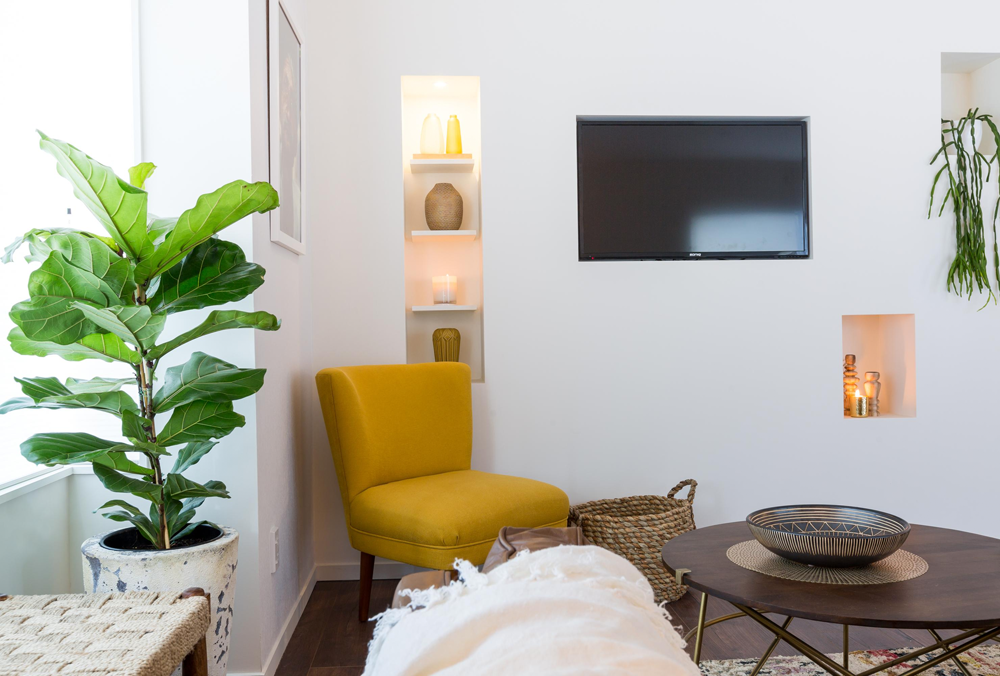
They chose a tribal theme using a beautiful earthy colour palette. I love the use of texture, their furniture choices, and their styling is pretty good too. The only criticism I have is that, although I like the tall inset shelving to the left of the TV, I don't feel the smaller ones on the right were necessary. They feel a bit random and 'bitsy'. Oh and if I'm being really picky, I would've liked the rug to be a bit bigger. But overall, a great effort, I look forward to seeing more from these two.

Emma and Courtney: 2nd Equal Place - 12 points (5 from Fiona and 7 from Paul)

Emma and Courtney were also very organised and calm in their first week, and they did a great job on the master bedroom. Another subtle wallpaper choice, the textured charcoal wall adds depth and a bit of drama to the room. I like the girls headboard, bedside tables, and lights. With the dark wood and touches of brass I think the wall would've looked even more stunning, and a nicer tonal contrast if it was a deep moody blue.

Beautiful texture introduced in the throw, pillows, plant, wall hanging and curtains helps to add softness. Although it's hard to see in these photos, what let the girls down were a few details like door handles not being attached, and the wardrobe not being finished inside. But on the whole I really like this room.

Dyls and Dylz: 2nd Equal Place - 12 points (6 from Fiona and 6 from Paul)

These boys surprised me the most. As a couple of qualified builders I knew they had that side covered, but I wasn't sure how they would go with the design. They did some really nice things with their dining room - far too much wood going on for my taste, but they did a fantastic job with the soft white linen curtains hung right from the ceiling, which help to soften the room. I like the idea of the wood wallpaper (although that isn't my favourite design), but a contrast in the table would've been nice, maybe a wooden base with a white top. Or keep the wood table and choose a different wallpaper.

The rug is a nice touch to ground the table, but it's far too small. You should be able to sit all of your chairs on the rug, and be able to pull them out without getting tangled in the edge of the rug. A round or smaller square table would've worked better in this space, and I think a big statement piece of art on the wall would've looked amazing instead of those little inset shelves (and help to break up all the wood). But the light is pretty cool and I think the boys did well with styling the table too.

Sam and Emmett: Last Place - 5.5 points (2.5 from Fiona and 3 from Paul)

Poor Sam and Emmett, they definitely had the most stressful week, falling behind the other teams in terms of progress, and they tried really hard but didn't quite make it with the design. Their builders came up with the idea of setting the bed back into a niche in the wall and surrounding it with shelving, and this works really well, as does the window seat, which I love. But the choice of wallpaper was atrocious, and the wall colour wasn't great either. I applaud the fact that they wanted to use colour, but perhaps a deep teal for drama, or a really soft duck egg for a peaceful feel would've been better.

They chose the same bed as Emma and Courtney, but although it's very nice, it's fighting with the wallpaper and blue shelving. You should choose one thing in your bedroom to be the hero - maybe the headboard, or a piece of art over the bed - and everything else should compliment it. The boys also had a lot of poor finishes due to a race to finish the room in time, but they did complete their wardrobe inside, and I love their little desk. Hopefully it's onwards and upwards from now for these boys.

The final twist for the week was the key and padlock... As the winners of the last challenge, Sam and Emmett were able to choose whether they took the padlock to lock their house and keep it safe, or the key to steal another team's house. Genuine nice guys, they opted to take the padlock. BUT... the key was then, controversially, accepted by second place getters in the challenge, Emma and Courtney. This is the first time in all of The Block NZ history that anyone has chosen to take another team's house, and let me tell you, it didn't go down well with Dyls and Dylz! It was their house that Emma and Courtney brazenly took. How will this play out? Has it started a war, or will the Double D's see it for what it really is, a tactical move and nothing personal? We shall see. Check out more on the TV3 website, and come back here in a weeks time for our next roundup.

Wallpaper Inspiration

Dael & I are so lucky to have access to the most amazing selection of wallpaper in our job. We've just had a visit from our lovely rep from Icon Textiles, who stock beautiful ranges from Cole & Son, Designers Guild, Christian Lacroix, Liberty and Ralph Lauren, just to name a few. As much as we love paint, sometimes we just need a bit more, and wallpaper is brilliant for adding depth and dimension. Don't be put off by bad wallpaper memories from your childhood! Wallpaper is back in vogue, and there truly is something for everyone.

If you're a fan of the neutral palette and don't want a lot of bright colours, the Eco Front collection has a gorgeous range of wallpaper that is void of colour but has stacks of texture and personality. A woven look; tiny squares that look like post-it notes; and I love how the drapery paper creates such softness on a flat wall.

There are plenty of other lovely subtle patterns available that sit quietly in the background. One of my favourites is Eco Crayon, (pictured below in pink and turquoise) this almost has a grasscloth effect with it's crosshatching pattern.

Coral by Cole & Son is a cool organic pattern found in the Landscapes collection. But if you want a more dramatic effect you could choose Vermicelli from the Cole & Son Curio Collection. It's the same pattern but in a larger scale and bolder colours with a metallic finish to die for!

If you do want wallpaper as a feature in your room, there are so many amazing and delectable papers that will add drama, atmosphere and personality. We've chosen the wallpaper below, Hicks' Hexagon from Cole & Son, to use in a client's entrance and hallway. The hall can be a little dark, but the metallic quality of the wallpaper, along with a large mirror, will help to bounce light around from the adjacent living room.

These images represent a tiny portion of the choices available to you. If you're in Hawke's Bay come and talk to us about your wallpaper requirements, or if you're not from our corner of the country, just email us, we'd love to find the perfect wallpaper for your next project.