The Block Kitchen + Dining | Girls vs Boys

I was impressed with all of The Block kitchens revealed on Sunday. It still amazes me that they can turn this room around in such a tight deadline, and the teams also had their dining room to complete. Kitchens are such an important part of the home and, like bathrooms, they require almost every trade, and huge amounts of planning and preparation. I was surprised with the judges scores though, what did you think?

Sam and Emmett: 1st place - 16.5 points (8.5 from Fiona and 8 from Paul)

Sam and Emmett took out the win this week, but their room definitely wasn't my favourite. I found their kitchen a bit too hard and shiny, and I wanted something to soften it. The strong contrast provided by the black and white is striking, but the open shelves and blank walls are crying out for something to break it up a bit. Maybe some natural wooden chopping boards, some potted herbs, some art, a touch of colour somewhere...

The microwave on the end of the bench became a feature, which I didn't like. Preferably tuck this away in a cupboard or somewhere discreet. What I do love is the little breakfast nook with the bar stools (although the stools will need to be replaced with lower ones), and the curved dining table, which does add some relief to the hard kitchen.

The shadows created on the ceiling from the David Trubridge pendant are beautiful, I would've hung it slightly lower though. When you hang a pendant over a dining table you don't have to worry about banging into it, but you obviously don't want it to obstruct your view of the person sitting opposite you - 80 to 100cm above the table top is good, but just use your eye to determine the best height in comparison to what is around and behind the table. The rug is great!

Dyls and Dylz: 2nd equal place - 15 points (8 from Fiona and 8 from Paul and a -1 from S+E)

After Fiona's scores were revealed, both boys teams were neck and neck at the front with 8 points. This prompted Sam and Emmett to play their "-1" point won in an earlier challenge. Although Dyls and Dylz wouldn't have quite won, the -1 meant that Niki and Tiff were able to draw with the boys for second place. I like the galley style layout of D+D's kitchen, and the light wood adds lovely warmth and texture.

The splash back is a photo of their feature schist wall in the bathroom. It's a clever use of continuity and if you love the schist wall, then you'll obviously love the splash back. I love the strip lighting on the kick boards.

I'm also a fan of their dining room. The large table and bench seats have a nice relaxed vibe, the rug is great, love the curtains and the grey feature wall, and I think they did a pretty good job at styling their table too - well done boys. Being picky, perhaps a slight tonal change between the table cloth and cushions, An inky blue table cloth would look lovely with the wood and the grey.

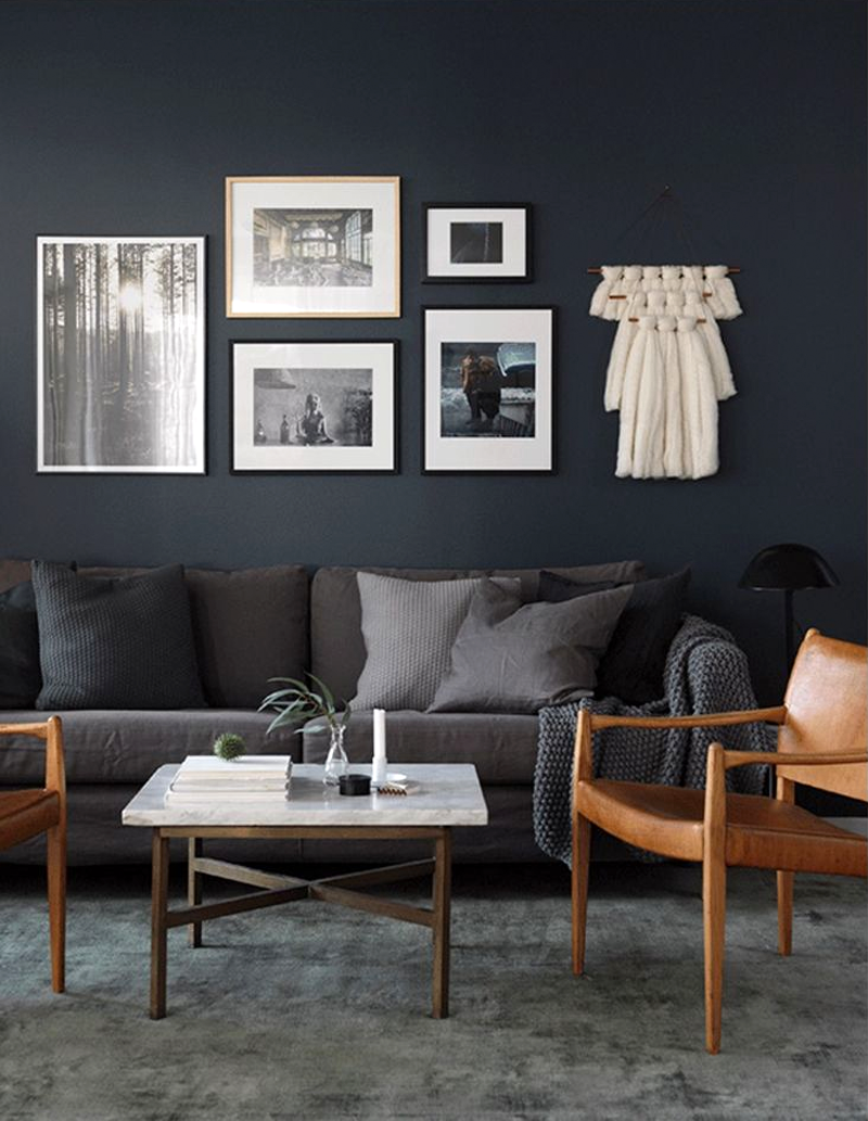
Niki and Tiff: 2nd equal place - 15 points (8 from Fiona and 7 from Paul)

I'll always be a fan of Niki and Tiff's style, and there is a lot I love in their kitchen and dining room, but I feel like they made a couple of mistakes this week. I'll start with the negative and move on to the positive. There seemed to be a mistake in measuring as I don't think the girls had intended for their bench and cabinetry to finish a bit short of the wall. It's not a huge space, so as much storage as possible is key, and it would've looked better had it carried on to the corner. Also, I hate the space between the top of the cabinets and the ceiling. It's not really big enough for proper storage or display, and I know how dirty and dusty it will get up there. Why not carry the cupboards right up to the ceiling? Even if you're not going to utilise the space, you could build a bulk head above.

Although, like Sam and Emmett, they have a black and white colour scheme, they have softened it with natural elements, and their tiles add a subtle texture. Love the butlers sink and black tap, also the discreet oven and microwave tucked behind the fridge.

I absolutely love the girls' dining table. Thank goodness for Ryan, who spent so much time restoring it. I know many of you will think it's crazy to spend thousands on what looks like a beaten up old table that still needs work to restore it (and perhaps it is), but I completely understand where Tiff is coming from. It's beautiful, interesting, full of character and personality, and imagine the stories it could tell. No one else will have one quite like it. I urge you to hold on to any older pieces of furniture that may have been in your family, if you think they could work in your home. Mix it up with some more contemporary pieces around it for a cool eclectic feel.

The chairs are also beautiful, and although the judges didn't like the girls' light, I kinda do! The curtains are great, I love the wave pleat they've used, it's unfussy and relaxed. The other styling touches such as the little bar cart, the plant, and the rustic bowls on the table all add visual interest and personality.

Emma and Courtney: Last place - 13.5 points (7.5 from Fiona and 6 from Paul)

I was most surprised by the low scores for Emma and Courtney's rooms, I felt they deserved more. Perhaps their finishes weren't as good, I'm not sure. But the added value of having a butlers pantry is huge, I wish I had one.

I love the girls' tiles and their inset shelf, but I might be biased on that, as it's very similar to my own kitchen that we renovated last year...

I have to say, I prefer our cabinetry with it's panelling to E+C's flat cabinets. I like the subtle texture introduced by the panels and they way it contrasts the angles of the cube tiles. But their kitchen looks tidy and functional, and the wood helps to break up all the white.

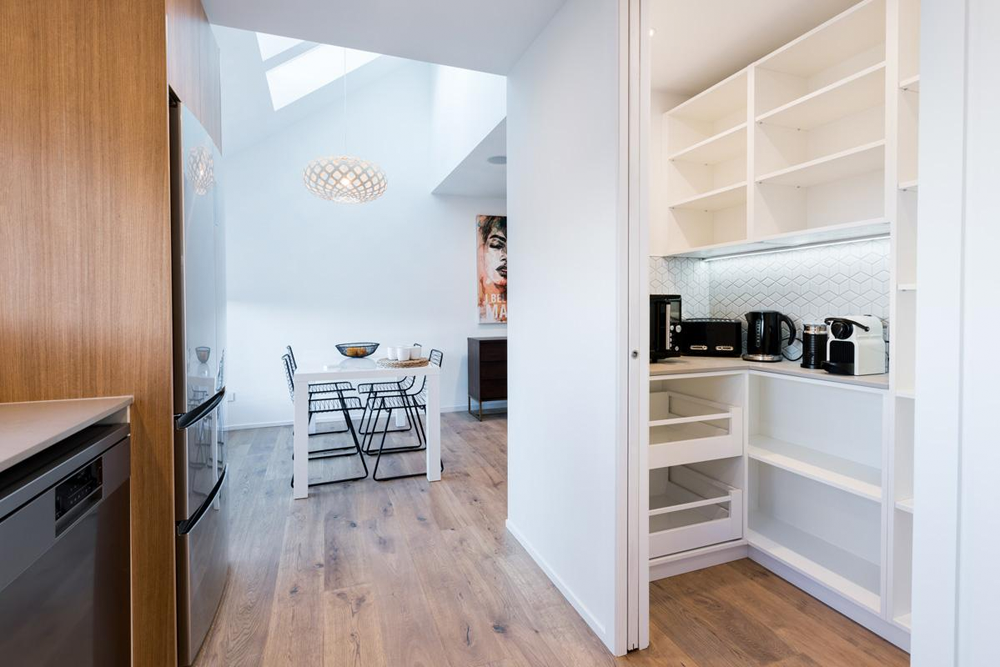
I think what brought their scores down was their dining room. Perhaps so much time went into working on the kitchen and butlers pantry that the dining room was a bit of an afterthought. The skylights and David Trubridge light are fab, but the table is pretty uninspiring, and the wall behind it is crying out for a large piece of art. It was a shame as I think E+C thought this might be their week to shine. On a positive note, they scored the highest from the team votes, so were able to pocket $2,000 - nice!

This week is another crazy, busy week for all with their entrances, stairs, landings, and hallways needing to be completed. It should be entertaining for us as the teams are all having to perform an act in front of a live audience for their latest challenge. We got to enjoy Emma and Courtney rocking it last night looking like divas from the eighties. Their genre was 'music', but I think they would've done quite well if it was 'comedy'. Tonight we'll see Niki and Tiff's comedy act (eek!), then we can look forward to seeing the Double D's in lycra performing acrobatics - I think Junior will nail that. Lastly Sam and Emmett will wow us with poetry. I can't wait. Catch up on lots more Block action on TV3.

Dark + Light

It's hard to go wrong with a clean white base in your home that you can layer with texture and colour. It will always and forever remain a favourite formula of mine. But I have to confess to also being seduced by the dark side - rooms painted in deep, moody greys, blues and greens. Come, see what I mean as I show you two homes that I adore - one dark, one light...

I love the contrast of crisp white and caramel leather against the dark walls, and the subtle tonal changes found in the sofa, cushions, throw and rug.

Softly, softly, with the barest hint of colour creates a calm and relaxing space and allows the beautiful view outside the doors to take centre stage.

A cosy nook with a chair to curl up in is essential in every home. Dark or light, the key is to keep it simple. Choose a chair with beautiful lines, add a statement piece of art, and keep everything else minimal.

Buffets or sideboards are super cool pieces of furniture. They're practical for storing those things that don't need to be on display, and provide the perfect surface for creating vignettes - little stories. I love the subtle texture and pattern on the white buffet against the steely blue wall. 

The deep green buffet with brass sleigh-like legs is, quite simply, spectacular! When you have such a special piece, don't over-do the styling as you will take away from the beauty of the furniture piece.

Last, but not least, the bedroom. Both are beautiful. The dark green walls and grey linen creates a cosy space with plenty of drama. The brass wall lights and touches of white break the darkness and add a lovely contrast.

White walls, duvet and bedsides create a serene bedroom space. Layering various shades of grey adds depth, as does the texture from the panelled walls and the fur cushion.

Do you have a favourite look - dark or light? Or are you like me and love them both? Want to see more of each home?... the dark and the light.

The Block Master Bedroom + Ensuite | Girls vs Boys

Last week on The Block required a mammoth effort from all the teams, as they had not one, but two spaces to create in just one week - their master bedroom and ensuite. There was some lovely work, but I have noticed a sea of white and beige across the board. I understand the need to create a beautiful blank canvas for future buyers, but I would dearly love to see more colour used in artwork and accessories.

Niki and Tiff: 1st place - 17 points (9 from Fiona and 8 from Paul)

Niki and Tiff have consistently used a neutral colour palette with a Boho vibe, and I do love their work. They have stuck with blinds throughout, but (and I've said this before) I think soft and subtle linen curtains would look beautiful in their spaces, and add softness.

The picture wall adds personality and I love the addition of the baskets for some texture and curves to break up the straight lines. The crystal pendants throw a beautiful pattern onto the panelled wall behind the bed. As much as I love the little stools/bedside tables (available to purchase through us, by the way), often in a master bedroom you want something with a drawer for everyday storage.

The little desk/makeup station is a great use of that corner nook. I love the big internal slider and the large walk-in wardrobe.

The ensuite is also consistent with their main bathroom, so the sense of continuity is great.

Sam and Emmett: 2nd place - 13.5 points (7.5 from Fiona and 7 from Paul and a -1 from N+T)

It was a particularly difficult week for these boys after it was discovered they had been getting outside interior styling help on previous rooms. As punishment they had to divvy up the winnings from their child's bedroom amongst the other three teams, and this week everyone was curious to see how they went on their own.

They did OK, I think. They had some good elements, and a nice (albeit very safe) colour scheme.

I like the concept of the bedside tables, and they would've been really cool if they were part of the headboard - one large built-in piece - but once again they don't allow for any extra storage. I would've moved the artwork slightly closer together and down, but they're quite cute.

The walk-in wardrobe is great, and I also like what they've done in the ensuite. An injection of colour would've been nice though - towels are an easy way to do this. Niki and Tiff disagreed about whether to use their -1 point, but Tiff's choice to use it on Sam and Emmett after only knowing Paul's scores, wasn't necessary in the end, as they were clear winners.

Emma and Courtney: 3rd place - 11 points (5 from Fiona and 6 from Paul)

Boy, do I want these girls to get a win! They always try really hard and have a great attitude, but their rooms lack enough oomph to take them across the line in first place. The judges didn't like the placement of the bed under the window, and I have to agree that the adjacent wall would've allowed them to give their bed more presence. The bed should be the main focal point of a bedroom, so it's nice to have some sort of hero piece, whether it's a headboard, artwork or a beautiful cushion or throw.

I do love the artwork by Jen Sievers, there are some of those colours I've been after! The girls pulled the pink out of it in their cushion, but I would've liked to have seen them go one step further and introduce some blue into the room, maybe in the throw or a cushion on the chair. Jen's art is amazing, but I would've used an even bigger piece, or pulled it down to have more of a connection with the chair, and placed a side table under it to create a little setting.

The wardrobe looks a little lacking, and I'm surprised the girls didn't do better on the storage aspect of their master bedroom, as they would've known from experience how important it is, especially to us gals.

But, their ensuite is great. I really like their choice of wall tiles and the timber floating vanity lit underneath. The black tiles in the shower are the same style as the white ones used in their main bathroom, which is a nice touch. But girls, more colour, more life!

Dlys and Dylz: Last place - 10 points (5 from Fiona and 5 from Paul)

I really like the fact that Dyls and Dylz have taken onboard advice from previous weeks. They are trying hard to simplify their design, while still staying true to the rustic look they love. In saying that, I feel the room needs more! I know that may be confusing to some, but it's all about getting a balance. You don't want too many elements competing for your attention, but you do want something to add personality, and the more simplistic a room is, the more important it is that every detail is just right.

The barn door is beautiful, but the wardrobe is definitely not big enough for a master bedroom. The floating bedsides are cool and consistent with other rooms, but again, maybe not functional enough. I like to live without too much clutter, but you do need a certain amount of storage to hide things away that you don't want on display all the time.

The ensuite is nice and pared back, but, I don't have to say it do I?... storage and some colour!

Now, I try not to give any of The Block contestants too hard a time, as we have to remember that none of them are professional interior designers, and they all have a crazy deadline each week that I know I would struggle with. I try to give constructive criticism so that any of you reading this may be able to use that in your own projects. Keep watching for more drama as this week unfolds, and check out TV3 for more pics and a list of suppliers.