Durham | Before + Afters

Sometimes a client will come to us for a colour consult, which then organically grows into a much bigger project. That’s what happened when we worked on this super cool home by Don Pitt Design. Our clients, Dana and Maia, with their two gorgeous kids (one who arrived mid way through this project), wanted their home to be calm and restorative. It had to be practical for their family that includes two dogs as well as the two kids, welcoming to their friends and whanau who they like to entertain, and a sanctuary to retreat to after a busy day.

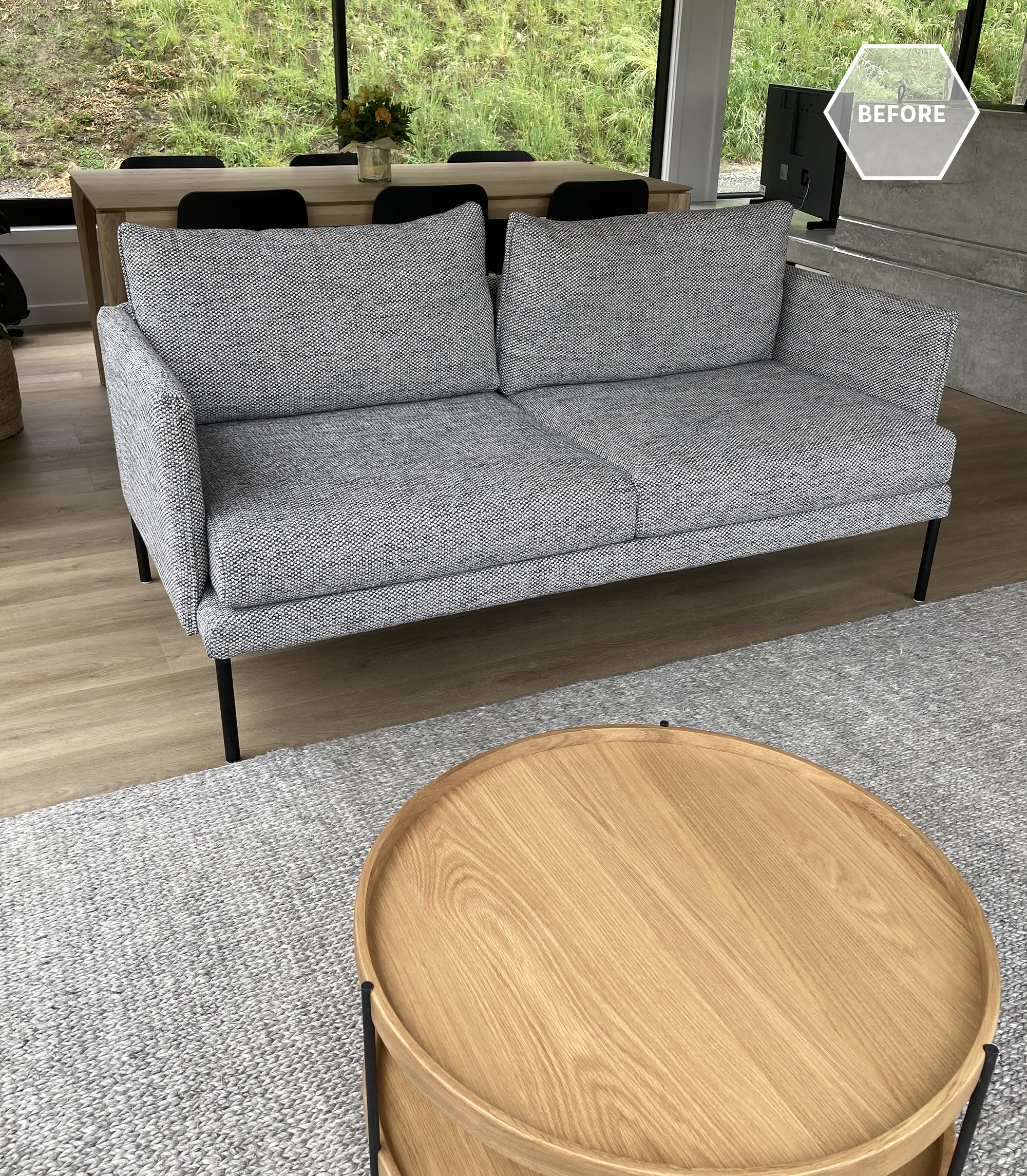
Once we had selected paint colours for outside and in, Dana came to us for help choosing rugs and coffee tables for the two living areas. The existing sofa in one living area wasn’t proving very practical either, so we chose a custom sofa that would suit the style of the house and covered it in an amazing fabric with a built-in stain resistant technology. We then added custom made Bibby + Brady cushions.

We love the concrete fire surround and window ledge that Don Pitt designed. It creates a divide between the two living areas, helping to zone them, and the window ledge doubles as a place to perch. The Samsung “The Frame” TV sits nicely to the side of the fireplace, looking like a piece of art when not in use.

The oak dining table and black stained chairs have strong, clean lines with subtle design detail that complement the home

Dana and Maia had chosen the two sofas in the second living room and they still looked great, but the rug was very similar in colour, so we moved that to one of the bedrooms and replaced it with a rug that introduced a subtle pattern and contrast. We added a custom made round ottoman to nestle with the oak coffee table we’d chosen, and made some more custom cushions. We even sourced some pieces that look great but are child-friendly, as the ottoman and coffee table are at the perfect height for toddlers.

The little powder room was designed by Don Pitt, but we sourced some accessories to take it to the next level. The little in-set wooden shelf is the perfect place for a few “pretties”.

The hallway leading to the bedrooms is one of our favourite features in the home. One side of the hall has large floor to ceiling windows to let in light and give it a luxurious, spacial feel. The other side has large floor to ceiling sliding doors to each bedroom that can be left open, or closed for privacy and quiet. The doors are such a beautiful, dramatic feature - open or closed.

We had beautiful linen curtains made for the bedrooms that hung from an almost invisible track in the ceiling. In the primary bedroom they wrapped around one corner for additional texture and softness. We designed each bedroom and wanted the primary bedroom to feel extra special, creating that luxury retreat for the hard-working parents.

Dana had already chosen the duvet cover, but we elevated the room by adding the custom made headboard that we designed, along with a linen quilt, Euro pillows, a Bibby + Brady lumbar cushion, oak bedsides, elegant lamps, the oak bench seat, and a stunning piece of art by Rakai Karaitiana.

The middle bedroom needed to be flexible so that most of the time it was a child’s bedroom, but sometimes the two single beds could be pushed together to make a king bed for guests.

There’s a built-in wardrobe on one side of the room but additional drawers were needed. To keep it clean and cohesive we matched the tallboy to the bedside table, and added height to the table with a bedside lamp in mossy green. The print on the wall is another favourite by Rakai Karaitiana.

The last bedroom needed a solution for when the children were sharing the room, so we added the cutest set of bunk beds leaving room for a large bookshelf and some room to play.

We chose white wooden shutters for the narrow, high window. They look clean and smart, let plenty of light in but can also be closed up tight at bedtime.

Thank you so much Dana and Maia for allowing us to share your amazing home, and for being the coolest clients ever! You were a pleasure to work with, we know you love your home as much as we do, and we hope you have many, many happy days in it.

Heipipi | Before + Afters

It was towards the end of 2019 when our clients first contacted us. They were adding a wing on to their beautiful home in the Esk Hills and wanted help with furniture, rugs and curtains, as well as design advice on tiles, lighting and more.

The location with its views was spectacular! The new addition would make our clients’ home a fabulous place to share with their children and grandchildren when they came to visit.

The new addition echoed the existing part of the house, and the living room, with its high, vaulted ceilings and large windows and doors, is an amazing space to be in.

Most of the furniture pieces we chose for this room were custom-made so our clients used some of their old pieces in the meantime. We initially designed a built-in unit for the TV nook, but our clients fell in love with the large rustic dresser which (crazily) fit with millimetres to spare. It ended up being instrumental in the look and design of the room, which had to be cosy and comfortable as well as practical for small children and one very big, adorable dog!

These occasional chairs are favourites of ours. They’re exceptionally comfortable and work just as well in a modern home as they do in a more traditional setting. We chose to cover them in a smart, dark green houndstooth fabric. The colours link to those found outside as well as the nearby kitchenette where we installed dark green tiles. The hand knotted wool rug is large enough to anchor all of the furniture and complements the polished concrete floor beautifully.

We teamed the chairs with a large corner sofa. Because we have these custom-made here in New Zealand we can choose not only the fabric, but the cushion inners as well. We’ll often use big, soft cushions that you just sink into, but for this room we decided to use a wrapped foam seat cushion. This gives more of a sleek profile, and the cushions don’t need fluffing up quite the same, which will be practical for this family. The fabric has a built-in stain resistant technology, perfect when you have kids and animals around, and the dark blue colour will help disguise the black dog hair in between vacuums.

The layout with the corner sofa and chairs works well for both TV watching and social situations, and you also get a great view of outside from the sofa.

The cushions are a combination of custom-made by us and ready-made from one of our wholesale suppliers.

Another custom-made piece, the ottoman can be used to put your feet up on, or as another seat, but primarily will be used as a coffee table. You can replace one or both of the books with a large tray if you want to put drinks down.

In the dining room, where our clients had been using their outdoor furniture, we chose a large oak dining table stained black and grounded it on a large Heirloom wool rug in a gorgeous deep teal colour.

A new light anchors the table from above, and the hero of the room is a stunning sideboard perfect for storing serving platters, glassware, drinks and more.

Thank you to our fabulous clients for working with us and allowing us to share these photos with you all.

POPPYPEACH Health Food Eatery

We recently added another gorgeous commercial project to our portfolio and wanted to share a little bit of the journey with you. It all started with these two lovely ladies…

Angie (on the left) was our very first residential interior design client. We worked with her and her husband Ryan way back in 2013/14 designing their beautiful family home, and went on to help with her future renovations and additions to the house. Kayla (on the right) was Angie’s much-loved nanny helping Angie with her four kids, including cooking for them, which is when the two discovered they shared a love of healthy, delicious food. You can read more about their story here.

When Angie no longer needed Kayla’s help at home she was devastated at the thought of no longer having her in their lives, so when the opportunity was presented to her to lease one of the brand new spaces in the Tamahere village she jumped at it. Angie decided to open a whole food eatery where Kayla could continue to create her healthy food and drinks, not just for the family, but for the whole village (and beyond).

This is where we come in. Angie got in touch back in November 2020 and asked if we would be willing to design the space, the catch being that she wanted to start the fit out late January 2021. That is a very tight turnaround at an especially busy time of year, and we had the added challenge of distance between us. On the positive side we knew Angie really well, we knew her style and she knew and trusted us, how could we say no?!

The building was an empty shell, an actual blank canvas. We knew we could design the interior and the spatial plan, but how were we going to pull off the install in that time frame when we were 3 1/2 hours drive away? The solution came in the form of Courtenay from Table Talks. She is local to Hamilton and experienced in hospitality design and fit outs. She kindly agreed to project manage our design along with Angie, and so it began.

Angie gave us a really clear and concise brief. She provided us with the images above explaining that she wanted clean, fresh and timeless, but also fun and quirky. She loved the brightness of the image on the right and wanted to include a place in the eatery that would be instagram-able and instantly recognisable when people saw it.

These images above are some of our inspiration that we pinned to a Pinterest board. We knew with all of the straight lines and hard, industrial materials in the building that we wanted to add softness with lots of curves. We knew Angie wasn’t afraid of colour and we loved the combination of pink and red in the first image. With smoothies, brekky bowls and salads (among other things) on the menu, those colours evoked vibrancy, freshness, juiciness and fun.

Angie had chosen the name POPPYPEACH for her eatery and needed branding, and it was important that it tie in with our design. So we put her in touch with our friend Suné Malot - Cirque Du Suné - whose graphic design skills are second to none! Let us show you what a genius she is… Suné listened to our ideas and used our images above to create the branding for POPPYPEACH. We’ve taken the liberty of missing a few steps out so as not to make this blog post even longer, but this will give you a really good idea of how her design came together…

This clever brand design could then be applied to many different aspects of the business, like the takeaway cups…

And the back wall of our seating nook - the Instagram-able moment…

photo: Ash Muir

In our original spatial plan we allocated more space in the seating area, but Angie explained that they really needed more room in the kitchen for all of the prepping. Because a lot of the customers would be grabbing healthy take-aways, or a quick healthy bite in between busy meetings, appointments and after-school activities, they could afford to have slightly less seating space - “goodness on the go”.

Plan 1

Plan 2

Part of our design process was to create 3D renders of the space so that Angie could clearly see how it would look and make changes before any building or installation. These would’ve also been helpful to Courtenay who was in charge of bringing our vision to a reality. You can see more of the renders here.

One of the challenges of the design was how to create an easy, clear and orderly flow into the eatery and up to the counter, so we designed the central dining banquette seat to have a high back that zoned the seating and ordering areas, and created a sort of passageway up to the counter.

The lower walls are kept white creating the light, bright environment Angie wanted and providing a nice contrast to the bright colours. The ceilings were painted a soft pink providing a faint glow and warmth, bringing those high ceilings down slightly for a more cosy, inviting feel. Here are a few photos of the finished space and you can see more in our portfolio

photo: Ash Muir

photo: Ash Muir

photo: Ash Muir

photo: Ash Muir

We are so thrilled with how incredible the space looks and we encourage you all to visit when you’re in Hamilton. Check out the POPPYPEACH website and their delicious menu, and follow them on Instagram.

Thanks so much to Angie for allowing us to be part of your adventure, you’re amazing! Thanks also to Courtenay of Table Talks, and Suné of Cirque Du Suné for your outstanding work. Have a peachy day everyone xx